AI 플랫폼 브랜딩 |
LG ThinQ
What we did
Client
Description
LG ThinQ는 스마트 홈 생태계의 비전을 표현한 AI 플랫폼 브랜딩 프로젝트입니다. 스크램블 스튜디오에서 기 제작했던 하드웨어 중심의 원격 제어 서비스 Smart ThinQ의 한계를 넘어 사용자 맞춤형 AI 서비스 생태계 구축을 위한 브랜드의 방향성을 담아냈으며, 이를 유기적으로 연결하는 정밀한 앱 로고 디자인 및 시각 체계를 구축하는 데 중점을 두었습니다.
LG ThinQ is an AI platform branding project that embodies the vision of a smart home ecosystem. It captures the brand’s strategic direction—moving beyond the limitations of the previously developed, hardware-centric remote control service “Smart ThinQ” to establish a personalized AI service ecosystem—while focusing on creating a precise app logo design and visual system that seamlessly connects these elements.
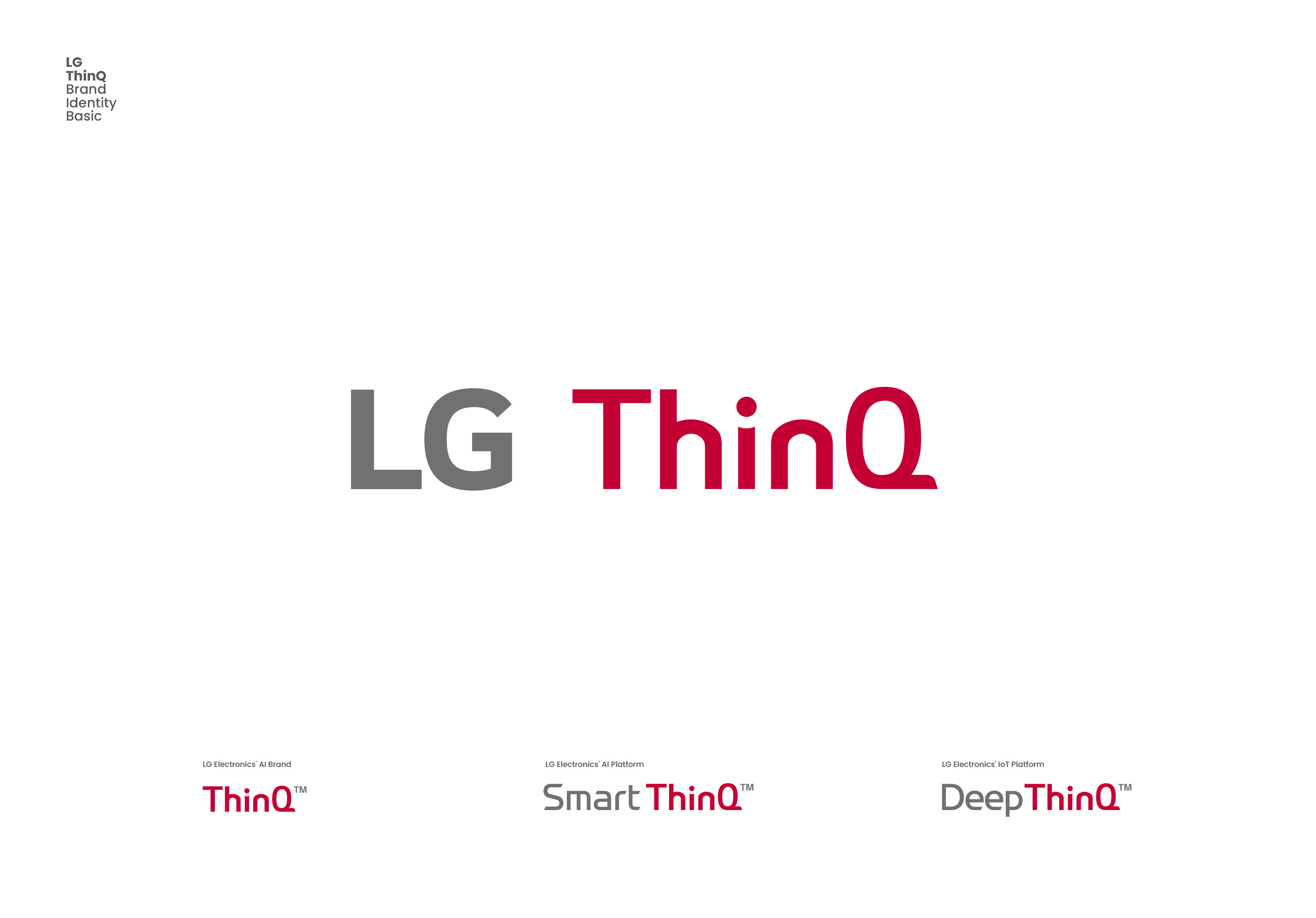
LG ThinQ는 인공지능과 IoT 플랫폼 브랜드를 시각적으로 연결한 LG전자 AI 기술의 대표 브랜드로서, AI 기술을 상징하는 Deep ThinQ (스크램블 스튜디오 제작)부터 스마트홈 기기를 제어하는 Smart ThinQ (스크램블 스튜디오 제작)까지 모두 마스터 브랜드인 LG ThinQ의 일관된 디자인 시스템으로 통합되었으며, 곡선과 직선의 비율, 밸런스를 통해 견고하게 디자인된 이 비주얼 아이덴티티는 모든 가전제품과 소프트웨어에 브랜드 아이덴티티와 앱 로고 디자인으로서 시각적 통일감을 주는 AI 플랫폼 브랜딩의 핵심 역할을 합니다.
LG ThinQ serves as the flagship brand for LG Electronics’ AI technology, visually unifying its AI and IoT platform brands; it integrates everything from “Deep ThinQ” (created by Scramble Studio)—which symbolizes the AI technology itself—to “Smart ThinQ” (also by Scramble Studio)—which controls smart home devices—under the consistent design system of the LG ThinQ master brand. Meticulously crafted through a balanced interplay of curves and straight lines, this visual identity plays a pivotal role in AI platform branding by establishing visual cohesion across all home appliances and software through a unified brand identity and app logo design.

Smart ThinQ의 심볼마크는 스마트홈 기기 간의 유기적인 데이터 흐름과 연결, 사용자의 직접적인 제어와 상호작용의 의미를 직관적으로 표현했으며, 형태와 라인, 요소간의 크기 테스트 등 다양한 Refinement 작업을 통해 제품 전면에 부착되는 메탈 엠블럼의 사출 규격부터 스마트폰의 제약된 앱 로고 디자인까지 모두 수용할 수 있도록 최적화하였습니다.
The Smart ThinQ symbol intuitively conveys the organic flow of data and connectivity among smart home devices, as well as direct user control and interaction; through extensive refinement—including adjustments to form, lines, and element proportions—the design has been optimized to accommodate everything from the injection-molding specifications for metal emblems on product fronts to the constraints of smartphone app icon design.