게이밍 브랜드 디자인 |
LG 울트라기어
What we did
Client
Description
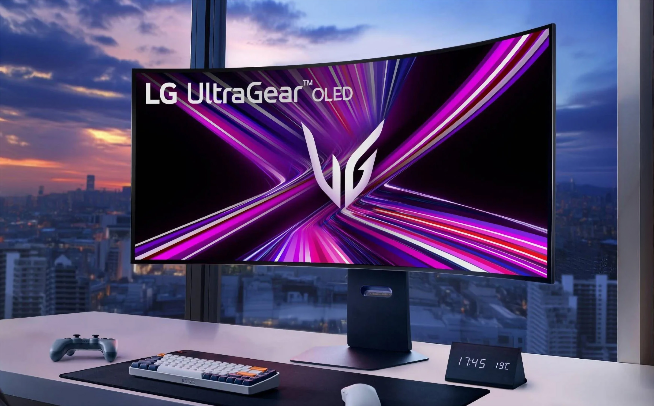
‘LG 울트라기어(UltraGear)’는 PC와 디스플레이 등 게임용 장비를 아우르는 LG전자의 게이밍 브랜드 디자인 / 엠블럼 디자인 프로젝트로 e스포츠 대중화와 고사양 게임 시장의 성장 속에서, 게임의 판도를 뒤바꿀 ‘게임 체인저(Game Changer)’로서 글로벌 IT 기업의 혁신을 잇는 제품 브랜딩을 위해 기획되었습니다. 스크램블 스튜디오는 이 프로젝트를 통해 하드웨어 스펙만으로는 전달할 수 없는 게이밍 브랜드 디자인의 정서적 가치를 시각적으로 구축하는 데 주력했으며, 브랜드 전략과 긴밀하게 맞물리도록 다각도로 협업을 진행했습니다.
Scramble Studio’s ‘LG UltraGear’ project is a successful emblem design and integrated BI design outcome for LG Electronics’ high-end gaming gear brand, encompassing gaming equipment such as PCs and displays. This project was planned to build an overwhelming product branding that continues the innovation of a global IT enterprise as a ‘Game Changer’ that will alter the landscape of gaming, amidst the popularization of e-sports and the growth of the high-spec gaming market.
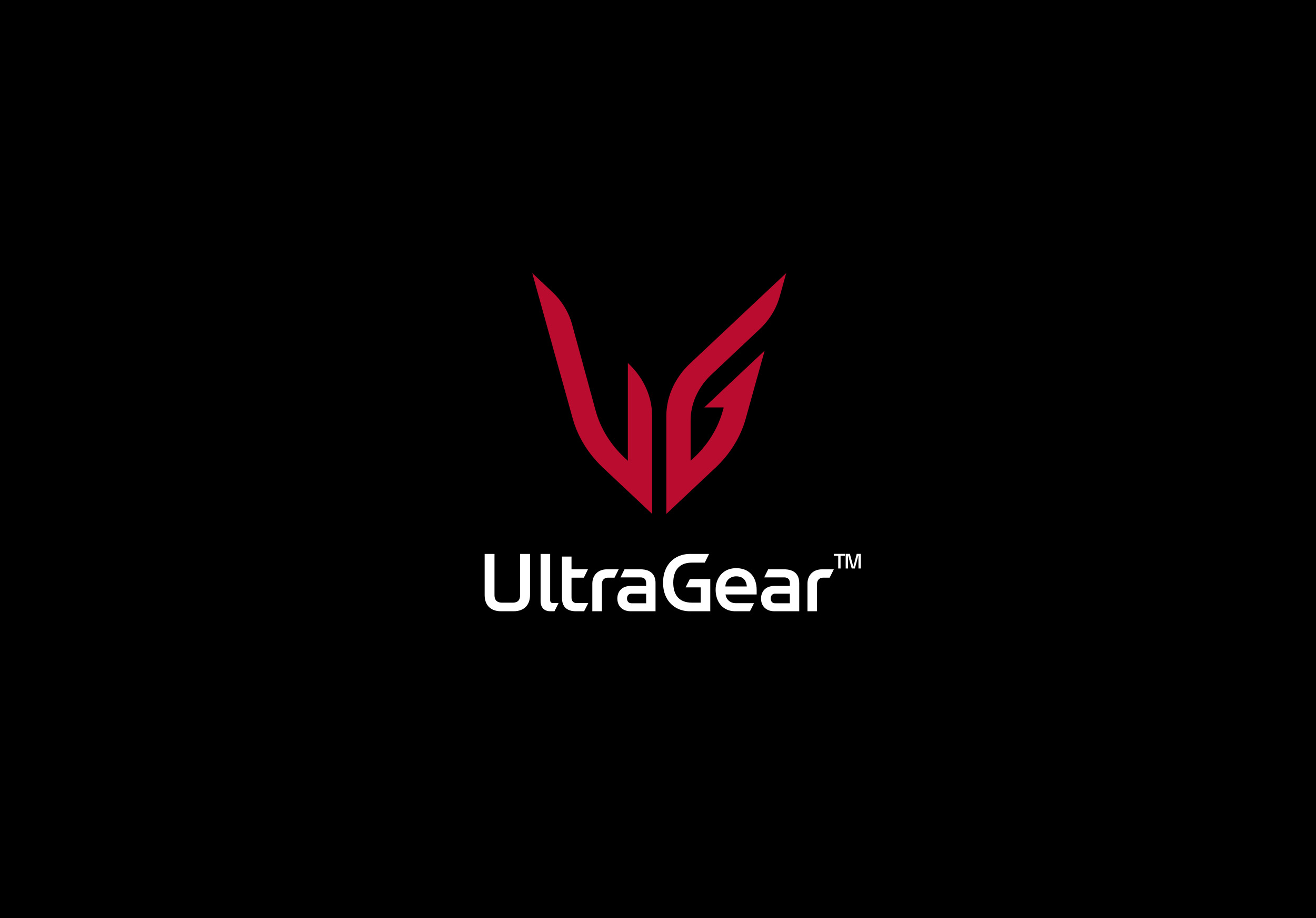


엠블럼 디자인은 형태적 차별성과 완성도, 무엇보다 엠블럼이 상징하는 메타포가 유저에게 어떤 이미지로 보여지는지가 중요합니다. LG 울트라기어 엠블럼 디자인은 Ultra와 Gear를 결합한 네이밍의 본질에 집중하여 유저에게 강력한 능력을 부여하는 ‘최강의 무기’로 시각적 형상화를 위해 롱기누스의 창, 엑스칼리버, 이지스 등 신화와 전설, 그리고 영화와 게임 속 무기까지 다양한 스토리텔링을 가진 무기들을 서치하고 개념적 뼈대 설계와 방향을 잡기 위한 디자인 스터디를 진행했습니다.
In emblem design, formal differentiation and completeness matter — but what matters most is how the metaphor the emblem embodies is perceived by users. The LG UltraGear emblem design focused on the essence of the naming itself, a combination of “Ultra” and “Gear,” to visually embody the idea of an “ultimate weapon” that grants users powerful capability. To achieve this, the team researched a wide range of weapons carrying rich storytelling — from mythology and legend, such as the Spear of Longinus, Excalibur, and the Aegis, to weapons found in film and games — conducting a design study to establish the conceptual framework and overall direction.

수 차례에 걸친 디자인 리뷰 끝에 울트라기어의 영문 이니셜 ‘U’와 ‘G’를 조합하여 그리스 신화 속 승리의 여신 니케(Nike)의 날개를 모티브로 ‘승리의 날개’를 형상화하여 게이머가 열광하는 ‘속도감’과 ‘승리’의 이미지, 강력하면서도 유연한 울트라기어의 성능을 표현한 최종안이 디자인 되었으며, 브랜드를 상징하는 엠블럼의 역할을 넘어 승리를 향한 유저의 마음을 담았습니다.
After several rounds of design review, the final emblem combined the English initials “U” and “G” of UltraGear, shaping them into “Wings of Victory,” inspired by the wings of Nike, the Greek goddess of victory. The design captures the sense of speed and triumph that gamers are drawn to, while expressing UltraGear’s powerful yet agile performance — going beyond the role of a brand-symbolizing emblem to embody the very spirit of every user’s drive toward victory.

로고타입은 스크램블 스튜디오에서 제작한 LG전자의 브랜드 에셋이자, 서체 특유의 캐릭터인 엣지를 통해 엠블럼 디자인과의 조화롭게 어울리는 LG Innovation (H&A Innovation) Font로 적용하여 혁신적이고 강력한 기술력을 가진 LG전자의 제품임을 고객이 인지할 수 있도록 했습니다.
The logotype applies LG Electronics’ LG Innovation (H&A Innovation) Font — a brand asset developed by Scramble Studio — whose distinctive edge harmonizes with the emblem design, letting customers instantly recognize the product as an innovative, powerful piece of LG Electronics technology.