핀테크 브랜딩 |
Cafe De Block
What we did
client
Description
현대BS&C(현 HN Corp.)의 Cafe De Block은 블록체인·핀테크 체험 카페로, 암호화폐 및 핀테크 사용자 뿐 아니라 일반 대중의 블록체인 서비스에 대한 이해를 돕고 실생활 적용 가능성을 경험할 수 있는 공간입니다. Cafe De Block의 브랜드 아이덴티티는 블록체인의 개념을 시각적으로 단순화하여 표현하는 데 중점을 두었으며, 핀테크 브랜딩 프로젝트이자 블록체인 브랜드 디자인으로서 공간, 그래픽, 사인, 인쇄물 등 다양한 접점에서 일관된 브랜드 경험을 제공할 수 있도록 체계적으로 구성되었습니다.
Cafe De Block, run by Hyundai BS&C (now HN Corp.), is a blockchain and fintech experience café—a space where not only cryptocurrency and fintech users but also the general public can better understand blockchain services and experience their potential real-life applications. Cafe De Block’s brand identity centers on visually simplifying the concept of blockchain, and as both a fintech branding project and a blockchain brand design, it was systematically structured to deliver a consistent brand experience across a range of touchpoints, including the space itself, graphics, signage, and printed materials.
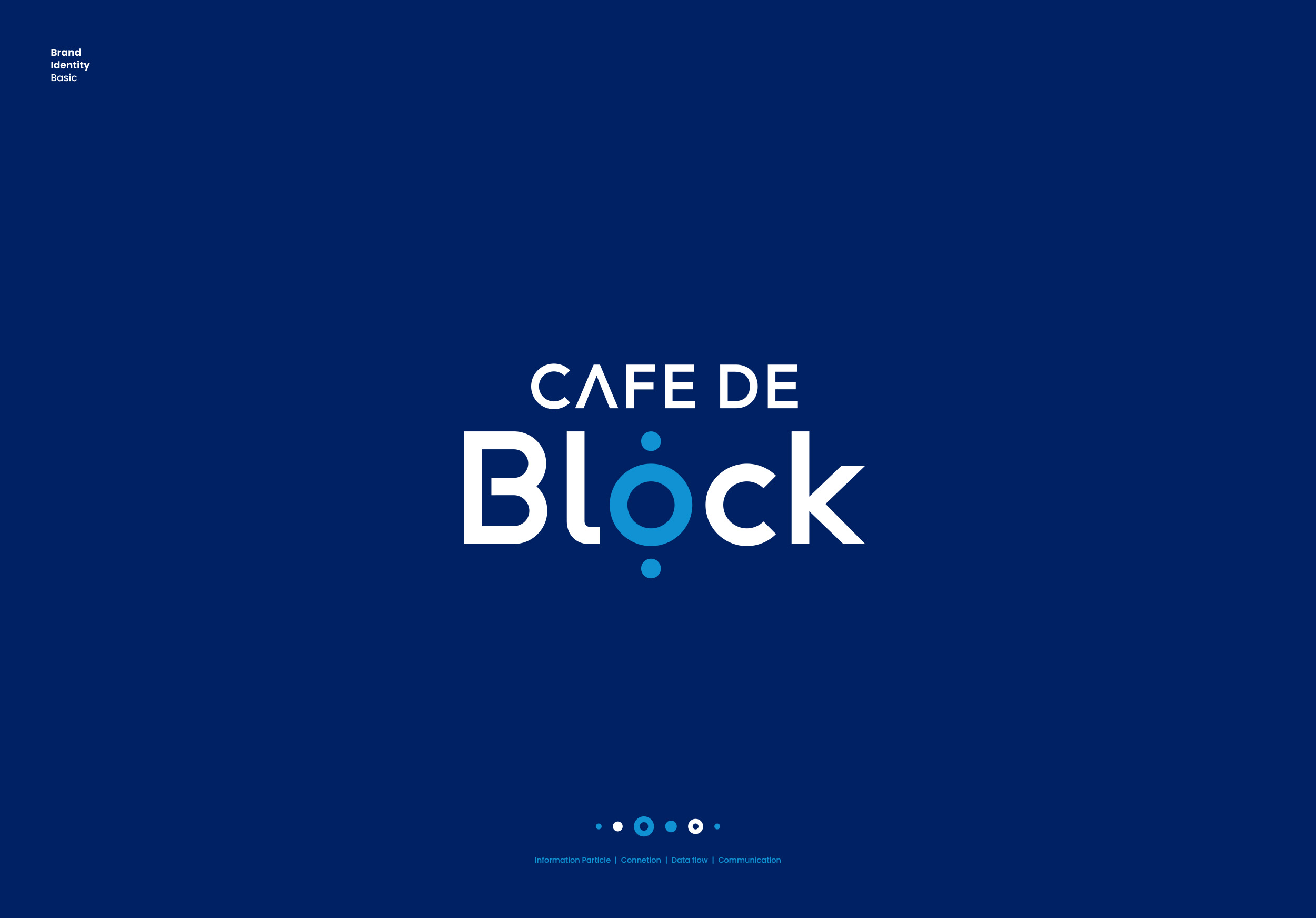
Cafe De Block의 베이직 디자인은 핀테크 브랜딩의 특징인 Network와 연결을 의미하는 Connect, 가치가 순환되는 Exchange, 사용자의 참여를 통한 Experience라는 개념을 하나의 심볼 안에 담았으며, 카페 테이블과 커피잔이라는 친숙한 오브제를 중의적으로 상징합니다. 또한 원(Circular Shape)의 안정적인 구조와 기하학적인 직선 요소를 조합하여 기술의 신뢰성, 확장성, 정밀함을 시각적으로 전달하고 기술과 일상의 연결이라는 핵심 철학을 시각화하였습니다.
The fundamental design of Cafe De Block integrates key concepts of fintech branding—”Connect” (representing networks and linkages), “Exchange” (the circulation of value), and “Experience” (user engagement)—into a single symbol, while simultaneously serving as a double entendre that evokes familiar objects like café tables and coffee cups. Furthermore, by combining the stable structure of a circular form with geometric linear elements, the design visually conveys the reliability, scalability, and precision of technology, effectively visualizing the core philosophy of connecting technology with everyday life.
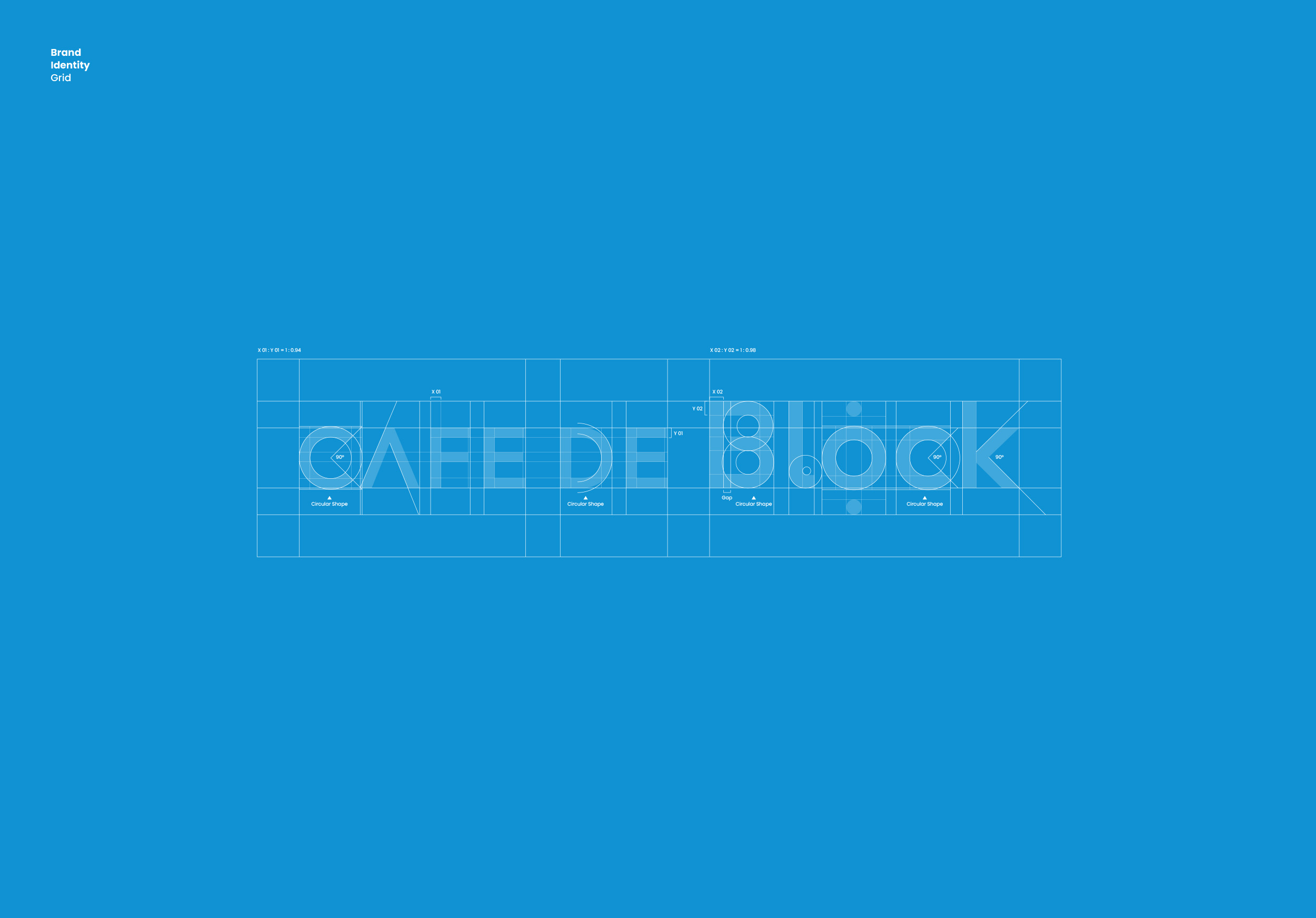
Cafe De Block의 브랜드 아이덴티티는 심볼과 로고타입이 하나의 워드안에서 표현이 되는 콤비네이션 마크(Combination Mark)의 형태로 디자인되었으며, 로고타입의 서체는 일반적으로 착시 방지를 위해 가로 획 대비 세로 획의 차이를 두는 것과 달리 1:0.95~0.99의 두께 비율로 제작되어 브랜드의 컨셉인 Network과 Connect를 강조할 수 있도록 하였습니다.
Cafe De Block’s brand identity was designed as a Combination Mark, in which the symbol and logotype are integrated within a single word. Unlike typical typefaces, which differentiate the thickness of vertical strokes from horizontal ones to prevent optical illusions, the logotype was crafted with a stroke-weight ratio of 1:0.95–0.99, reinforcing the brand’s core concepts of Network and Connect.
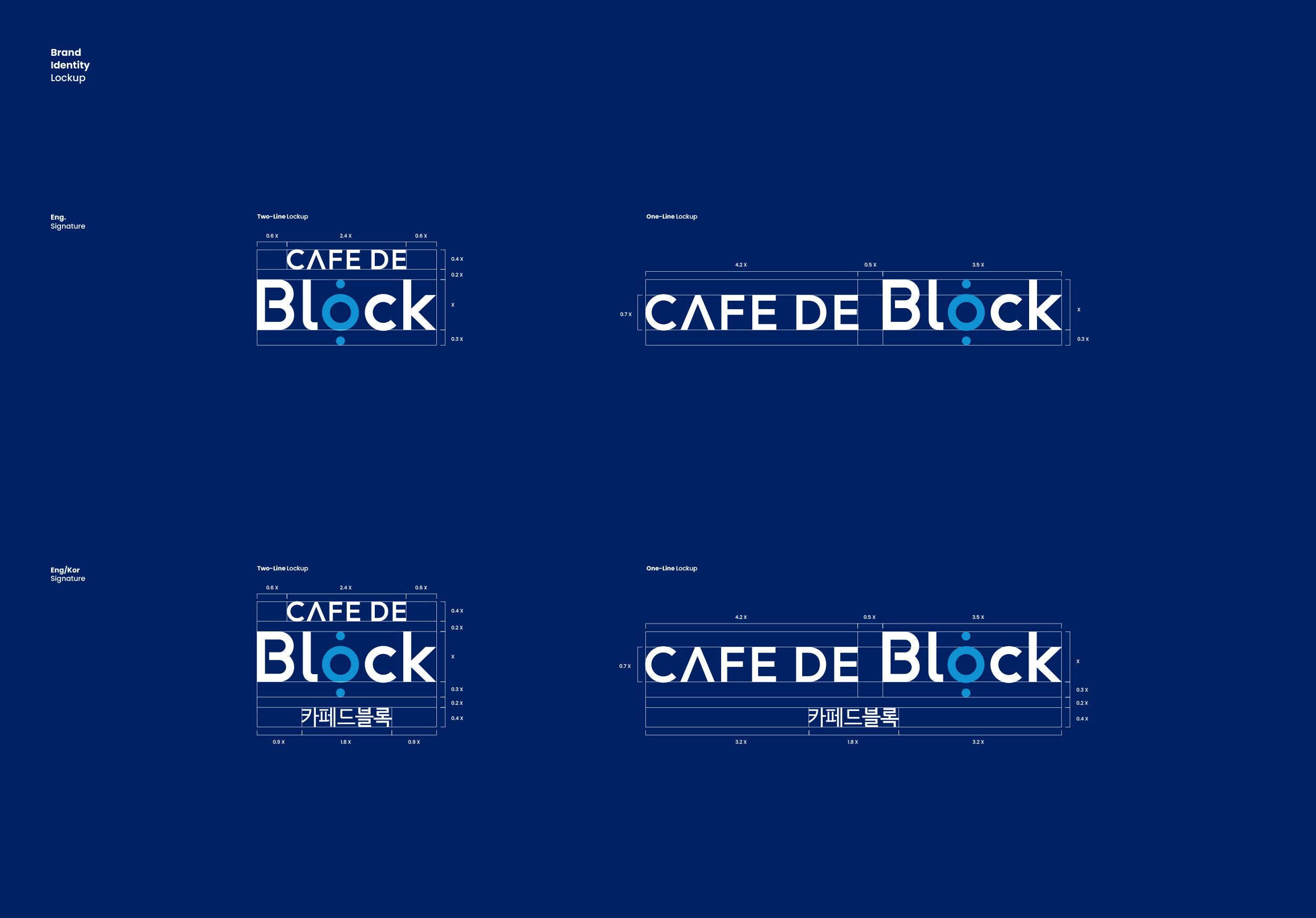
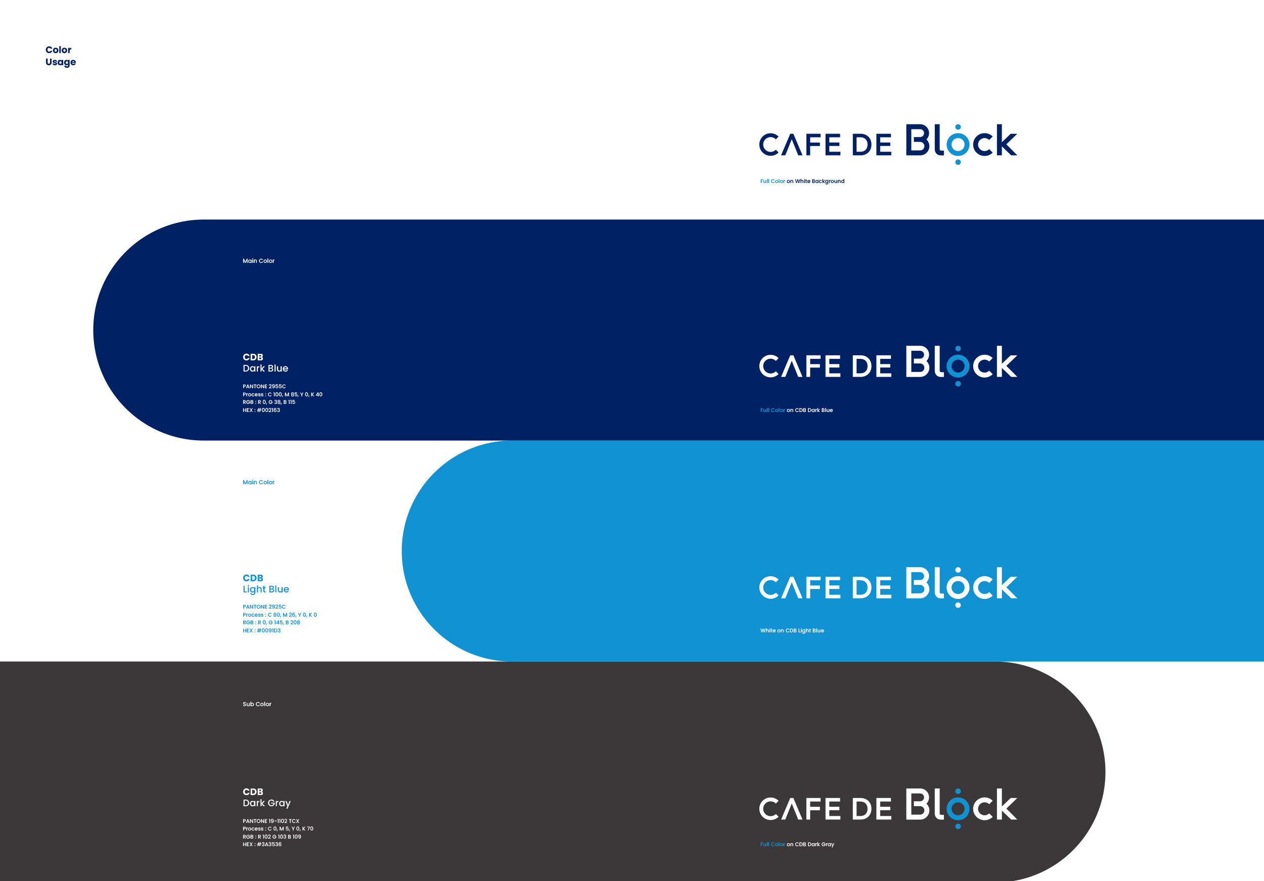
Cafe De Block의 베이직 디자인은 적용 매체와 환경에 따라 세로형 또는 가로형 조합으로 사용할 수 있으며, 로고타입의 두께, 단어 간격, 단어별 크기 등을 다양하게 테스트해, 온·오프라인 어떤 매체에 적용하더라도 왜곡 없이 일관된 커뮤니케이션이 가능하도록 설계했습니다. 또한 기술적 신뢰와 스마트함을 상징하는 블루 계열(Dark Blue, Light Blue)을 주색으로, 어떤 색상과도 조화를 이루는 다크 그레이를 보조색으로 적용하여 낯선 기술 서비스를 소비자에게 친숙하게 전달한다는 핀테크 브랜딩 / 블록체인 브랜드 디자인의 목표를 효과적으로 구현할 수 있도록 하였습니다.
Cafe De Block’s Basic Design can be used in either a vertical or horizontal combination depending on the application medium and environment, and was engineered through extensive testing of logotype thickness, word spacing, and relative word sizing to ensure consistent communication without distortion across any online or offline medium. The color palette also applies blue tones (Dark Blue, Light Blue)—symbolizing technological trust and intelligence—as primary colors, with a dark gray that harmonizes with any color as a secondary color, effectively achieving the fintech branding and blockchain brand design goal of making an unfamiliar technology service feel approachable to consumers.