LG ThinQ Brand Identity Design
What we did
Client
Description
LG ThinQ : 공간과 기술의 조화를 완성하는 시각적 질서와 디자인 가이드라인
가전 영역에서 ‘스마트(Smart)’라는 키워드가 지극히 기계적인 기술의 연결성에 머물러 있던 시절, LG전자는 단순한 원격 제어를 넘어 사용자 맞춤형 AI 서비스 생태계 구축을 선언했습니다. 이러한 이정표 아래 탄생한 ThinQ 브랜드는 기존 Smart ThinQ의 한계를 극복하고 인간 중심의 스마트 홈 패러다임을 제안하고자 했습니다.
우리의 핵심 과제는 이 거대한 브랜드 진화 흐름을 제품과 디지털 환경 전반에 흔들림 없이 적용할 수 있는 Brand Identity Design을 정교하게 시각화하는 것이었습니다. 가전이 놓이는 인테리어 공간과 사용자가 마주하는 그래픽 인터페이스가 어색함 없이 유기적인 조화를 이룰 수 있도록 심플하고 감도 높은 비주얼 정체성을 설계하고자 했습니다.
ThinQ의 비주얼 아이덴티티는 단순한 로고마크의 배치를 넘어, 고유의 서체 스타일과 공간의 비율 속에서 비로소 완성됩니다. 우리는 프리미엄 메탈 소재에서부터 모바일 애플리케이션의 픽셀에 이르기까지 일관된 시각적 무게감을 전달하기 위해 디자인의 세부 요소를 세밀하게 조정했습니다.
-
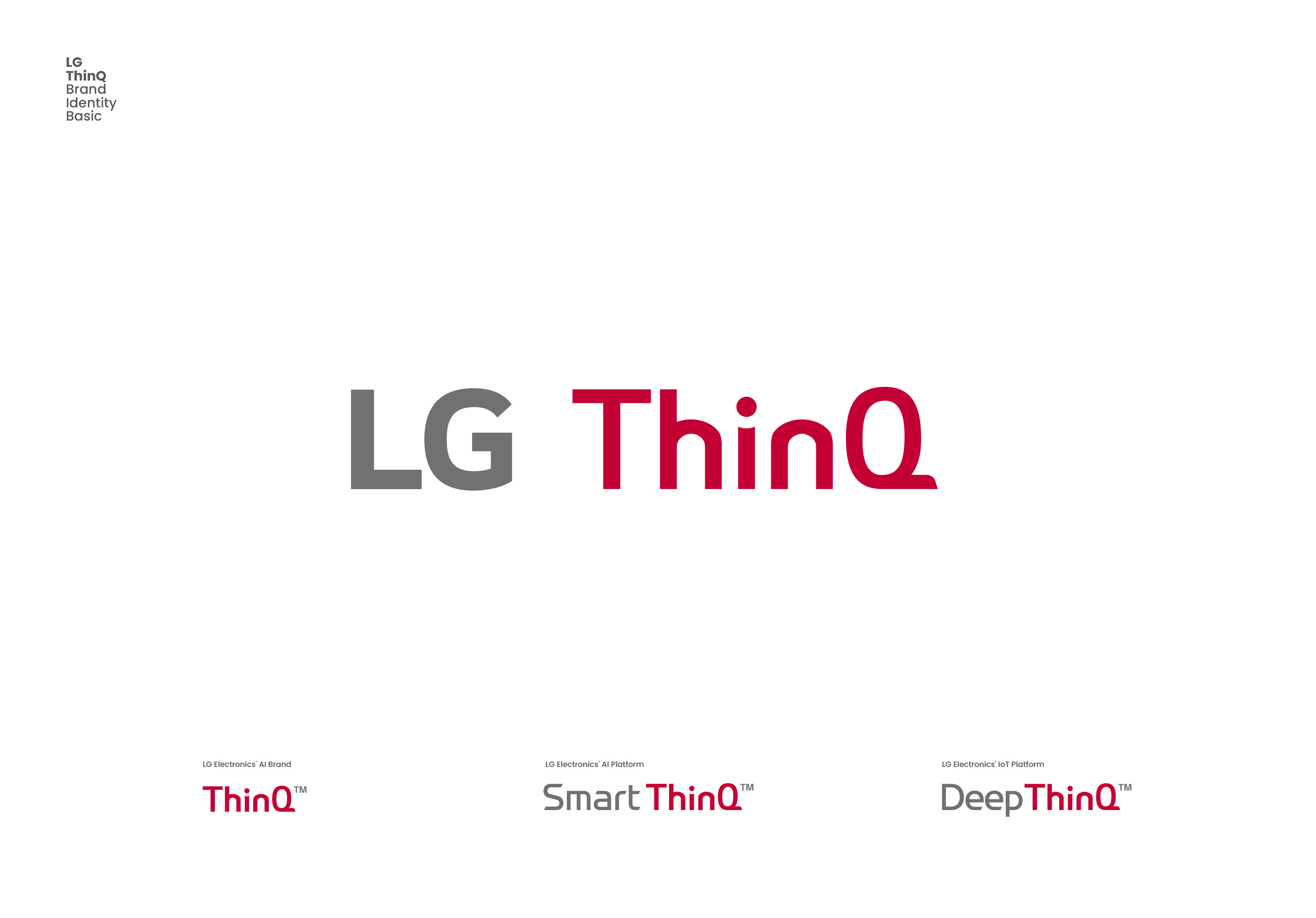
타이포그래피의 균형과 율동성 (Typographic Balance): 대소문자로 구성된 둥글고 안정적인 로고타입을 기반으로, ‘Q’의 꼬리 부분은 수평으로 디자인되었으며 획의 모서리는 부드러운 라운드 처리로 마감했습니다. 이는 차가운 디지털 기술 속에 흐르는 인간미를 상징적으로 구현하는 시각적 앵커 역할을 합니다.
2017년 구축된 ThinQ의 비주얼 아이덴티티는 고유의 곡선과 직선의 비례감을 무기로, 전 가전 라인업의 통일감을 부여하는 핵심 매개체가 되었습니다. 제품 전면에 부착되는 프리미엄 메탈 엠블럼부터 스마트폰 화면 위의 모바일 아이콘에 이르기까지, 사용자의 모든 시선이 닿는 접점에서 동일한 브랜드 감각을 경험할 수 있도록 비주얼 규칙을 일관되게 정립했습니다.
이번 Brand Identity Design 프로젝트는 확립된 브랜드 철학을 시각적 현실로 번역해 내는 디자인 스튜디오의 전문성을 입증한 사례입니다. 복잡한 알고리즘을 드러내지 않고도 우아하고 절제된 형태로 기술의 가치를 증명하는 것, 그것이 우리가 본 포트폴리오를 통해 보여주고자 한 디자인의 궁극적인 지향점입니다.
LG ThinQ: Establishing Visual Order and Design Guidelines for the Perfect Harmony of Space and Technology
In an era when the term “Smart” in home appliances remained confined to a purely mechanical level of connectivity, LG Electronics announced a pivotal transition toward a user-centric AI ecosystem that went far beyond basic remote control. Under this milestone, the ThinQ brand was introduced, aiming to overcome the limitations of the existing Smart ThinQ and present a human-centered smart home paradigm.
Our core challenge was to precisely visualize this grand evolution into a sophisticated Brand Identity Design system that could be seamlessly implemented across physical products and digital environments alike. We set out to design a simple, high-sensitivity visual identity where the physical interior spaces housing the appliances and the graphic interfaces encountered by the user could harmonize organically.
The visual identity of ThinQ goes beyond the simple placement of a logomark, finding its ultimate completion within its unique typographic style and spatial proportions. We meticulously calibrated every design element—from premium metallic materials to the pixels of mobile applications—to deliver a consistent visual weight.
-
Typographic Balance: Based on a rounded, stable logotype combining uppercase and lowercase letters, the tail of the “Q” is designed horizontally, with the stroke corners softly rounded. This structural detail serves as a key visual anchor, symbolically infusing human warmth into cold digital technology.
Developed in 2017, ThinQ’s visual identity leveraged its unique proportion of curves and straight lines to become the primary medium conveying unity across the entire appliance lineup. From the premium metal emblems mounted on product surfaces to the UI icons displayed on smartphone screens, we established consistent visual guidelines so that users experience a unified brand aesthetic at every single touchpoint.
This Brand Identity Design project serves as a testament to our studio’s expertise in translating established brand philosophies into tangible visual realities. Revealing the true value of technology in an elegant, restrained form without exposing complex underlying algorithms—this is the ultimate direction of design we aimed to demonstrate through this portfolio.