창립 기념 엠블럼 |
아이디스(IDIS) 20주년
What we did
Client
IDIS/Angle Comm.
Description
본 프로젝트는 글로벌 영상 보안 솔루션 전문 기업 아이디스의 역사와 미래 비전을 정제된 시각 언어로 정립한 아이디스(IDIS)의 창립 기념 엠블럼 / 20주년 기념 로고 디자인 프로젝트로 축적된 기술적 혁신과 글로벌 시장에서의 리더십을 기념하고, 새로운 도약을 향한 기업의 핵심 가치를 시각적 자산으로 구현하기 위해 기획되었습니다. 객관적인 기업 분석을 바탕으로, 단순한 연도의 표기를 넘어 아이디스가 지향하는 안전과 신뢰, 그리고 지속적인 진화의 방향성을 담은 비주얼 시스템을 구축하는 데 중점을 두었습니다.
This project involved designing an emblem and logo to commemorate the 20th anniversary of IDIS, a global leader in video surveillance solutions. The initiative aimed to celebrate the company’s history of technological innovation and global market leadership while visually embodying the core values driving its future growth. Grounded in an objective analysis of the company, the project focused on creating a visual system that transcends a mere numerical representation, instead capturing the essence of IDIS’s vision: safety, trust, and a commitment to continuous evolution.
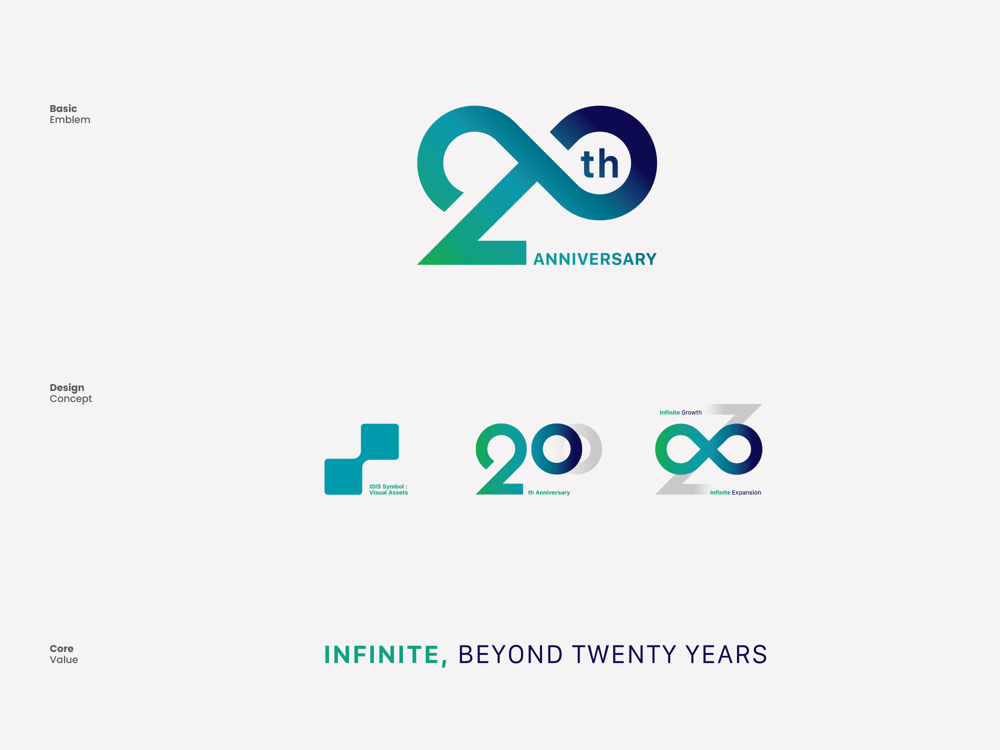
창립 기념 엠블럼을 구축하는 것은 기업의 과거 유산을 존중하면서도 미래의 철학을 일관된 메시지로 전달하는 브랜드 아키텍처를 세우는 과정입니다. 스크램블 스튜디오는 형태적 안정성과 기하학적 그리드 시스템을 기반으로 심볼 디자인을 개발했습니다. 선의 굵기, 자간, 비례를 수학적으로 조율한 전용 타이포그래피 시스템은 디지털 스크린부터 대형 인쇄 매체, 금속 배지에 이르기까지 다양한 환경에서 명확한 가독성과 시인성을 유지합니다.
Building a foundation anniversary emblem is the process of establishing a brand architecture that respects the company’s past heritage while delivering future philosophy as a consistent message. Scramble Studio developed the symbol design based on structural stability and a geometric grid system. The exclusive typography system, mathematically adjusting stroke thickness, kerning, and proportions, maintains clear readability and visibility in various environments, from digital screens to large print media and metal badges.

브랜드의 신뢰도를 전달하기 위해 전략적인 색채 설계가 적용되었습니다. 기업의 전문성과 견고함을 상징하는 메인 코퍼레이트 컬러와, 20주년의 비전을 시각적으로 환기하는 메탈릭 실버 및 골드 톤을 유기적으로 결합했습니다. 이러한 정밀한 컬러 팔레트는 20주년 기념 로고 내에서 복잡한 메시지를 시각적으로 단순화하여 대중의 인지 품질을 향상시킵니다.
Strategic color design was applied to convey the brand’s credibility. The main corporate color, symbolizing the company’s professionalism and solidity, was organically combined with metallic silver and gold tones that visually evoke the vision of the 20th anniversary. This precise color palette visually simplifies complex messages within the 20th anniversary commemorative logo, improving cognitive quality for the public.