
기업 10주년 엠블럼 디자인 |
GM코리아 10주년 (2012)
What we did
client
GM Korea/Cheil Worldwide Inc.
Description
2012년 한국지엠(GM코리아)의 기업 10주년 엠블럼 디자인 프로젝트는 출범 이후 10년간 브랜드를 향한 고객의 사랑에 감사를 전하고, 지속적인 성장으로 쌓아온 기업의 헤리티지와 비전을 대내외에 전달하기 위해 기획되었습니다. 기업의 긍정적 이미지를 계승하기 위해 GM코리아의 비주얼 에셋을 활용했으며, 기업을 연상시키는 다양한 메타포에 숫자 ’10’과 ‘고객 감사’의 의미를 담아 함축적으로 표현하였습니다.
The 2012 corporate 10th anniversary emblem design project for Korea GM (GM Korea) was conceived to express gratitude for a decade of customer loyalty since its launch, and to convey, both internally and externally, the heritage and vision the company had built through sustained growth. To carry the company’s positive image forward, the design drew on GM Korea’s existing visual assets, weaving together various metaphors associated with the company, the number ’10,’ and the meaning of gratitude to customers into a single, implicit expression.


GM코리아의 기업 10주년 엠블럼 디자인은 ‘인피니트’를 상징하는 뫼비우스의 띠를 모티프로, 하트·리본·길과 같은 서로 다른 상징적 메타포를 정교한 곡선과 교차점의 비례로 견고하게 표현했습니다. 특히 본 엠블럼처럼 복잡한 곡선을 표현할 때는 그리드의 ‘원’을 그대로 사용할 경우, 시각적 착시가 발생하는데, 이를 줄이기 위해 기하학적 형태에 인위적인 드로잉과 미세 조정을 더해 시각적 안정감은 물론 10주년을 상징하는 기념 엠블럼 디자인으로서 갖춰야 할 구조적 완성도를 높였습니다.
GM Korea’s corporate 10th anniversary emblem design takes the Möbius strip—symbolizing infinity—as its motif, solidly rendering distinct symbolic metaphors such as heart, ribbon, and path through the precise proportions of its curves and intersections. In particular, complex curves like these can create a visual illusion when the grid’s perfect circle is used as-is; to correct for this, the geometric forms were refined through manual drawing adjustments and fine-tuning, enhancing both visual stability and the structural precision expected of a commemorative emblem marking the company’s 10th anniversary.
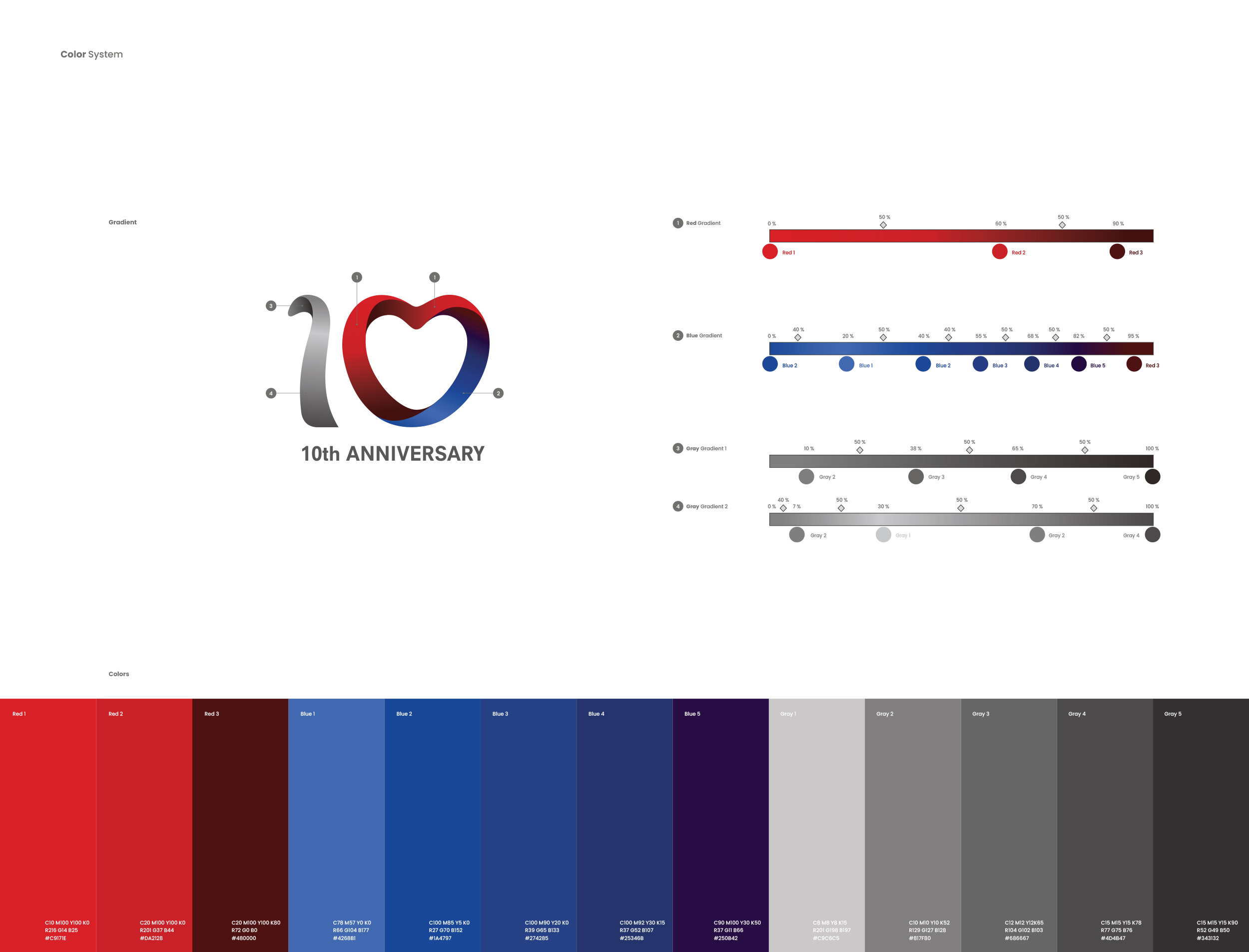

본 엠블럼의 컬러 시스템은 GM코리아 CI의 레드(Red)와 블루(Blue)색상을 바탕으로 레드 그라디언트, 블루 그라디언트, 그레이 그라디언트 등 총 3가지의 컬러 그라디언트로 이루어져있습니다. 각 그라디언트는 자연스러운 색 구현을 위해 밝은 톤에서 중간 톤, 어두운 톤까지 단계적으로 구성되었으며, 인쇄 시 색이 탁해지지 않도록 정밀한 색상 보정을 거쳐 적용되었습니다.
The emblem’s color system consists of three color gradients—Red, Blue, and Gray—developed from the Red and Blue colors of GM Korea’s CI. Each gradient progresses in stages from light to mid to dark tones for natural color rendering, and was applied only after precise color correction to ensure the colors would not appear dull in print.