공공기관 브랜딩 |
국가보훈부 Vision Slogan 2017
Description
스크램블 스튜디오의 국가보훈처(현 국가보훈부. 이하 국가보훈부) 비전 슬로건 프로젝트는 2017년 대한민국 정부의 4대 보훈 정책을 상징하며 정책의 메시지와 보훈의 가치를 정제된 시각 언어로 정립한 공공기관 브랜딩 사례입니다. 본 프로젝트는 국가를 위해 헌신한 국가유공자에 대한 적극적이고 정당한 예우를 위해 대한민국 정부에서 기획되었으며, 국가유공자의 명예를 기리고 국민 통합의 메시지를 친근하면서도 격조 높은 비주얼 아이덴티티로 전환하여 비전 슬로건의 비주얼 자산을 완성하는 것을 목표로 디자인되었습니다.
Scramble Studio’s vision slogan project for the Ministry of Patriots and Veterans Affairs (hereinafter referred to as the Ministry) is a public institution branding case that symbolizes the South Korean government’s four major veterans’ affairs policies in 2017 and establishes the policies’ messages and the values of veterans’ affairs through a refined visual language. This project was planned by the South Korean government to ensure active and proper recognition for national meritorious persons who have dedicated themselves to the nation. It was designed with the goal of honoring the dignity of these individuals and translating the message of national unity into a visual identity that is both approachable and dignified, thereby completing the visual assets for the vision slogan.
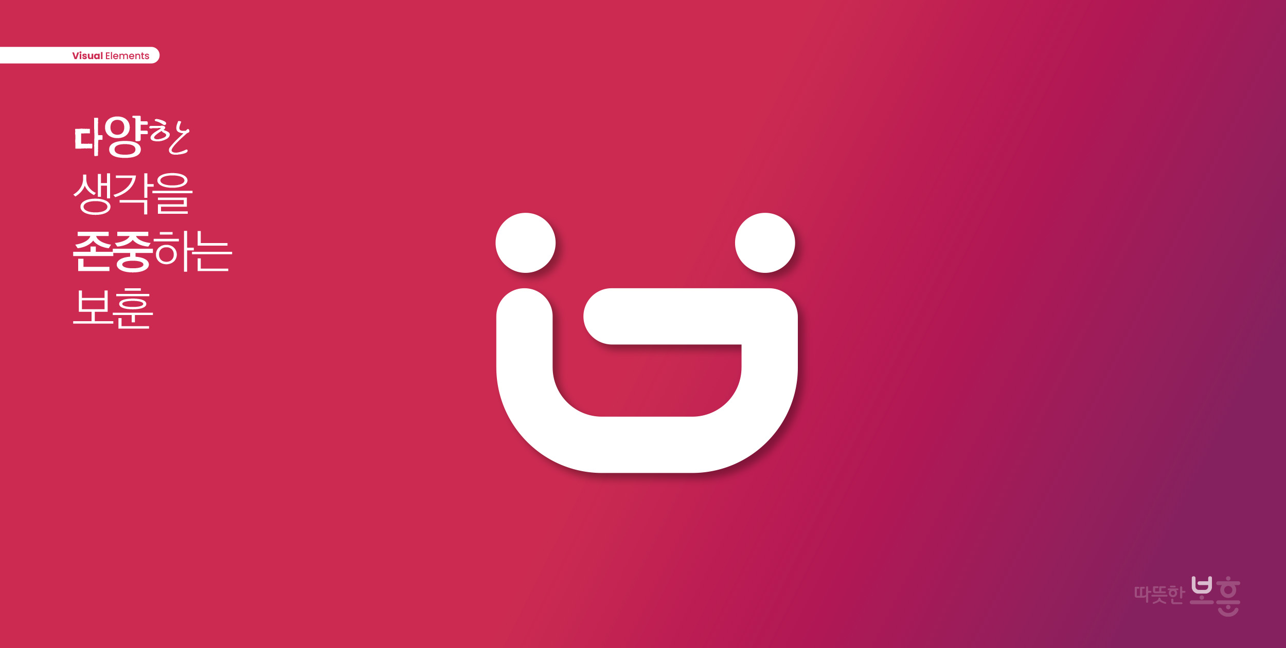
본 슬로건 디자인의 한글 자소 ‘ㅂ’은 서로 따뜻하게 포옹하는 모습을 형상화하여 정부에 대한 다양한 생각, 보훈에 대한 다양한 생각을 존중하고 국민 통합을 위한 비전을 상징합니다.
The Korean character ‘ㅂ’ in this slogan design is stylized to resemble two figures warmly embracing each other, symbolizing respect for diverse perspectives on the government and veterans’ affairs, as well as a vision for national unity.
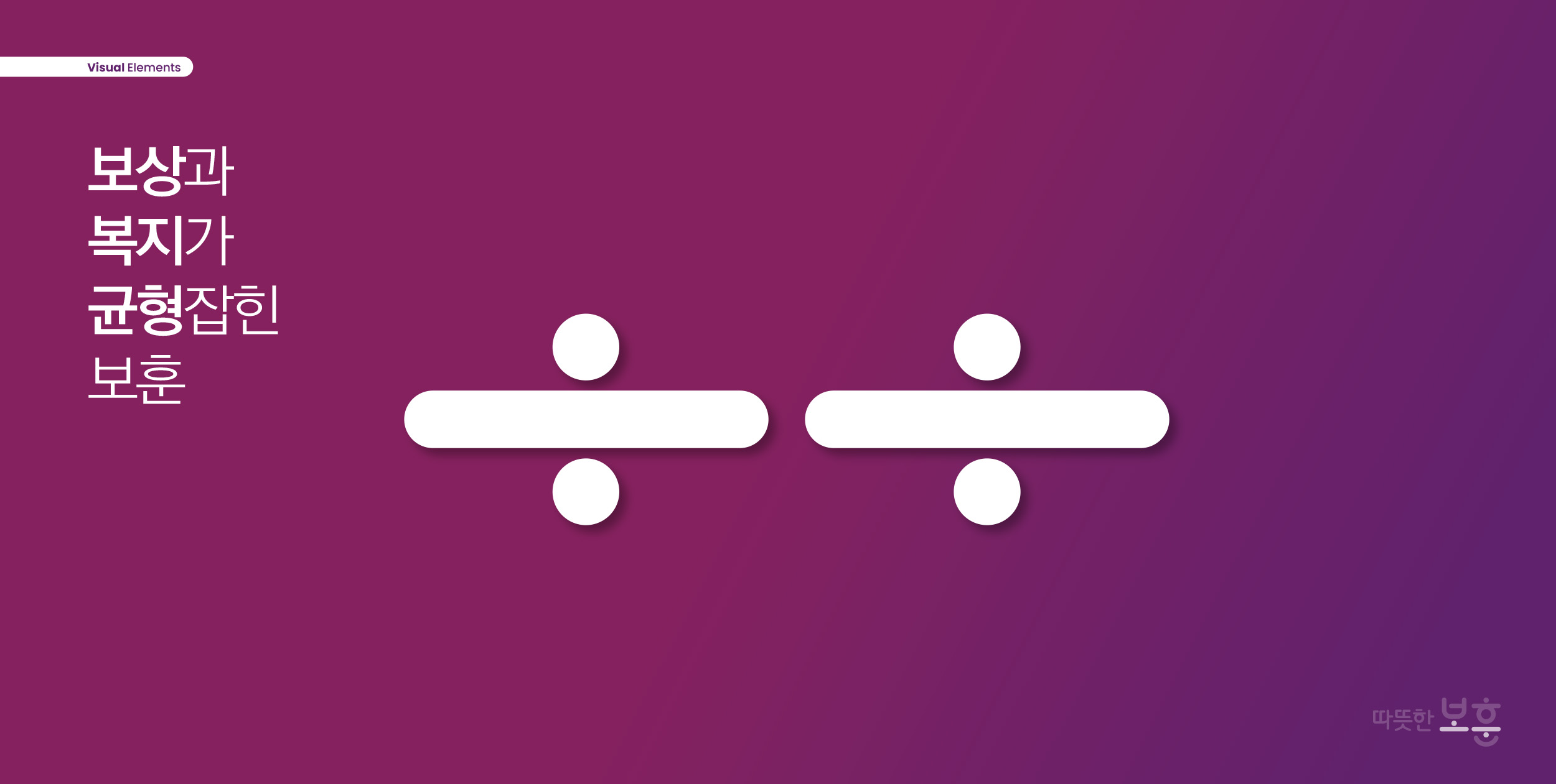
한글 자소 ‘ㅗ’와 ‘ㅜ’는 ‘저울’의 형태와 ‘나누기 부호’를 상징하며 보상과 복지가 균형 잡힌 정책을 직관적으로 표현했습니다.
The Korean characters ‘ㅗ’ and ‘ㅜ’ in the slogan symbolize a “scale” and a “division sign,” respectively, intuitively conveying a policy that balances rewards and welfare.
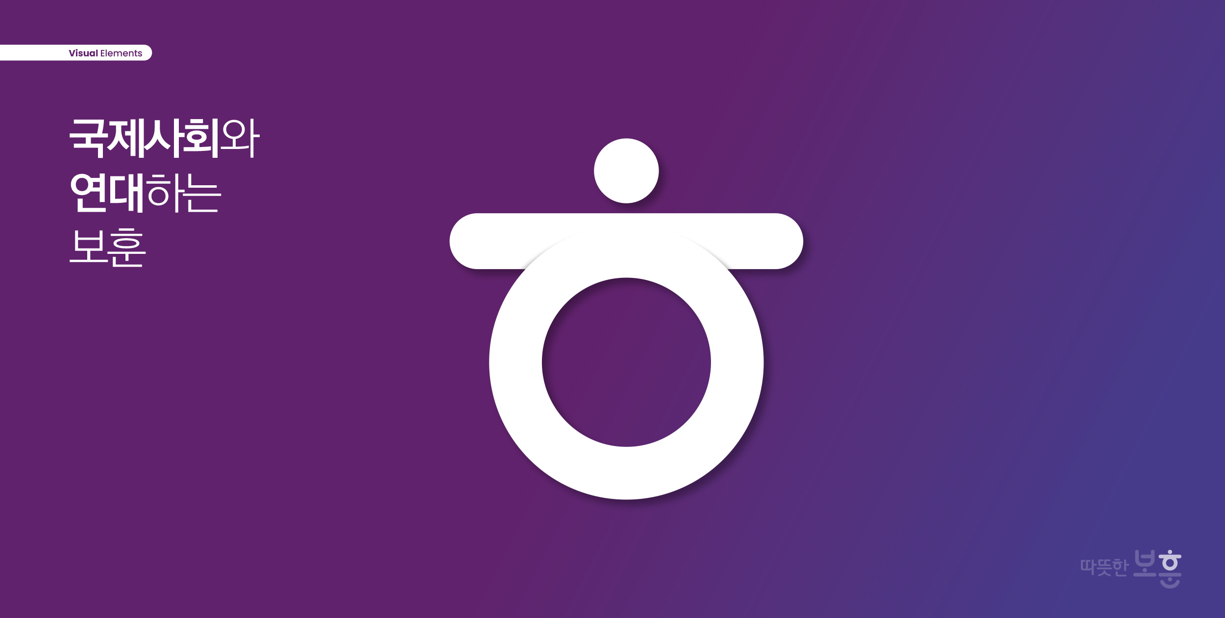
한글 자소 ‘ㅎ’은 양팔을 벌리고 지구를 감싸고 있는 사람의 모습을 통해, 나라를 위해 헌신하였으나 멀리 있어 국가의 보훈 혜택을 받을 수 없는 국가유공자들을 정부에서 직접 찾을 수 있도록 국제사회와 연대하는 보훈의 확장을 상징합니다.
The Korean letter ‘ㅎ’ depicts a person with arms outstretched, embracing the globe. It symbolizes the expansion of veterans’ benefits through solidarity with the international community, enabling the government to directly identify national merit recipients who have dedicated their lives to the country but are unable to receive state benefits due to their distance from home.
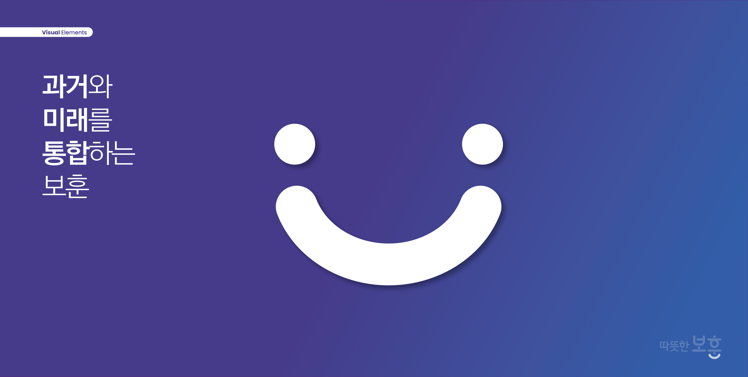
한글 자소 ‘ㄴ’은 마주보고 악수하는 모습, 밝게 웃고 있는 형태를 추상적으로 표현하였으며 과거의 역사와 밝은 미래를 통합하고 이어주는 ‘이음줄’을 상징합니다.
The Korean letter ‘ㄴ’ is an abstract representation of two people facing each other and shaking hands, or of a bright smile, and symbolizes a “link” that unites and connects the past with a bright future.
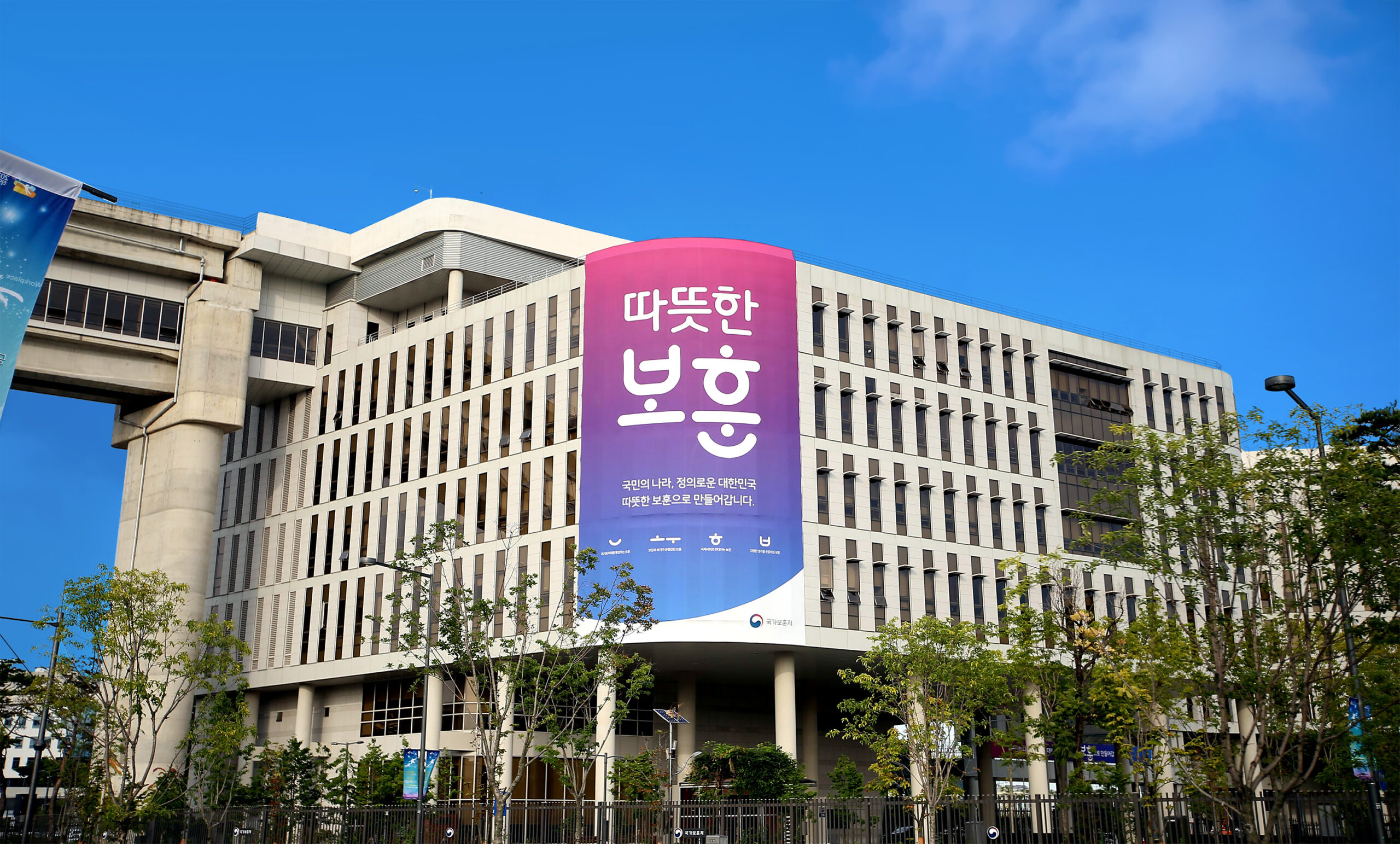
비전 슬로건 ‘따듯한 보훈’은 정형화된 정책의 틀에서 벗어나, 국가가 국가유공자 한 분 한 분을 직접 찾아 마땅한 권리를 되찾아 드리고자 하는 대한민국 정부의 의지를 담았습니다. 보훈 정책의 방향을 시각적으로 표현하는 동시에 국가 비전을 국민에게 전달하며, 국민과의 정서적 교감과 국가기관으로서의 신뢰성을 함께 확보하는 것을 디자인의 핵심 과제로 삼았습니다.
The vision slogan, “Warmhearted Veterans Affairs” embodies the South Korean government’s commitment to moving beyond the confines of rigid policy frameworks and personally reaching out to each and every national veteran to restore their rightful entitlements. The core objective of the design was to visually represent the direction of veterans affairs policy while communicating the national vision to the public, thereby fostering an emotional connection with citizens and establishing trust as a government agency.
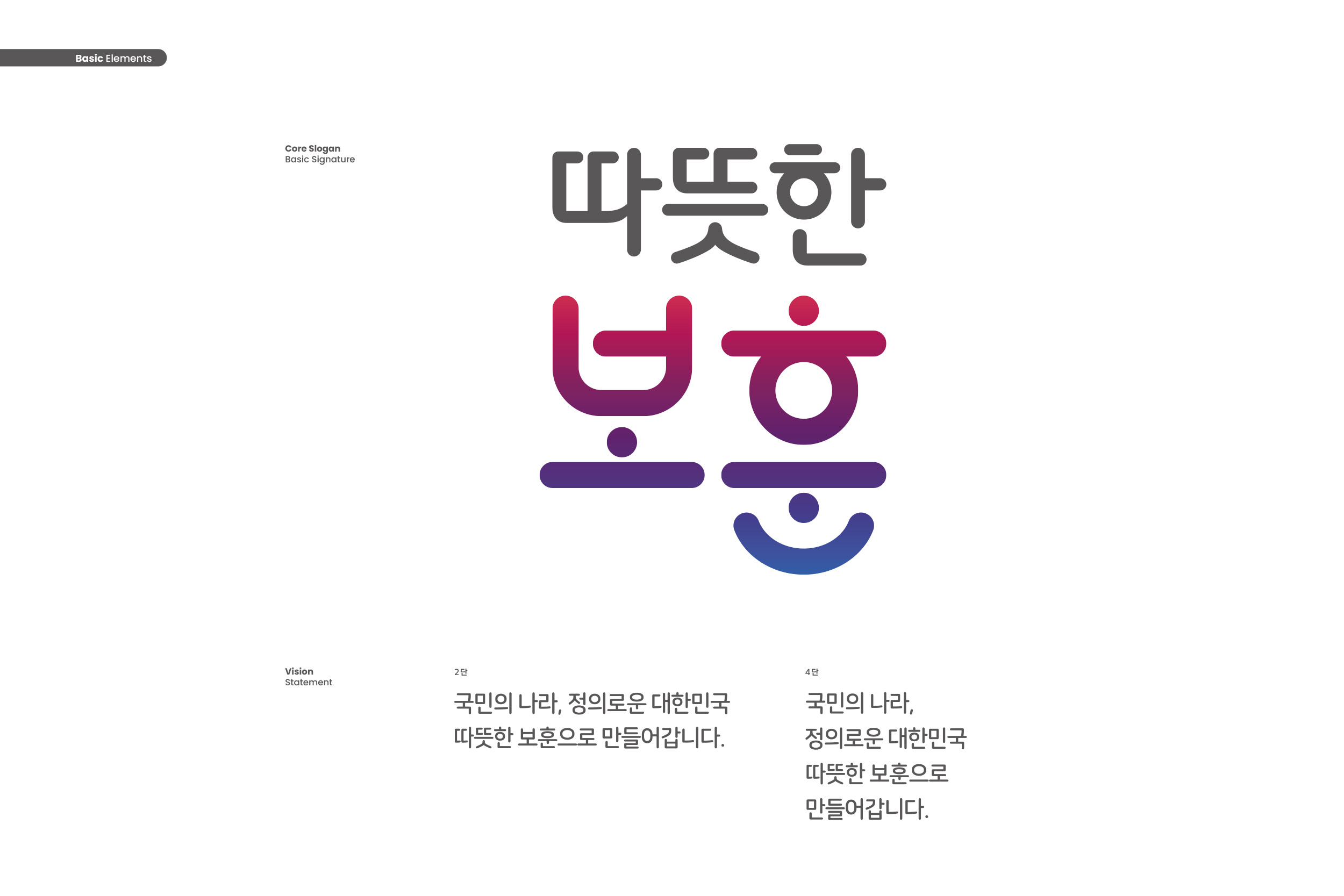
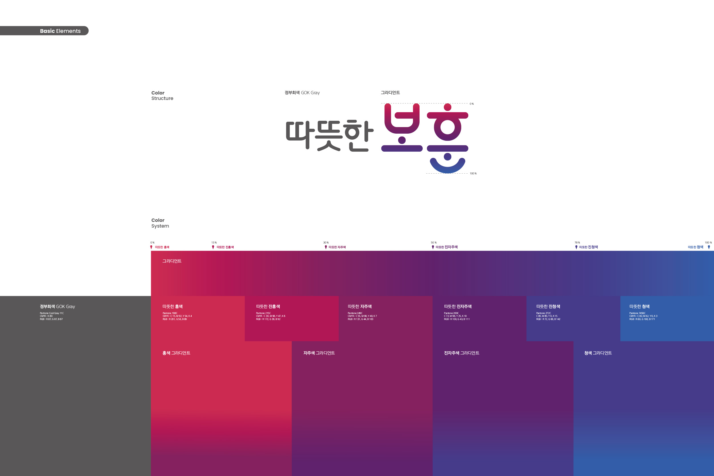
국가보훈부의 비전 슬로건 디자인은 ‘따뜻한 보훈’이라는 한글 슬로건에 정부의 보훈정책 메시지를 표현하되 한글이 가진 기하학적 조형미와 가독성을 높이고자 그래픽 요소와 자소의 변형은 최소화했으며 전체적으로 친근하고 부드러운 느낌을 위해 둥글게 표현했습니다. 본 비전 슬로건은 Core Slogan ‘따뜻한 보훈’과 비전의 직접적인 정책 메시지인 Vision Statement로 구성되었으며, Core Slogan을 Main Visual Identity로 디자인하였습니다.
The design of the Ministry of Patriots and Veterans Affairs’ vision slogan uses the Korean phrase “Warmhearted Veterans Affairs” to convey the government’s message regarding veterans’ policies. To enhance the geometric beauty and readability inherent in the Korean script, graphic elements and character modifications were kept to a minimum, and the overall design was rendered in rounded shapes to create a friendly and gentle impression. This vision slogan consists of the Core Slogan, “Warmhearted Veterans Affairs” and the Vision Statement, which conveys the direct policy message of the vision. The Core Slogan was designed as the Main Visual Identity.
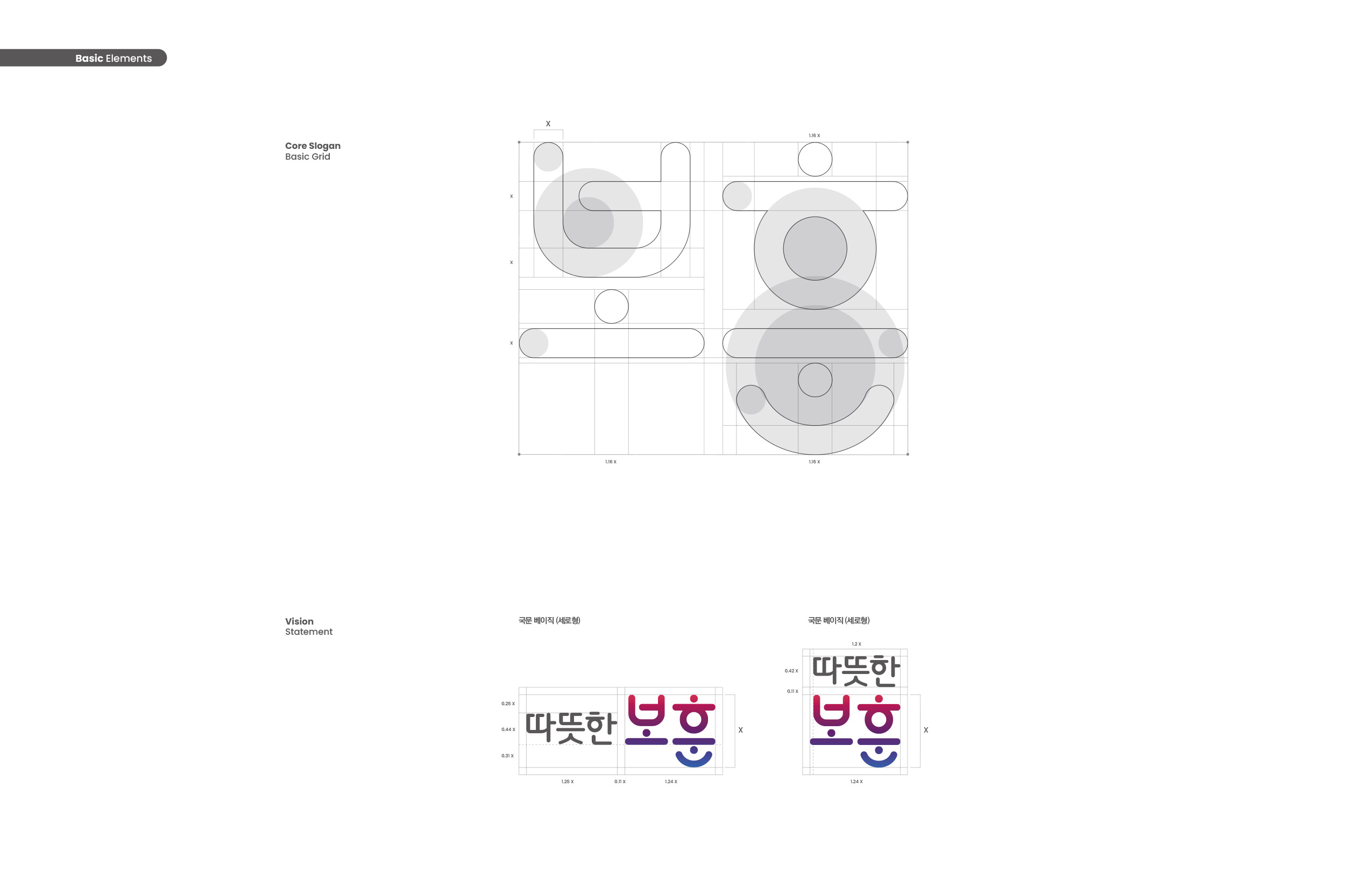
본 비전 슬로건은 워드마크형 한글 슬로건으로, 국가기관으로서의 신뢰도와 정책 메시지를 효과적으로 전달하기 위해 한글의 조형성과 구조적 특성을 면밀히 고려하여 디자인되었습니다. 일반적인 타이포그라피에서는 시각적 착시를 방지하기 위해 세로획을 가로획보다 두껍게 처리하는 반면, 본 슬로건은 보훈 정책의 그래픽 정체성을 표현하기 위해 가로획과 세로획의 두께를 동일하게 설계하였습니다. 이를 통해 균형 잡힌 시각적 구조를 형성하면서도 가독성을 유지하도록 하였습니다. 또한 한글 자소 ‘ㅗ’, ‘ㅜ’, ‘ㅎ’의 단획(短劃)을 점 형태로 표현함으로써 추상적 상상력을 높이는 동시에 한국적 조형미를 강조하였습니다.
This vision slogan is a wordmark-style Hangul slogan designed with careful consideration of the typographic form and structural characteristics of Hangul to effectively convey the credibility of a government agency and its policy messages. While standard typography typically makes vertical strokes thicker than horizontal ones to prevent visual illusions, this slogan was designed with strokes of equal thickness to express the graphic identity of veterans’ affairs policy. This approach creates a balanced visual structure while maintaining readability. Additionally, by rendering the short strokes of the Hangul characters ‘ㅗ’, ‘ㅜ’, and ‘ㅎ’ as dots, the design enhances abstract imagination while emphasizing Korean aesthetic beauty.