기업 슬로건 디자인 |
NH농협금융 Vision Slogan
Description
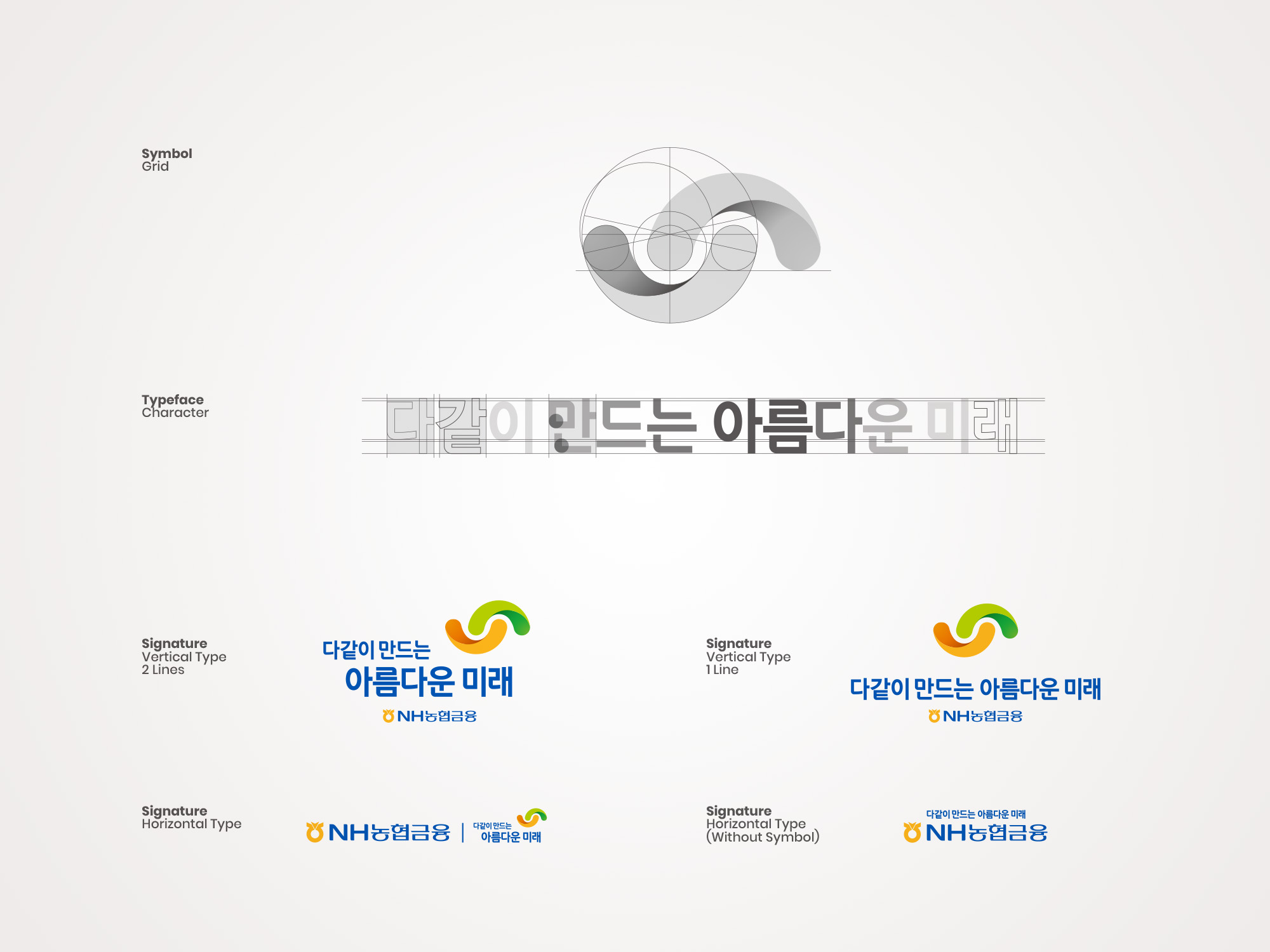
NH농협금융 슬로건 프로젝트는, 대기업의 아이덴티티를 정교하게 수립하는 기업 슬로건 디자인 레퍼런스입니다. 금융 패러다임과 디지털 환경 속에서 금융 기업이 지향해야 할 미래 가치와 고객 신뢰 자산을 시각 체계로 표현하였습니다. 본 브랜딩 프로젝트는 농협이 지닌 고유의 헤리티지(Color 및 Tone & Mood)를 지키는 동시에, 보수적인 금융 슬로건의 혁신성과 대중성을 확보하는 것을 최우선 과제로 삼고 개발에 착수하였습니다. 특히 심볼 마크는 함께와 미래라는 가치를 바탕으로 정립되었습니다. 서로 맞잡은 손과 무지개의 조형적 형태를 모티프로 삼아 금융이 지향해야 할 상생의 공존과 내일의 미래 가치를 시각화한 것이 특징입니다. 이러한 상징성을 통해 금융 서비스가 추구하는 사람 중심의 따뜻한 가치를 그래픽적으로 표현하였습니다.
NH Nonghyup Vision Slogan Design & Integrated Brand Visualization System
The NH Nonghyup Vision Slogan Design project, executed by Scramble Studio, integrates the future-oriented values and customer trust of NH Nonghyup Financial Group. This project prioritized respecting the unique heritage of NH Nonghyup while overcoming rigid financial marks to secure brand innovation and universal public appeal.
디자인 전략 및 기업 슬로건 디자인 시각 언어 구축


