가전 브랜드 디자인 |
LG PuriCare
What we did
Client
Description
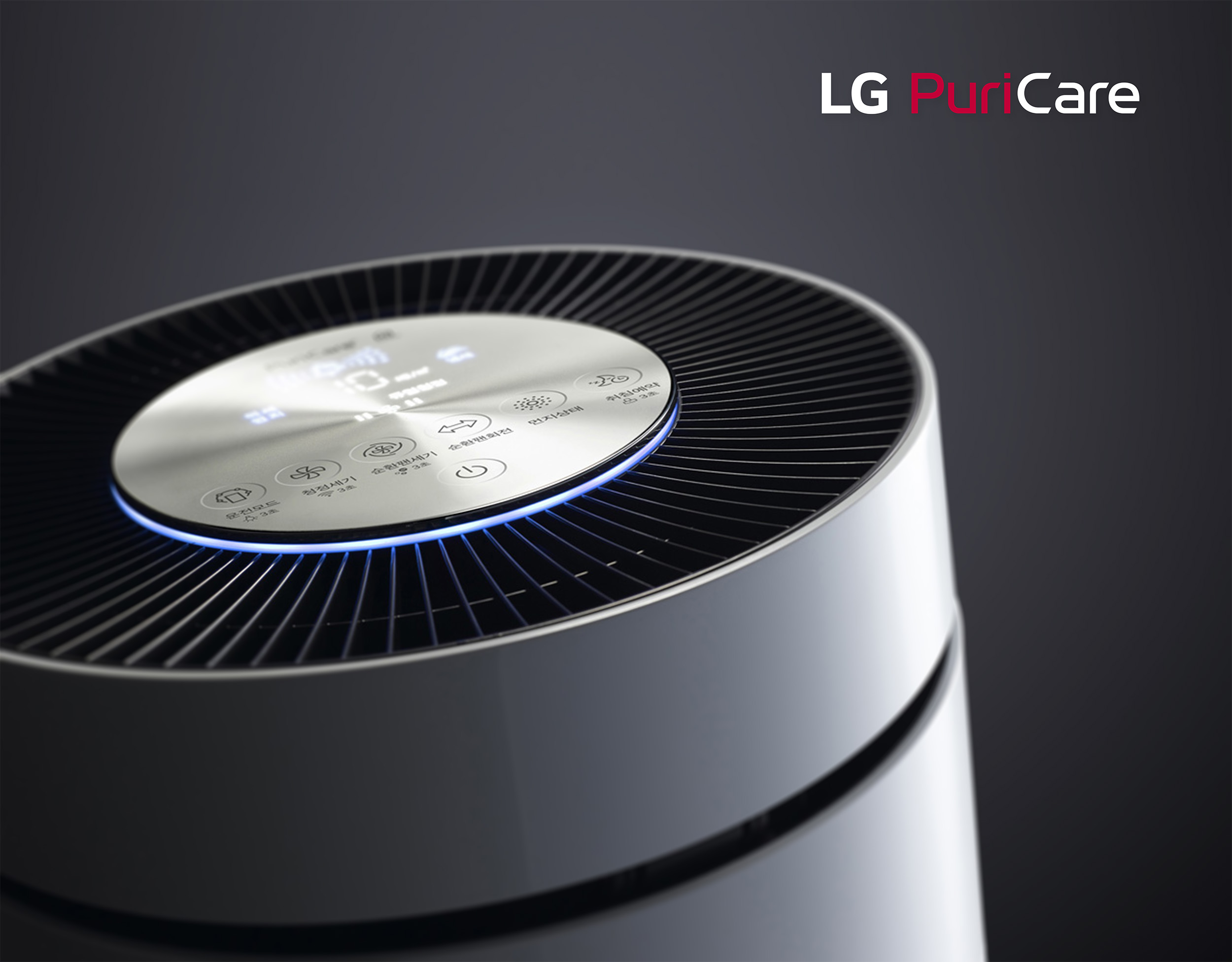
LG PuriCare는 LG전자의 가전 브랜드 디자인 프로젝트로, H&A 사업부의 다양한 가전 라인업 중 공기청정기 브랜드의 정체성을 정제된 디자인으로 표현했으며, BI 디자인의 형태적 차별성과 전자제품 브랜드가 가진 시각적 안정성과 브랜드 모기업이 지닌 신뢰도를 결합하는 데 중점을 두었습니다.
LG PuriCare is LG Electronics’ consumer appliance brand design project, expressing the identity of its air purifier brand within the H&A division’s diverse appliance lineup through refined design. The project focused on combining the formative differentiation of the BI design with the visual stability inherent to electronics brands and the trust carried by the parent brand.


LG전자의 가전 브랜드 디자인은 주로 LG Red와 LG Gray 기반의 색상 스킴을 사용합니다. 이는 기업의 브랜드 이미지와 제품의 브랜드 이미지를 연결하여 기업의 헤리티지와 브랜드의 전문성을 명확히 전달하고 소비자가 기업 인프라가 보증하는 제품의 품질과 신뢰도를 직관적으로 인지하게 합니다. 또한 명확하게 통제된 컬러 가이드라인을 통해 인쇄물과 패키지, 온오프라인의 다양한 채널 전반에서 일관된 기업과 브랜드의 정체성을 유지할 수 있습니다.
LG Electronics’ product brands primarily utilize a color scheme based on LG Red and LG Grey. This approach connects the corporate brand image with the product brand image, clearly communicating the company’s heritage and brand expertise while allowing consumers to intuitively recognize the quality and reliability guaranteed by the company’s extensive infrastructure. Clearly controlled color guidelines also ensure that a consistent corporate and brand identity is maintained across print materials, packaging, and a wide range of online and offline channels.