브랜드 아이덴티티 디자인 |
LG Quick Cover Case
What we did
client
Description
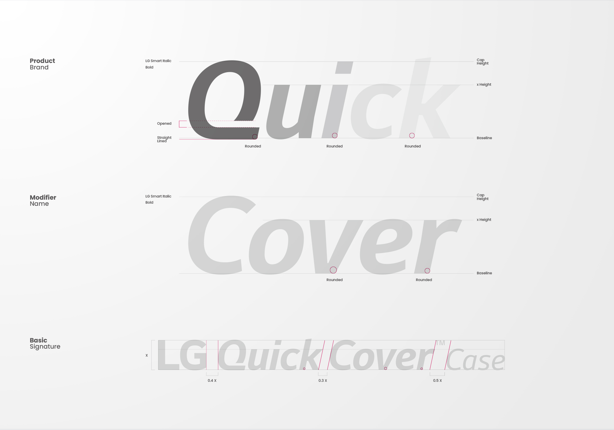
LG Quick Cover Case는 스마트폰 프리미엄 액세서리의 정체성과 기능적 특장점을 정제된 시각 언어로 정립한 제품 브랜딩 및 BX 디자인 사례입니다. 커버를 열지 않고도 스마트폰의 핵심 정보와 기능을 제어할 수 있는 퀵커버 케이스 고유의 제품 특성을 시각적으로 표현하는 동시에, Circle Case 등 Modifier와의 시각적 밸런스와 비주얼 시스템의 일관성을 확보하는 것이 본 제품 브랜딩의 핵심 과제였습니다.
The LG Quick Cover Case project is a product branding and BX design case study that establishes the identity and functional strengths of a premium smartphone accessory through a refined visual language. Visually communicating the unique product characteristics of the Quick Cover Case — which allows users to check key information and control functions without opening the cover — was the central challenge, as was ensuring visual balance and consistency across the broader visual system, including Modifiers such as the Circle Case. Achieving this coherence was the core objective of this product branding initiative.