사회공헌 사업 BI · 공공 복지 브랜딩 |
농업인 행복버스
What we did
Description
NH농협의 농업인 행복버스(현 농촌 왕진버스)는 농촌 지역 고령층과 농업인을 직접 찾아가 의료·문화·복지 혜택을 전하는 사회공헌 사업 BI 프로젝트입니다. 정부와 NH농협이 공동으로 기획했으며, 버스로 이동하며 서비스를 제공하는 ‘이동형 복지’ 모델의 특성을 살려 정보 소외 계층도 어떤 혜택인지 한눈에 알아볼 수 있는 비주얼 아이덴티티 개발에 중점을 두었고, 사업을 이끄는 주체가 누구인지, 어떤 도움을 받을 수 있는지를 버스 외관만 보고도 파악할 수 있도록, 공공 복지 브랜딩으로서의 직관적인 비주얼 시스템을 구축했습니다.
NH NongHyup’s Farmers’ Happiness Bus (now the Rural Home-Visit Bus) is a social contribution BI project that reaches out directly to elderly residents and farmers in rural areas to deliver medical, cultural, and welfare benefits. Jointly planned by the government and NH NongHyup, it focused on developing a visual identity that draws on the characteristics of the “mobile welfare” model, allowing even those with limited access to information to immediately recognize what benefits are being offered. It also built an intuitive visual system as public welfare branding, designed so that who is leading the initiative and what help is available can be understood at a glance, just from the bus’s exterior.
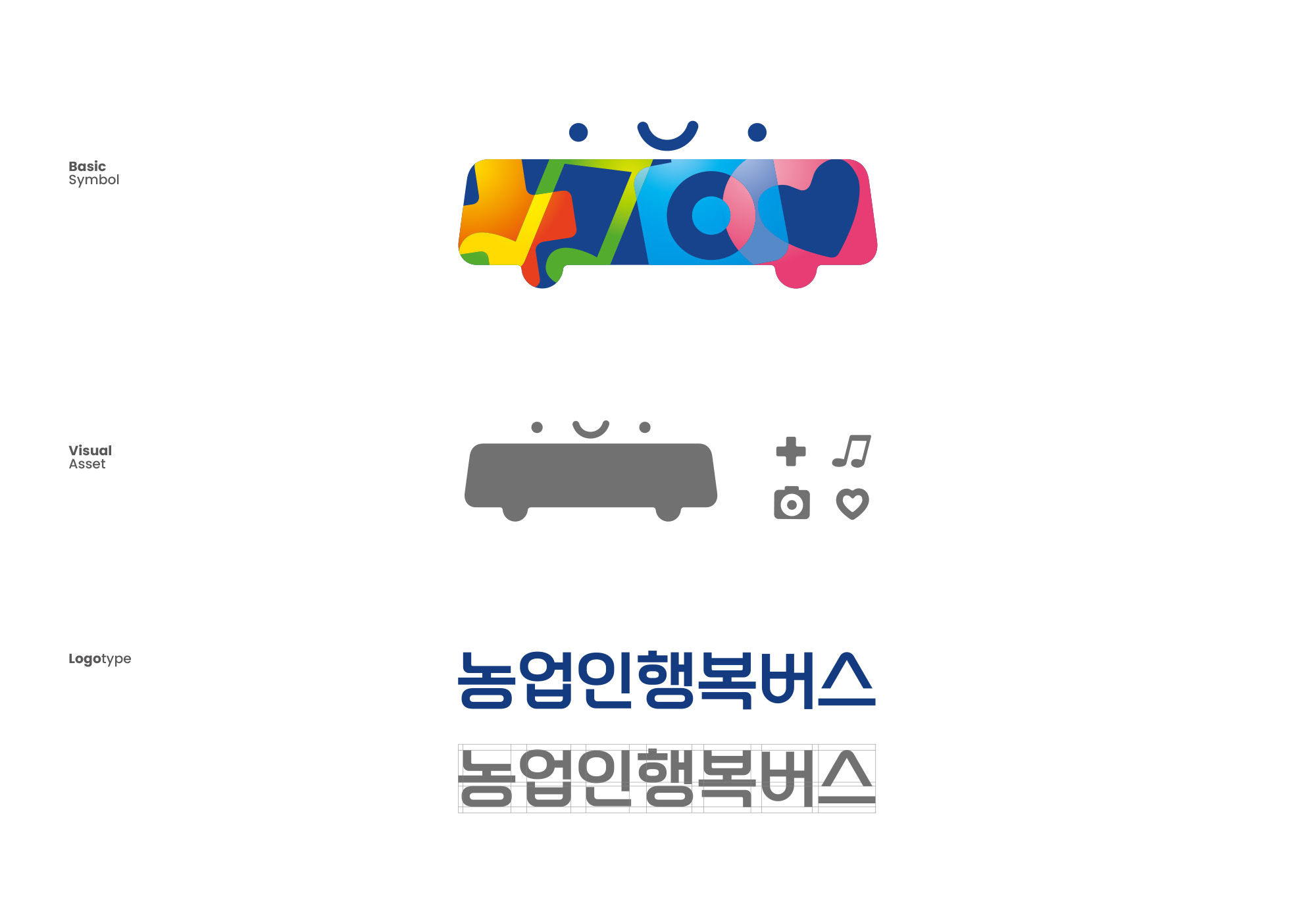

공공 복지 브랜딩은 다양한 매체 환경에서 왜곡 없는 가시성을 확보하는 정밀한 시각 아키텍처를 요구합니다. 본 프로젝트는 각 복지 기능을 상징하는 아이콘 시스템을 정립하고, 옐로우 그라디언트(Yellow Gradient), 그린 그라디언트(Green Gradient), 블루 그라디언트(Blue Gradient), 핑크 그라디언트(Pink Gradient) 등 서비스별 자연스럽고 부드러운 색상 그라디언트를 적용했으며, 버스 그래픽을 적용할 때는 별도의 장식 없이 각 서비스의 아이콘만을 적용하여 버스 자체가 하나의 비주얼 아이덴티티로 기능할 수 있도록 했습니다.
Public welfare branding demands a precise visual architecture that ensures distortion-free visibility across diverse media environments. This project established an icon system representing each welfare function and applied a natural, soft color gradient for each service—Yellow Gradient, Green Gradient, Blue Gradient, and Pink Gradient. When applying graphics to the bus, only each service’s icon was used, without additional ornamentation, allowing the bus itself to function as a single visual identity.