기업 엠블럼 |
AJ파크
What we did
Client
Description
‘AJ파크’는 모기업 AJ그룹의 렌터카 사업을 바탕으로 주차 관련 자체 장비 설계/제작부터 및 결제 시스템까지 수직계열화를 이루어낸 주차 시스템 업계의 선도 기업으로, 본 프로젝트는 기존의 흩어져 있던 시각 정체성의 정립과 AJ파크를 상징할 수 있는 브랜드 요소 개발 등 AJ파크와 모기업의 브랜드 가치 재고를 위한 기업 엠블럼/CI 리뉴얼 작업입니다.
AJ Park is a leading company in the parking systems industry, having achieved vertical integration — from designing and manufacturing its own parking-related equipment to building its own payment systems — built on the foundation of parent company AJ Group’s car rental business. This project was an integrated CI renewal designed to establish a unified visual identity out of what had previously been scattered, develop brand elements capable of symbolizing AJ Park, and, through this work, elevate the brand value of both AJ Park and its parent company.
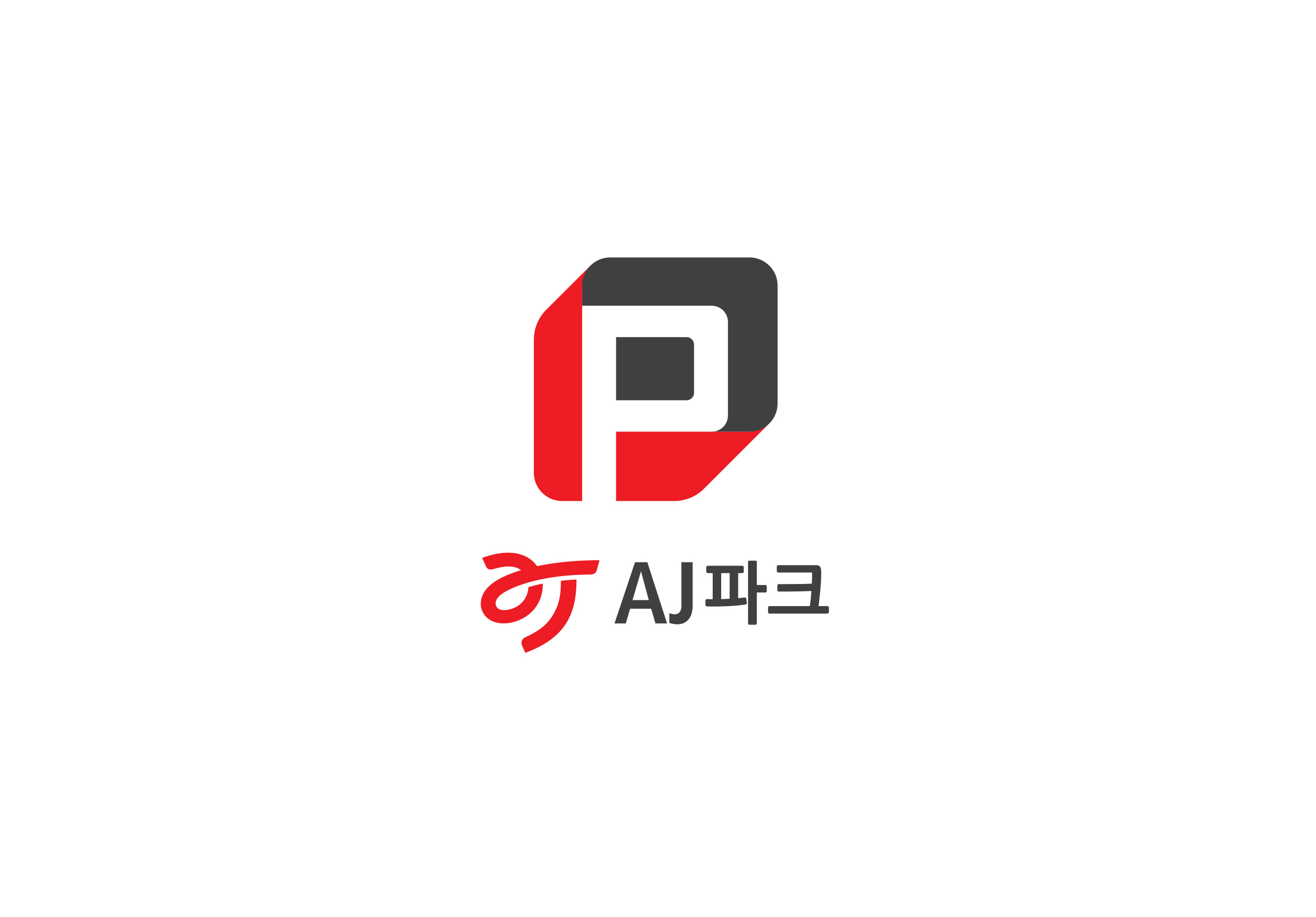

AJ파크의 CI는 모그룹의 CI 정립 원칙에 따라 워드마크형으로 개발되었으며, 고객이 브랜드를 인식할 수 있는 요소가 ‘AJ파크’라는 기업 이름과 ‘로고타입’, ‘기본 색상’으로 한정적이었기에, 제한되어 있던 브랜딩 요소의 확장을 위해 독자적 시각 구별 요소를 필요로 했습니다. 그에 따라 스크램블 스튜디오는 CI 재정립과 함께 주차 시스템을 대표하는 기업임을 인식하게 하고 더불어 소비자에게 주차장 입구에서부터 AJ파크의 브랜드의 아이덴티티를 접할 수 있도록 파킹의 약어이자 주차 마크를 상징하는 ‘P’자를 다양한 의미와 형태로 기업 엠블럼 디자인 스터디를 진행했습니다.
AJ Park’s CI was developed as a wordmark, following the parent group’s CI establishment principles. Because the elements through which customers could recognize the brand were limited to the company name “AJ PARK,” its logotype, and a base color, the brand needed a dedicated emblem to expand its constrained set of branding and visual differentiation elements. Accordingly, alongside re-establishing the CI, Scramble Studio conducted an emblem design study built around the letter “P” — the abbreviation for “parking” and a universal symbol for parking — exploring a range of meanings and forms, so that consumers could recognize AJ Park as a company representing the parking systems industry and encounter its brand identity from the moment they arrive at a parking lot entrance.

AJ파크의 기업 엠블럼 디자인은 주차 시스템의 근본 키워드 Parking Place와 주차 시스템의 전문가들을 의미하는 Professional, 업계 선두주자라의 Pride를 의미하며, 주차관리 시스템의 핵심 기술인 차량번호 인식(LPR: License Plate Recognition) 프로세스를 모티브로 정보를 스캔하고 인식하는 시스템의 디지털적인 속성을 주차 마크인 ‘P’의 형태와 결합하여 기하학적으로 디자인되었습니다.

AJ파크의 기업 엠블럼은 AJ그룹의 코퍼레이트 컬러인 AJ Red와 AJ Gray를 메인 색상으로 적극 활용하여 그룹사 전체의 브랜드 이미지와 강력한 시너지를 이루도록 설계했습니다. 여기에 백색과의 대비를 더해 기존보다 한층 더 젊고 세련된 인상을 부여하며, 디지털 환경과 실제 주차장 인프라 양쪽 모두에서 높은 시인성을 보일 수 있도록 했습니다.
The design makes extensive use of AJ Group’s corporate colors, AJ Red and AJ Gray, as the primary palette, creating strong synergy with the brand image across the entire group. Contrast with white is added on top of this, lending a younger, more refined impression than before, while also ensuring high visibility across both digital environments and real-world parking infrastructure.