
멤버십 브랜딩 |
Ace Club
What we did
Client
Description
한화생명의 ‘Ace Club’은 계약 업적, 고객 유지 효율, 리크루팅 등에서 탁월한 성과를 거둔 상위 1% 최우수 설계사(FP)를 위해 수여되는 최고의 영예를 상징하며, 정통성은 유지하되 다소 올드하고 보수적이었던 이미지를 탈피하고,유능한 금융 전문가로서의 자긍심 부여를 위해 기획된 멤버십 브랜딩이자 인터널 브랜딩 프로젝트입니다.
Hanwha Life’s ‘Ace Club’ symbolizes the highest honor awarded to the top 1% of elite financial planners (FPs) who have achieved outstanding results in contract performance, customer retention efficiency, and recruiting. It is a membership branding and internal branding project designed to preserve the club’s sense of authenticity while shedding its somewhat dated, conservative image, instilling in members a renewed sense of pride as accomplished financial professionals.
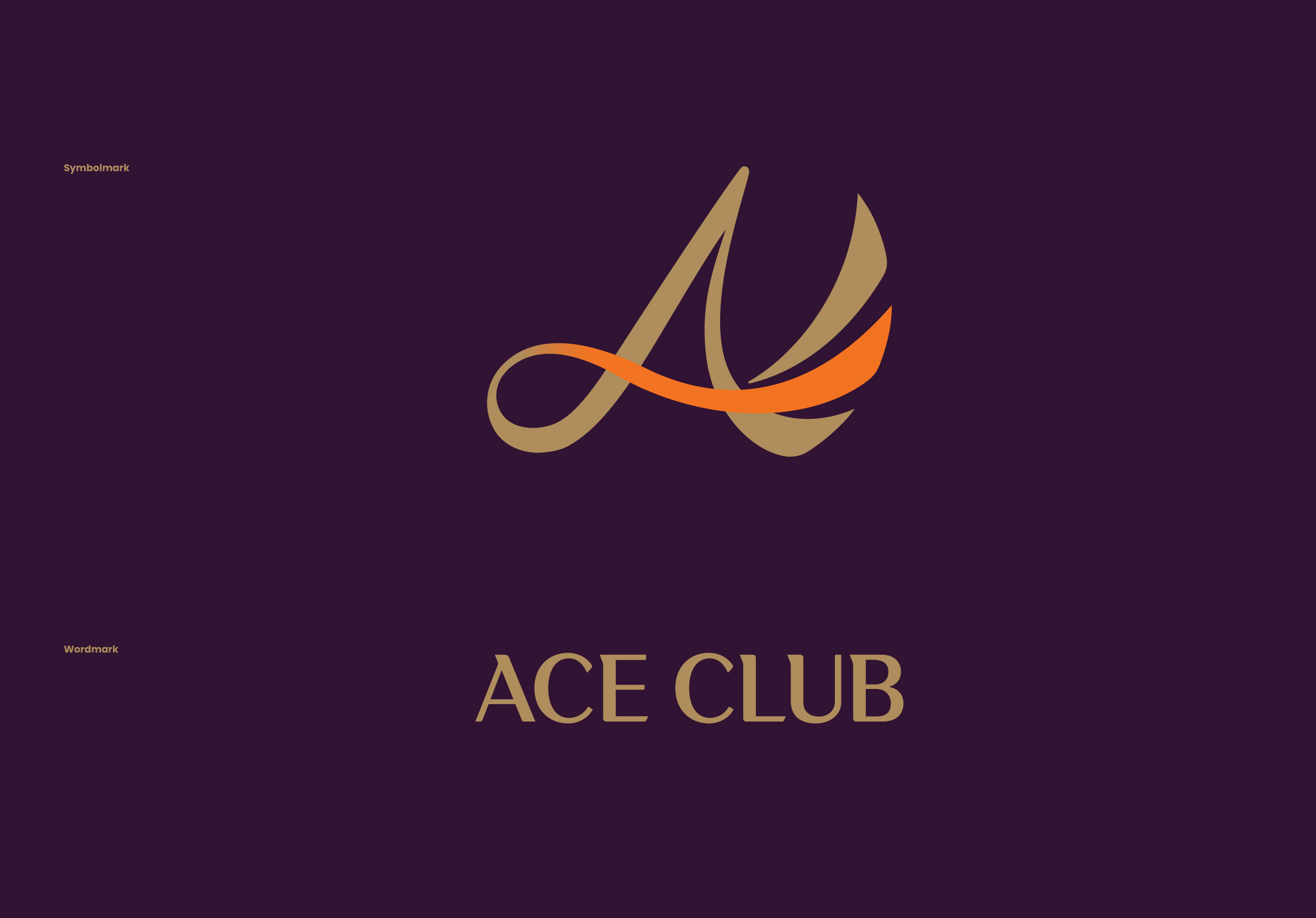

한화 ‘Ace Club’의 로고타입은 산세리프의 서체에 세리프를 추가하여 현대적이면서 우아한 여왕의 느낌을 부여했고, 직선과 곡선, 사선의 밸런스조정, 서체의 미세 조정, 자간의 미세 조정을 통해 워드마크로 단독 사용시에도 아이덴티티를 유지할 수 있도록 견고하게 디자인되었습니다.
Hanwha Life’s ‘Ace Club’ logotype is built on a sans-serif base with serifs added to lend it a modern yet elegant, queen-like quality. Balancing straight lines, curves, and diagonals, along with fine-tuned letterforms and letter spacing, it was engineered to remain robust and hold its identity even when used independently as a standalone wordmark.


한화생명의 멤버십 브랜딩 ‘Ace Club’는 실적에 따라 President, Royal, Noble, Pre Ace 등 4가지 등급으로 나뉘며, 워드마크와 엠블럼 조합형 모두 사용할 수 있도록 디자인 되었습니다.

한화생명의 멤버십 브랜딩 ‘Ace Club’의 색상 시스템은 한화그룹의 색상인 Orange 색상을 사용하되, 최우수 설계사를 상징할 수 있도록 골드 색상과, 실버 색상을 사용할 수 있도록 했으며, 귀족을 상징하는 색상 Purple을 배경색이자 Sub-Color로 사용하여 에너지가 넘치는 Orange를 더욱 돋보이게 하고 동시에 고급스러움을 강조했습니다.


