카페 브랜딩 |
Deeep Roastery
What we did
Client
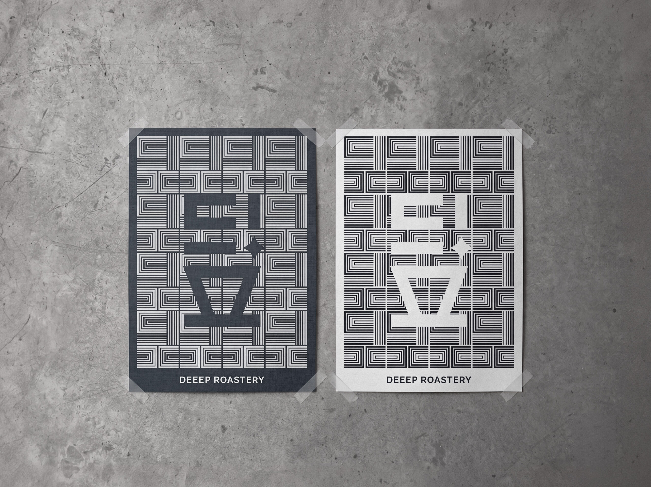

딒 로스터리(Deeep Roastry)는 일반적인 카페 브랜딩의 정적인 이미지에서 탈피하기 위해 한글 로고의 기하학적 요소를 동적인 패턴으로 분해하고 재조립하는 그래픽 시스템으로 디자인되었습니다. 이렇게 확장된 다이내믹 비주얼 자산은 시즌별 커피 메뉴 및 프로모션 홍보물에 적용되어 소비자의 시각적 흥미를 유발하며, 매체의 목적에 맞춰 유연하게 변형되는 이 시스템은 오프라인 매장의 활기를 더하고 브랜드 인지도를 강화합니다.
Deeep Roastery’s graphic system was designed to break away from the static imagery typical of café branding, deconstructing and reassembling the geometric elements of the Korean logotype into dynamic patterns. The resulting visual assets are applied across seasonal coffee menus and promotional materials, generating visual interest among consumers. This system — flexible enough to adapt to the purpose of each medium while maintaining a consistent form — brings energy to the offline space and reinforces brand recognition.
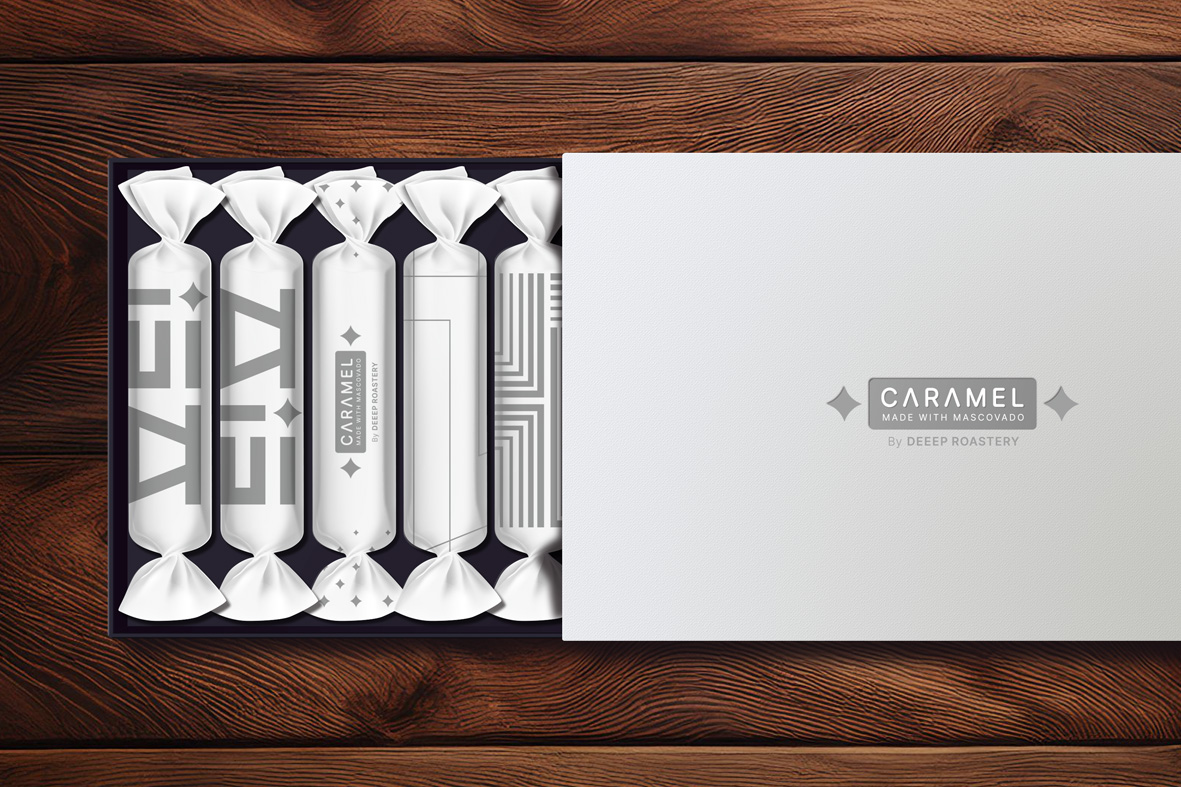
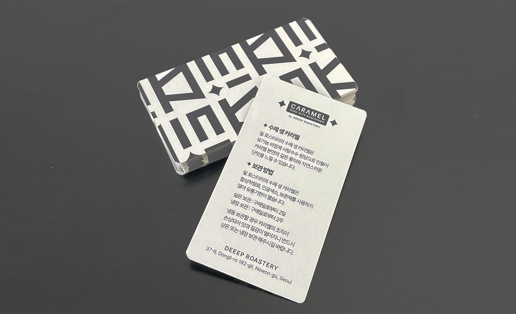
F&B 브랜딩에서 패키지 디자인은 심미성과 함께 제품의 안전성을 동시에 충족해야 합니다. 시그니처 카라멜 패키지는 각 제품 라인업을 상징화하여 심볼릭하게 표현했고, 서랍형 하드박스 구조에 노루지 소재를 매칭하여 프리미엄 디저트의 성격을 시각화했습니다. 또한 식품류가 주변 냄새를 흡수하는 특성을 고려하여 인쇄 및 후가공 과정에서 잉크 냄새가 잔류하지 않도록하여 식품 패키지의 안전성을 높였습니다.
In F&B branding, package design must satisfy both aesthetic and product safety requirements simultaneously. The signature caramel packaging symbolically represents each product line, with a drawer-style hard box structure paired with kraft paper to visually communicate the premium nature of the dessert. Recognizing that food products readily absorb surrounding odors, the printing and post-processing workflow was carefully controlled to ensure no residual ink odor remained on the packaging, enhancing the safety standards of the food packaging.


