요거트 카페 브랜딩 |
Skyrowl
What we did
client
Tagsupply
Description
스키로울(Skyrowl)은 신선한 유제품과 요거트가 지닌 고유의 결을 세련되고 감각적인 시각 언어로 풀어낸 아이슬란딕 요거트 카페 브랜딩 프로젝트입니다. 스키로울의 브랜드 아이덴티티는 단순한 로고 제작을 넘어 철저한 브랜드 분석과 독창적이고 심플한 그래픽을 바탕으로 온·오프라인 매장 접점에서 일관된 브랜드 경험을 전달하고 매장과 제품 전반에 브랜드의 철학을 입체적으로 녹여내는 데 집중하여 진행했습니다.
Skyrowl is an Icelandic yogurt café branding project that translates the distinctive character of fresh dairy and yogurt into a sensory visual language. Moving beyond simple logo production, it was carried out with a focus on delivering a consistent brand experience across every online and offline store touchpoint, grounded in thorough brand analysis and original graphics, while weaving the brand’s philosophy three-dimensionally throughout both the store and the products.


아이슬란딕 요거트 카페 브랜딩 프로젝트 스키로울은 트렌드에 치우치기보다 정통성을 강조하되, 현대적인 표현을 더하는 디자인 전략을 통해 제품의 순수함과 독창적인 감성을 직관적으로 전달하고자 했습니다. 또한 기하학적이고 정교한 서체 디자인과, 심플하지만 다양한 표현이 가능한 그래픽을 유기적으로 조합하여 브랜드의 가독성과 브랜드 시스템의 견고함을 살렸습니다.
The Icelandic yogurt café branding project Skyrowl sought to emphasize authenticity over trend-chasing, intuitively conveying the product’s inherent purity and distinctive sensibility through a design strategy that layers in contemporary expression. Geometric typography was also organically combined with graphics that are simple yet capable of diverse expression, preserving both legibility and structural robustness.

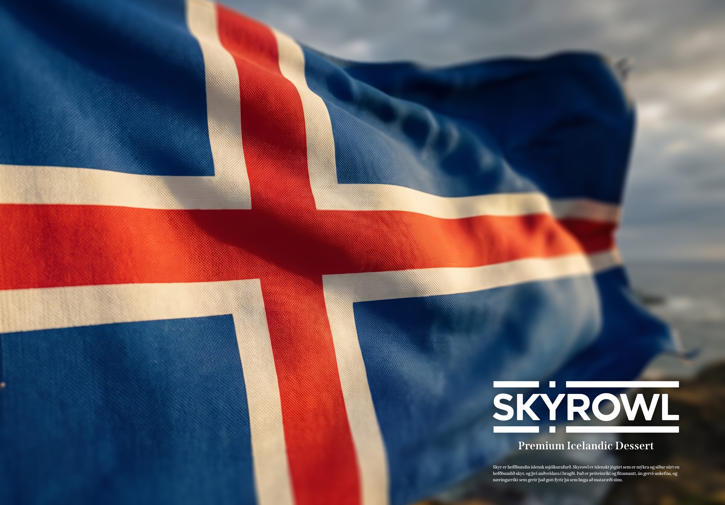
요거트 카페 브랜딩 프로젝트 스키로울의 주색은 아이슬란드 국기에서 영감을 받은 아이슬란딕 레드(Icelandic Red), 아이슬란딕 오션 블루(Icelandic Ocean Blue)를 사용하여 아이슬란딕 디저트라는 아이덴티티를 강조하였습니다. 보조색인 아이슬란딕 스카이 블루(Icelandic Sky Blue)와 아이슬란딕 라바 그레이(Icelandic Lava Gray)를 통해 아이슬란드의 맑은 하늘과 태초의 자연을 표현하였으며, 각 색상을 배경으로 사용할 때는 백색을 적용해 가시성을 확보함으로써 F&B 패키지 디자인은 물론 사인, 홍보물 전반에 일관되게 적용할 수 있도록 구성하였습니다.
Icelandic Red and Icelandic Ocean Blue, inspired by the Icelandic flag, were used to emphasize the brand’s identity as an Icelandic dessert. The secondary colors, Icelandic Sky Blue and Icelandic Lava Gray, express Iceland’s natural landscape, and white was applied whenever each color was used as a background to ensure visibility—allowing the palette to be applied consistently across promotional materials.