제품 브랜드 디자인 | LG OLED TV Brand Identity Design
Description
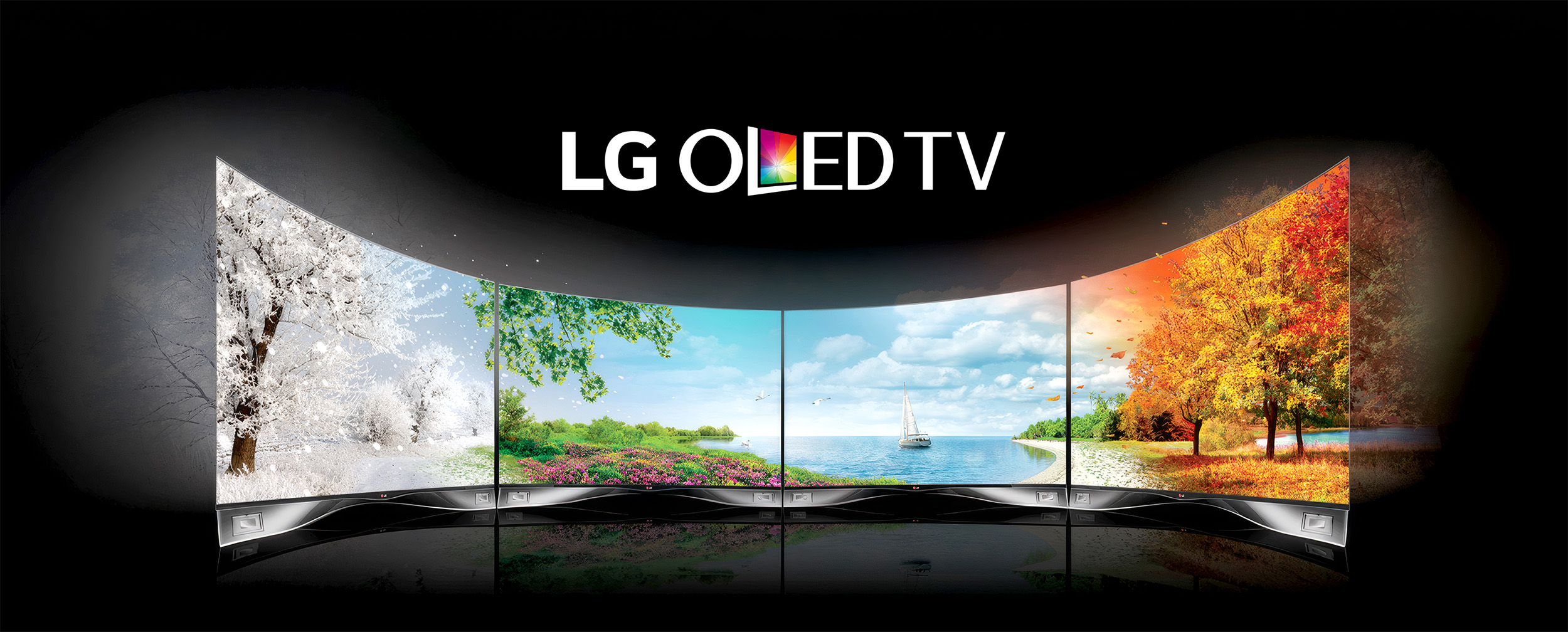
2012년 개발된 LG OLED TV 브랜드 아이덴티티 디자인 프로젝트는 국내 대표 글로벌 가전 기업 LG전자의 프리미엄 가전 시장의 플래그십 디스플레이 라인업을 위한 TV 제품 브랜딩 사례입니다. LG OLED TV Brand Identity는 TV 디스플레이를 상징하는 심볼마크와 역동적이고 생동감 있는 컬러 픽셀 입자이 발산하는 모습을 입체적으로 표현한 콤비네이션 마크 형태의 디자인 프로젝트입니다. 유기적 발광을 하는 OLED 디스플레이의 본질을 직관적으로 표현하는 데 초점을 맞추어, 프레임의 형태와 컬러를 중심으로 한 그래픽 시스템을 구성했습니다.
Developed in 2012, the LG OLED TV Brand Identity Design Project is a TV product branding initiative for the flagship display lineup in the premium home appliance market of LG Electronics, a leading global home appliance company based in South Korea. The LG OLED TV Brand Identity is a design project featuring a combination mark that combines a symbol representing the TV display with a three-dimensional depiction of dynamic, vibrant color pixels radiating outward. Focusing on intuitively expressing the essence of OLED displays—which emit light organically—we developed a graphic system centered on the shape and color of the frame.
TV 화면 자체에서 영감을 받은 비주얼 요소들은 깊은 명암 대비와 풍부한 색 표현을 상징하며, 몰입감 있는 시청 경험을 직관적으로 전달합니다. 스크램블 스튜디오는 빛과 어둠의 대비를 형상화한 그래픽 모티프를 정교하게 설계했습니다. 타이포그래피 시스템은 슬림하고 현대적인 세리프와 산세리프 서체의 위계를 엄격하게 규정하여, 제품의 초슬림 디자인 특성과 기술적 정밀함을 폰트의 구조적 비례 속에 그대로 투영했습니다.
Visual elements inspired by the TV screen itself symbolize deep contrast and rich color expression, intuitively delivering an immersive viewing experience. Scramble Studio engineered a sophisticated graphic motif modeling the contrast between light and darkness. The typography system strictly defines a hierarchy of slim, modern serif and sans-serif typefaces, projecting the ultra-slim product aesthetics and technical precision into structural letter proportions.
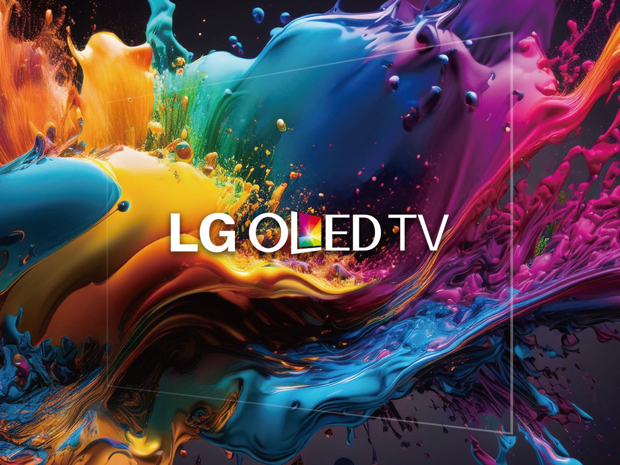
본 브랜드 아이덴티티의 컬러 스킴은 디스플레이 기술을 상징하는 깊고 밀도 높은 블랙(Pure Black)을 중심 축으로 설정했습니다. 여기에 미세한 광원의 확산과 다채로운 색상 영역을 암시하는 컬러 픽셀의 그라데이션 포인트 컬러를 결합하여, 화면 안에서 펼쳐지는 생생한 몰입감을 시각적으로 가시화했습니다. 이러한 그래픽 에셋들은 제품 패키지부터 글로벌 리테일 매장의 VMD 환경까지 일관되게 적용되어 브랜드의 가치를 공고히 합니다.
The color scheme of this brand identity sets a deep, dense Pure Black, which symbolizes display technology, as its primary foundation. We combined this with gradational point colors of color pixels that imply the diffusion of microscopic light sources and rich color spectrums, clarifying the immersive experience unfolding within the screen. These graphic assets are consistently implemented from packaging to global retail VMD to solidify its premium market positioning.