모바일 브랜드 아이덴티티 |
LG전자
What we did
Client
Description
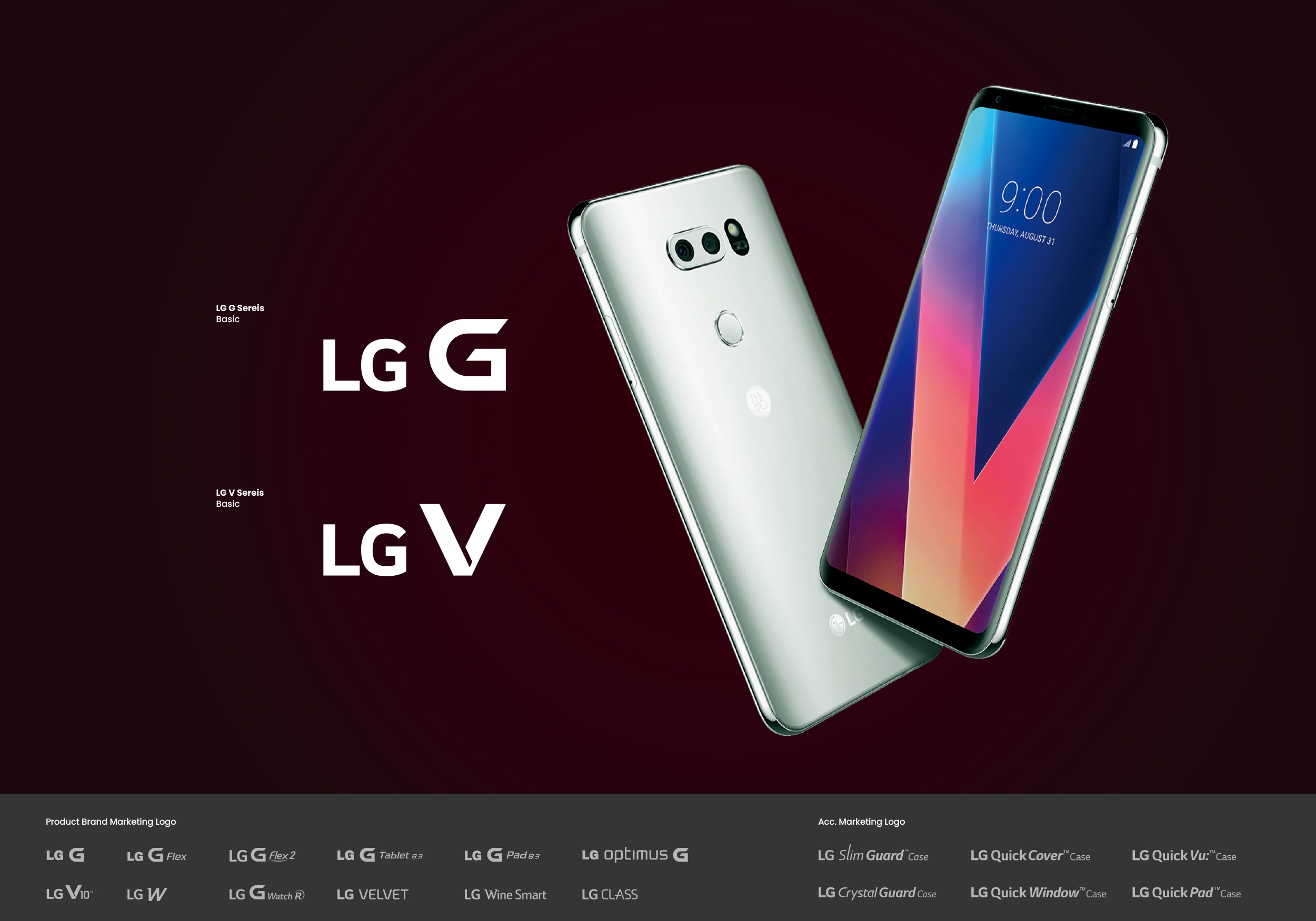
본 프로젝트는 2010년대 초 LG전자의 기술적 혁신을 상징하는 G 캠페인과 함께 출시된 Optimus G를 시작으로, LG전자 스마트폰 라인업의 정체성을 구축해온 모바일 브랜드 아이덴티티 디자인(BI 디자인) 프로젝트입니다. Bold한 영문 이니셜 ‘G’와 제품의 동작 속도 및 기술 혁신을 상징하는 Edge를 결합해 고유의 엠블럼을 개발하였으며, 이후 LG G 시리즈의 Modifier(Flex, Pad..)들과 V 시리즈, LG W 시리즈, Velvet에 이르기까지 LG전자 모바일 사업부의 다양한 브랜드 라인업을 구축하였습니다.
This project is a Mobile Brand Identity and BI design endeavor that established the core identity of LG Electronics’ smartphone lineup. The journey began in the early 2010s with the Optimus G, launched alongside the ‘G Campaign’ to symbolize LG’s technological innovation. By combining a bold initial ‘G’ with sharp ‘Edge’ details representing processing speed and technological breakthroughs, we developed a distinctive emblem. This robust design foundation successfully expanded to build a diverse brand portfolio for LG Electronics’ Mobile Division, seamlessly encompassing LG G series modifiers (Flex, Pad, etc.), the V series, LG W series, and Velvet.
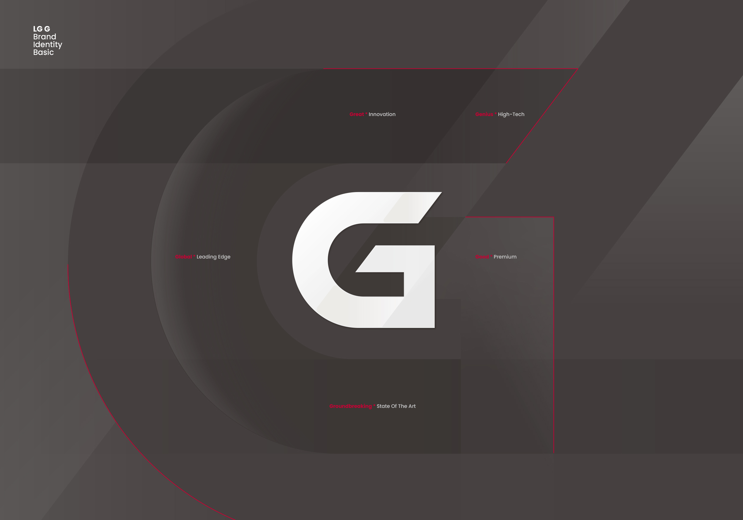

모바일 디바이스의 브랜드 디자인은 광고물, 패키지 디자인 등을 통해 어떤 제품인지를 소비자에게 가장 먼저, 그리고 가장 강력하게 전달하고 브랜드의 가치와 지향점을 대변합니다. LG전자의 모바일 브랜드 아이덴티티 디자인은 브랜드의 본질적 가치를 온전히 담아내기 위해 정교한 그리드 시스템을 바탕으로 제작되어 브랜드의 상징성과 시인성을 동시에 확보하였으며, 각 제품의 타겟 세그먼트(Premium vs Mass)에 맞춰 명도와 채도를 엄격히 제한하고, 심볼의 형태와 엣지의 각도, 획의 두께와 비례감, 전체적인 밸런스를 수학적으로 조정하여 디자인의 완성도를 높였습니다.
A mobile device’s brand design serves as its most powerful initial touchpoint, instantly communicating the product’s identity, brand values, and strategic vision to consumers through advertising and packaging. To fully encapsulate these core values, the LG Mobile Brand Identity was meticulously engineered based on a sophisticated grid system, ensuring both striking symbolism and optimal visibility. Our BI design achieved an uncompromising level of perfection by strictly calibrating brightness and saturation for distinct target segments (Premium vs. Mass), while mathematically adjusting every detail—from the symbol’s form and edge angles to stroke thickness and overall proportional balance.