지주사 CI 리뉴얼 |
KG그룹 (2022)
What we did
Client
Description
KG그룹은 화학, 철강, 자동차(모빌리티) 등 중후장대 산업부터 전자결제(핀테크), 미디어, F&B에 이르기까지 다각화된 사업 포트폴리오를 구축한 기업으로, 이번 작업은 그룹사의 확장과 가족사 간 기업 이미지 통일을 위해 진행된 지주사 CI 리뉴얼 프로젝트입니다. 프로젝트의 주관사인 KG그룹의 요청에 따라 비주얼 자산 중 가장 큰 비중을 차지하고 기업의 철학과 비전을 담은 심볼마크는 그대로 유지하였고, KG 로고타입과 가족사 서체를 정리하고 조정하는 리파인먼트(Refinement) 방식으로 비주얼 아이덴티티를 재정립함으로써 대내외적인 변화를 도모했습니다. 이와 함께 KG그룹과 가족사가 일관된 브랜드 이미지를 낼 수 있도록 비주얼 자산의 디테일을 다듬고, 기본 항목과 응용 항목 등 브랜드 커뮤니케이션 채널 전반에 적용할 수 있는 브랜드 매뉴얼 구축에 집중해 기업 이미지 전반에 걸친 작업을 진행했습니다.
KG Group is a company with a diversified business portfolio spanning heavy industries such as chemicals, steel, and automotive (mobility) to electronic payments (fintech), media, and F&B. This project was a holding company CI renewal undertaken to support the group’s expansion and unify the corporate image across its affiliates. At the request of KG Group, the project’s principal client, the symbol mark—which accounts for the largest share of the visual assets and embodies the company’s philosophy and vision—was retained unchanged. The visual identity was instead re-established through a refinement approach that organized and adjusted the KG logotype and affiliate typefaces, driving change both internally and externally. Alongside this, the visual asset details were refined to ensure a consistent brand image across KG Group and its affiliates, with a focus on building a brand manual—spanning both basic and applied elements—that could be applied across the full range of brand communication channels, resulting in work that extended across the company’s overall corporate image.
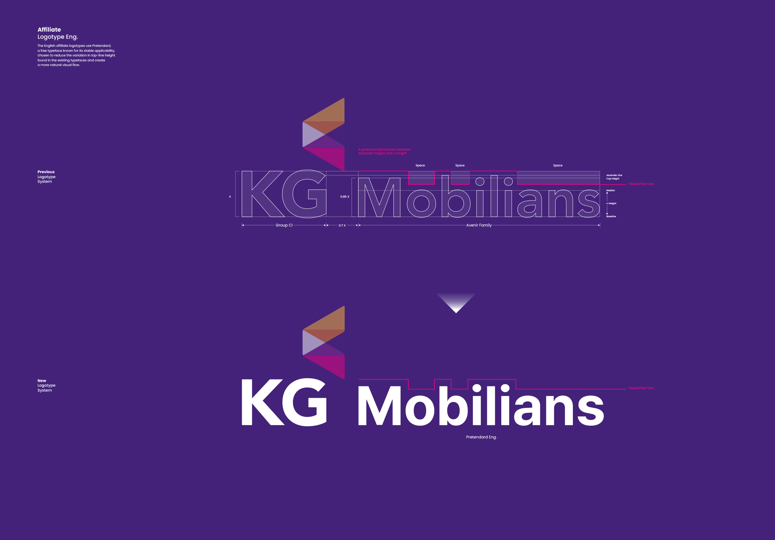


KG그룹의 로고타입은 KG 로고타입과 가족사의 국영문 기업명 중 KG 모빌리언스(현. KG 파이낸셜)를 기준으로 테스트되었으며, 이를 통해 효율적인 지주사 CI 리뉴얼의 기틀을 마련했습니다. 기존 로고타입을 그대로 적용하고 가족사의 로고타입만 정제된 서체로 적용하는 방향부터, 더 직관적이고 기하학적인 느낌의 서체를 새롭게 디자인하거나 기업의 철학과 비전을 담을 수 있는 기성 서체를 스터디해 리파인먼트하는 방법까지 다양한 방식으로 프로젝트가 진행되었습니다. 또한 로고타입의 영문 K를 기준으로 1:1.2의 비율부터 1:1.7의 비율까지 심볼마크의 밸런스 테스트를 진행하여, 최종적으로 CI 단독 사용과 가족사 조합 사용을 구분하여 적용했습니다.
The KG Group logotype was tested using the KG logotype together with the Korean and English corporate names of its affiliates, with KG Mobilians serving as the reference point, establishing the foundation for an efficient holding company CI renewal. The project proceeded through a range of approaches—from applying the existing logotype as is while refining only the affiliate logotypes with a more refined typeface, to newly designing a more intuitive, geometrically inspired typeface, to studying and refining existing typefaces capable of embodying the company’s philosophy and vision. Balance testing of the symbol mark was also conducted at ratios ranging from 1:1.2 to 1:1.7, based on the English letter K in the logotype, and the identity was ultimately applied with a clear distinction between standalone CI use and combined use with affiliates.


가족사의 아이덴티티를 통일된 이미지로 묶어내는 것은 지주사 CI 리뉴얼 및 브랜드 매뉴얼 구축의 중요한 과정으로, 다양한 테스트를 통해 정립한 조합 규정을 바탕으로 그룹 내 모든 개별 가족사의 커뮤니케이션 네임에 로고타입 서체 적용 테스트를 별도 진행하였고 자간과 커닝 등의 디테일을 정교하게 다듬어 적용했습니다.
Unifying the identities of the affiliates into a consistent image is an important step in group CI design and brand manual development. Based on the combination rules established through extensive testing, a separate round of logotype typeface application testing was conducted on the communication names of every individual affiliate within the group, with details such as letter spacing and kerning meticulously refined and applied.

가족사 네임 조합용 서체는 다양한 테스트와 검증을 거쳐 심볼마크 및 로고타입과의 밸런스가 뛰어난 프리텐다드 패밀리를 최종 채택했으며, 이를 통해 효율적이고 범용적으로 활용할 수 있는 서체 체계를 구축했습니다.
After extensive testing and verification, the Pretendard family was ultimately adopted as the typeface for affiliate name combinations for its excellent balance with the symbol mark and logotype, establishing an efficient and versatile typographic system.