제조업 CI 리뉴얼 / 건설기업 브랜딩 |
예림가설산업
What we did
client
Description
‘예림가설산업’은 예림가설산업(주), (주)예인, 예림 RNC(주), (주)예림타워 등 총 4개사를 운영하며 가설재 시장을 선도하는 기업으로, 기존 기업 정체성의 한계를 벗어나 새롭게 도약하는 기업을 도모하고 흩어져있던 브랜드 자산들을 통합하기 위하여 리뉴얼을 진행했으며, 체계적인 브랜드 이미지 전략 수립과 비주얼 아이덴티티를 통해 젊고 패기 넘치는 건설재 전문 기업으로 이미지를 성공적으로 탈바꿈한 제조업 CI 리뉴얼 / 건설기업 브랜딩 프로젝트입니다.
Yelim Temporary operates four companies — Yelim Temporary Co., Ltd., Yein Co., Ltd., Yelim RNC Co., Ltd., and Yelimtower Co., Ltd. — and leads the temporary construction materials (formwork/scaffolding) market. This B2B brand design project carried out a CI renewal to move the company beyond the limits of its existing corporate identity and consolidate its previously scattered brand assets, establishing a systematic brand image strategy and visual identity that successfully transformed its image into that of a young, dynamic construction materials specialist.
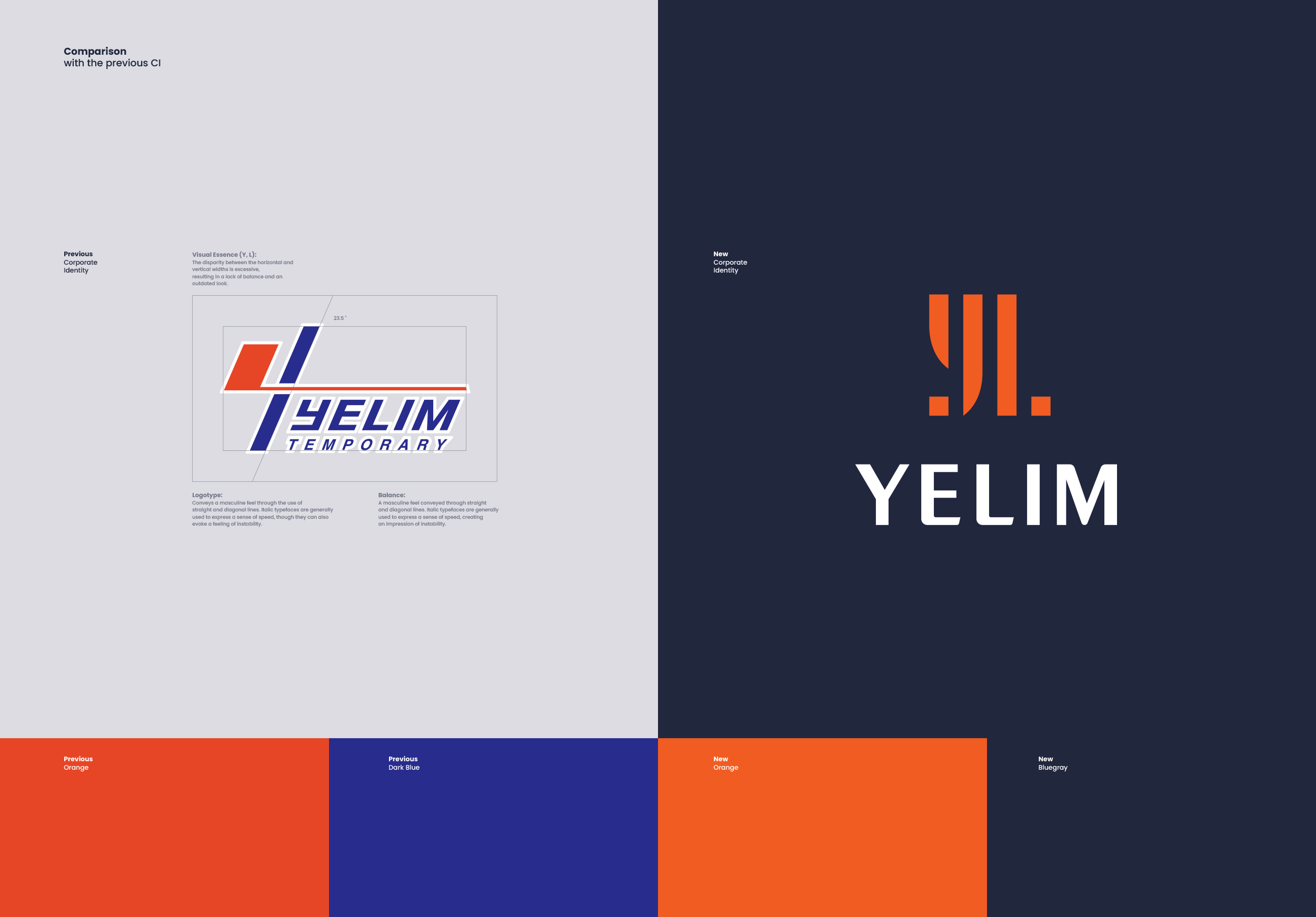

새로운 CI 디자인 리뉴얼은 예림의 영문 이니셜 ‘Y’와 ‘L’의 자소를 분해하고 재조립하는 과정을 거쳐 체계적으로 시각화했으며, 획의 과감한 삭제를 통해 가설재 특유의 ‘결합’과 ‘분리’라는 정체성을 기하학적으로 표현했습니다. 또한 가설재 산업의 특성을 ‘고객사와 소비자를 잇는 튼튼한 가교이자 건설업계를 든든하게 받치는 주춧돌의 역할’로 시각화하였고, 고객과 동행하는 예림가설산업의 브랜드 아이덴티티를 확고히 다집니다.
The new CI design was systematically visualized by deconstructing and reassembling the letterforms of Yerim’s English initials, ‘Y’ and ‘L’; through the bold omission of strokes, it geometrically expresses the identity of temporary construction materials—specifically the concepts of “joining” and “separating.” Furthermore, the design visualizes the industry’s role as both a robust bridge connecting clients with consumers and a solid cornerstone supporting the construction sector, thereby solidifying Yerim Temporary Construction Materials’ brand identity as a partner that moves forward alongside its customers.

건설 인프라 및 건설기업 브랜딩에서 가장 중요한 인지 가치는 ‘안전’과 ‘안정’입니다. 기존 콤비네이션 마크는 형태가 투박하고 밸런스가 불안정하여 기업의 핵심 가치를 담아내기에 한계가 있었습니다. 이를 해결하기 위해 지나치게 무거운 느낌을 덜어내고, 신뢰감 있고 현대적이며 가독성이 뛰어난 산세리프 타입의 서체가 디자인 되었으며, 이는 향후 다각적인 기업 확장까지 고려한 추상적이고 중의적인 표현 방식으로, 서체의 시각적 안정감을 통해 사용자에게 굳건한 기업의 철학을 직관적으로 전달합니다.
“Safety” and “stability” are the most critical values for the branding of construction infrastructure and companies. The previous combination mark had a clunky form and lacked balance, limiting its ability to effectively convey the company’s core values. To address this, a modern, highly legible sans-serif typeface was designed to eliminate any sense of excessive heaviness. This design employs an abstract and multi-layered visual approach—anticipating future business diversification—while using the typeface’s visual stability to intuitively communicate the company’s steadfast philosophy to the audience.


기존 CI의 색상조합은 채도가 높은 다크 블루(Dark Blue)와 오렌지(Orange)가 서로 충돌하여 시각적으로 불안정한 느낌을 준다는 것이었습니다. 따라서 젊고 에너지 넘치는 오렌지를 메인 컬러로 변경하고 기존 다크 블루의 채도를 정밀하게 낮춰 보조색으로 전환했으며, 이러한 컬러 시스템의 재정립은 색상 간의 충돌을 방지하여 시각적 피로도를 낮추며, 디지털 웹 환경에서도 명확한 명암비를 제공하여 긍정적인 브랜드 디자인 이미지를 구축하는 역할을 수행합니다.
The previous corporate identity (CI) suffered from a visual sense of instability caused by a clash between high-saturation dark blue and orange. To address this, orange—representing youth and energy—was adopted as the primary color, while the saturation of the existing dark blue was precisely lowered to repurpose it as a secondary color. This redefined color system eliminates color clashes and reduces visual fatigue; furthermore, it ensures clear contrast in digital web environments, thereby helping to establish a positive brand image.