협회 CI 리뉴얼 |
한국제약협회 (현. 한국제약바이오협회)
What we did
client
Description
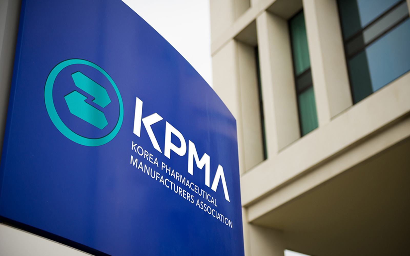
한국제약협회 CI 리뉴얼 프로젝트는 기존 한국제약협회(현. 한국제약바이오협회. 이하 한국제약바이오협회)가 보유한 헤리티지와 철학은 유지하되 비주얼 자산과 비전을 새롭게 담아 현대적으로 재구성하여, 국내 제약 산업의 역할과 비전을 책임지는 보다 젊고 스마트한 조직으로의 이미지를 표현하고 협회의 정체성을 더욱 강화하여 신뢰도를 높이고자 제작되었습니다.
The Korea Pharmaceutical Association’s CI renewal project was undertaken to modernize the organization’s image—transforming it into a younger, smarter entity that takes responsibility for the role and vision of the domestic pharmaceutical industry—while preserving the heritage and philosophy of the existing association (now the Korea Pharmaceutical and Bio-Pharma Manufacturers Association). By refreshing its visual assets and vision, the project aims to strengthen the association’s identity and enhance its credibility.
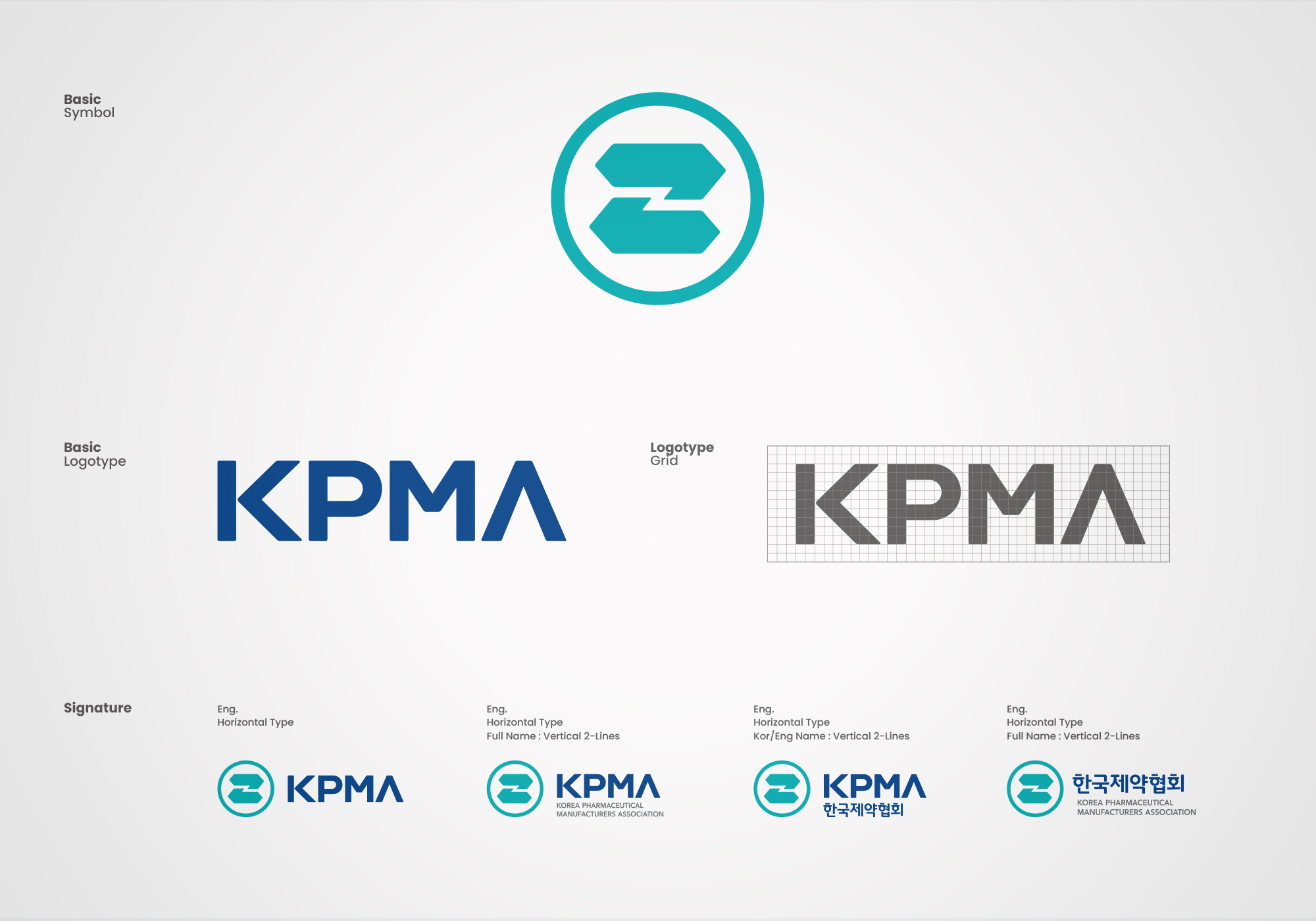

한국제약바이오협회 CI 리뉴얼 디자인은 협회의 정체성과 헤리티지를 보존하기 위해 기존 심볼마크의 형태를 최대한 유지하되, 시각적으로 정교하지 않은 부분을 다듬고 정리하는 리파인먼트(Refinement)의 방식으로 작업이 되었습니다. 또한 색상에 변화를 주어 기존의 오래되고 정체된 조직의 이미지에서 벗어나 새로움과 변화를 추구하는 젊고 스마트한 제약바이오협회의 이미지를 부여하고 ‘신약개발 글로벌 진출’이라는 새로운 비전을 담고자 했습니다.
The KPBMA CI renewal design preserved the association’s identity and heritage by retaining the original symbol mark’s form as closely as possible, taking a refinement approach that polished and streamlined areas that lacked visual precision. A shift in color palette was also introduced to move the organization’s image away from one that felt dated and static, lending KPBMA a young, smart image geared toward newness and change, while capturing a new vision centered on global expansion in new drug development.
한국제약바이오협회 CI 리뉴얼의 가장 중요한 변화는 형태적 변화보다 ‘협회의 비전과 혁신을 담은 색상의 변화’였습니다. 기존의 평범하고 저채도의 ‘블루’ 색상을 신뢰와 믿음을 상징하는 ‘로열 블루’로 교체하고, 혁신과 제약 바이오 분야의 대표 색상이자 젊음의 신선한 에너지를 상징하는 ‘민트 블루를 메인 색상으로 적용하여 제약 및 바이오헬스 기관·단체 로고 디자인에서 가장 중요한 요소인 신뢰도와 전문성, 혁신의 이미지를 전달하고자 했습니다.
The most significant change in the KPBMA CI renewal was not formal but chromatic—”a change in color that captures the association’s vision and innovation.” The previously plain, low-saturation ‘Blue’ was replaced with ‘Royal Blue,’ symbolizing trust and confidence. Alongside this, ‘Mint Blue’—a color representing innovation and the pharmaceutical and bio-health sector, as well as the fresh energy of youth—was applied as the main color, aiming to convey the trust, expertise, and innovation that matter most in institutional and association logo design for the pharmaceutical and bio-health sector.