
소형 가전 브랜딩 |
LG 꼬망스
Description
LG전자의 꼬망스는 미니멀 라이프스타일에 맞춰 세분화된 가전 시장에서 차별화된 비주얼 아이덴티티를 구축한 소형 가전 브랜딩 프로젝트로, 1인 가구 증가와 인테리어 트렌드를 반영하여 디자인되었으며, 기존 대형 가전의 무겁고 노동 중심 이미지에서 벗어나, 콤팩트한 공간에 자연스럽게 녹아드는 꼬망스 특유의 트렌디한 매력을 기하학적이고 심플하게 담아내고자 했습니다.
LG Electronics’ Comangs is a small appliance branding project that established a distinctive visual identity within a home appliance market increasingly segmented around minimal lifestyles. Designed in response to the rise of single-person households and current interior trends, it sought to move away from the heavy, labor-associated image of conventional large appliances, capturing Comangs’ distinctly trendy appeal—one that blends naturally into compact spaces—through geometric, simple forms.
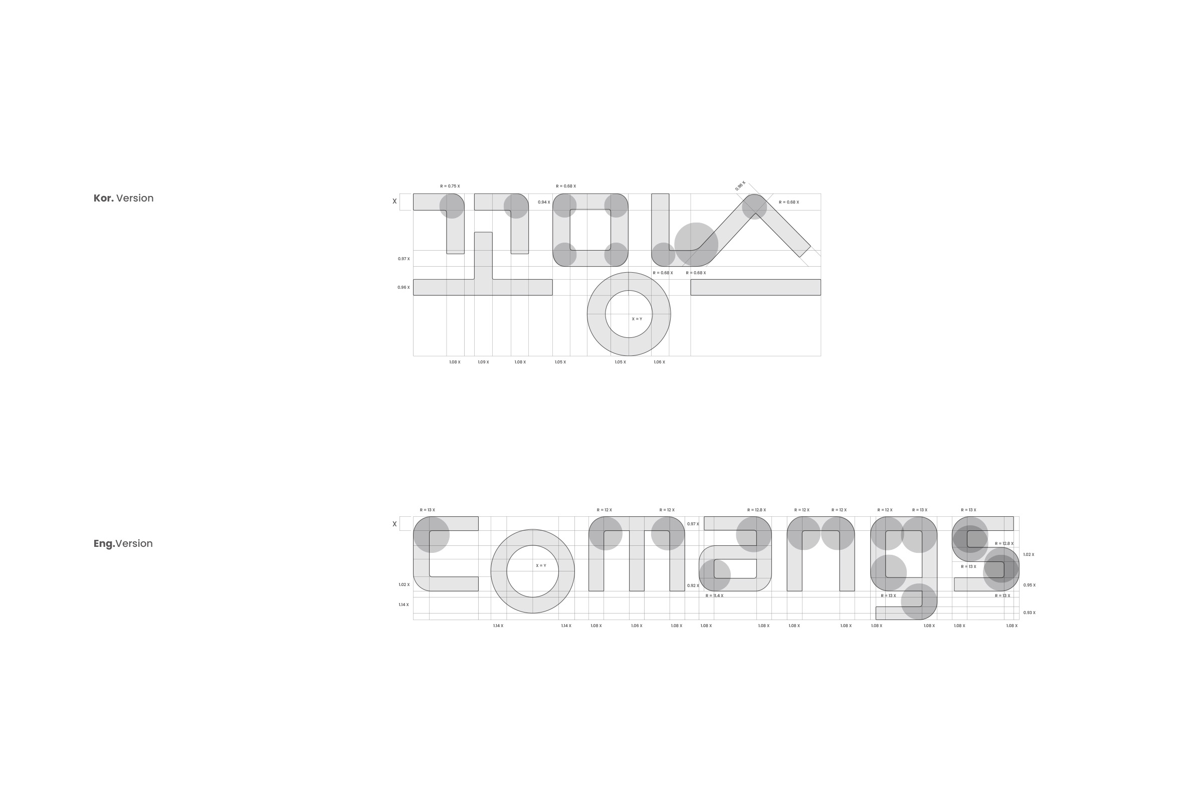
워드마크형 로고인 LG 꼬망스의 브랜드 아이덴티티는 미니멀 라이프를 위한 프리미엄 가전 제품이라는 특징을 표현하고자 심벌 역할을 하는 원의 느낌을 강조하고, 수평·수직의 직선과 부드러운 곡선 느낌의 획 처리를 통해 공간 효율성을 직관적으로 표현했습니다. 그리드를 기반으로 디자인된 기하학적이고 미니멀한 로고타입은 제품의 견고한 완성도와 기술력을 동시에 담아내며, 어떤 크기와 매체에 적용되어도 흔들림 없는 인상을 유지합니다.
The brand identity of LG Comangs, a wordmark-style logo, emphasizes the feel of a circle acting as a symbol to express its character as a premium appliance for minimal living, while intuitively conveying space efficiency through a treatment of strokes that combines horizontal and vertical straight lines with soft curves. The geometric, minimal logotype, designed on a grid, captures both the product’s solid craftsmanship and technological sophistication, maintaining an unwavering impression regardless of the size or medium in which it is applied.
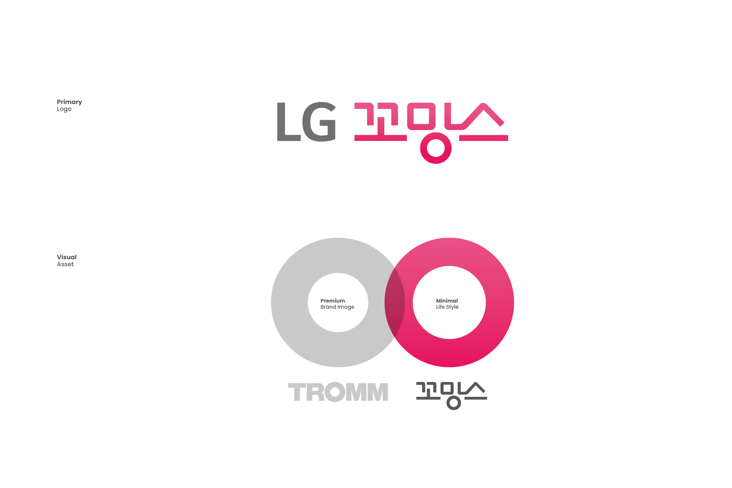
LG 꼬망스는 코퍼레잇 컬러인 레드를 대신해 차분한 소프트 파스텔 톤 컬러 스킴을 적용하여 세련되고 감각적인 프리미엄 소형 가전의 아이덴티티를 표현했으며, 제품의 콤팩트함과 실용성을 강조하는 편리한 스마트 라이프를 효과적으로 전달하고자 했습니다.
LG Comangs applies a calm, soft pastel color scheme in place of its corporate red, expressing the identity of a refined, sophisticated premium compact appliance, and aims to effectively convey a convenient smart life that highlights the product’s compactness and practicality.


