제품 브랜드 디자인 |
LG Ultra HD TV Brand Identity Design
Description
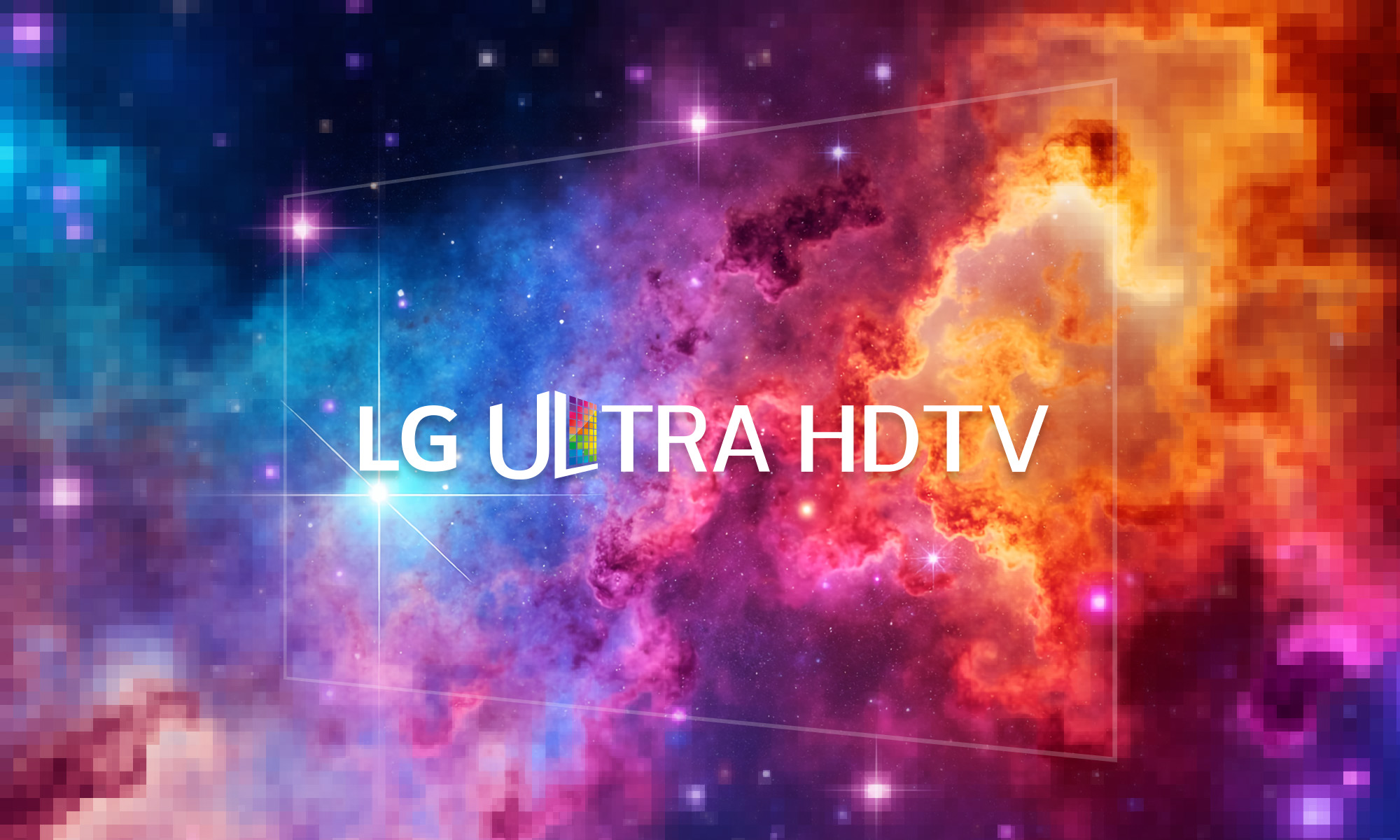
LG Ultra HD TV 제품 BI 개발 프로젝트는 4K 초고해상도 디스플레이 시장에서 제품의 화질적 우위와 몰입감을 시각적인 자산으로 정립한 디바이스 브랜딩 레퍼런스입니다. LG Ultra HD TV 브랜드 아이덴티티는 4K 초고해상도 디스플레이 패널과 픽셀 그래픽을 활용해 해상도와 색 표현력을 시각적으로 구현한 디스플레이 브랜딩 프로젝트입니다. 소비자가 제품의 선명함과 프리미엄 가치를 직관적으로 인지하고 선택할 수 있도록 차별화된 제품 BI 개발 및 그래픽 모티프 시스템을 설계하는 것을 목표로 삼았습니다.
-
디자인 전략 및 초고화질 비주얼 아이덴티티 구축
초고해상도 디스플레이의 브랜드 아이덴티티는 시각적인 선명함과 화면의 확장성을 형태적으로 증명해야 합니다. 스크램블 스튜디오는 이를 위해 픽셀의 미세한 정밀도와 화면의 끝없는 확장을 상징하는 기하학적 그리드 시스템을 기반으로 디바이스 브랜딩 시스템을 구축했습니다. 로고타입은 세련되면서도 강인한 인상의 고해상도 전용 타이포그래피로 설계되어, 글로벌 온오프라인 미디어 환경에서 선명한 가독성을 발휘하며 제품군의 시각적 위계를 명확히 구분해 줍니다. 이러한 방식은 LG TV 브랜드 디자인의 기술적 신뢰도를 시각적으로 안착시키는 데 효과적입니다.
-
컬러 사이콜로지 및 아이덴티티 시스템 조율
본 프로젝트의 컬러 스킴은 완벽한 시각적 선명도를 전달하기 위해 차가우면서도 지적인 느낌의 플래티넘 실버와 세련된 다크 그레이를 메인 컬러로 조합했습니다. 이는 디바이스 자체의 메탈릭한 인테리어 소재 감각과 자연스럽게 동화되는 동시에, 화질의 사실성을 강조하는 최첨단 테크놀로지 브랜드의 정체성을 효과적으로 대변합니다.
-
리테일 VMD 및 매체별 스케일러블 시스템 설계
글로벌 가전 매장의 경쟁 환경에서 일관성을 유지하기 위해, 본 BI 디자인은 대형 오프라인 매장의 POP 연출물, 제품 상단 부착 스티커, 디지털 카탈로그, 글로벌 웹사이트 마케팅 배너 등 다양한 터치포인트에 유연하게 대응하도록 설계되었습니다. 스크램블 스튜디오는 해상도가 변형되더라도 로고의 가독성과 서체 시스템의 비율이 왜곡되지 않도록 엄격한 스케일러블 비주얼 가이드를 정립하여 글로벌 마케팅의 일관성을 높였습니다. 이 가이드라인은 온오프라인 미디어를 아우르는 디바이스 브랜딩의 지침서 역할을 수행하며 장기적인 브랜드 자산을 유연하게 보존합니다.
LG Ultra HD TV Global Product BI and Brand Design
The LG Ultra HD TV Brand Identity project, developed by Scramble Studio, is a device branding reference that establishes the picture quality and immersive experience of displays into visual assets within the 4K ultra-high-resolution market. The LG Ultra HD TV Brand Identity is a display branding project that visually realizes resolution and color expressiveness utilizing 4K ultra-high-resolution display panels and pixel graphics. The core objective was to design a differentiated product BI development and graphic motif system that enables consumers to intuitively recognize product clarity and premium value.
-
Design Strategy and Formulation of High-Resolution Visual Identity
Ultra-high-resolution display branding must formally demonstrate visual sharpness and screen scalability. To achieve this, Scramble Studio built a device branding system based on a geometric grid system symbolizing pixel precision and infinite screen expansion. The logotype is engineered with a refined yet commanding high-resolution typography, ensuring clear legibility across global online and offline media and clearly distinguishing its visual stance. This method is highly effective in visually anchoring the technical credibility of LG TV brand design.
-
Color Psychology and Alignment of Identity Systems
The color scheme of this project combines an intelligent, crisp Platinum Silver with a sophisticated Dark Gray to convey absolute visual clarity. This harmonizes naturally with the metallic interior textures of the device itself, while effectively representing the identity of a captivating technology brand that emphasizes lifelike picture realism.
-
Retail VMD and Scalable System Design per Media Boundary
To preserve brand consistency across competitive global retail environments, this BI design is engineered to adapt flexibly to diverse touchpoints, including physical store POP displays, product stickers, digital catalogs, and global website marketing banners. Scramble Studio established a rigorous, scalable visual guide to prevent distortions in legibility and typeface proportions even when screen scale changes, maximizing the consistency of global marketing assets. Consequently, this guideline serves as a standard manual for device branding, efficiently preserving the long-term value of corporate brand assets.