I am text block. Click edit button to change this text. Lorem ipsum dolor sit amet, consectetur adipiscing elit. Ut elit tellus, luctus nec ullamcorper mattis, pulvinar dapibus leo.
기업 엠블럼 디자인 |
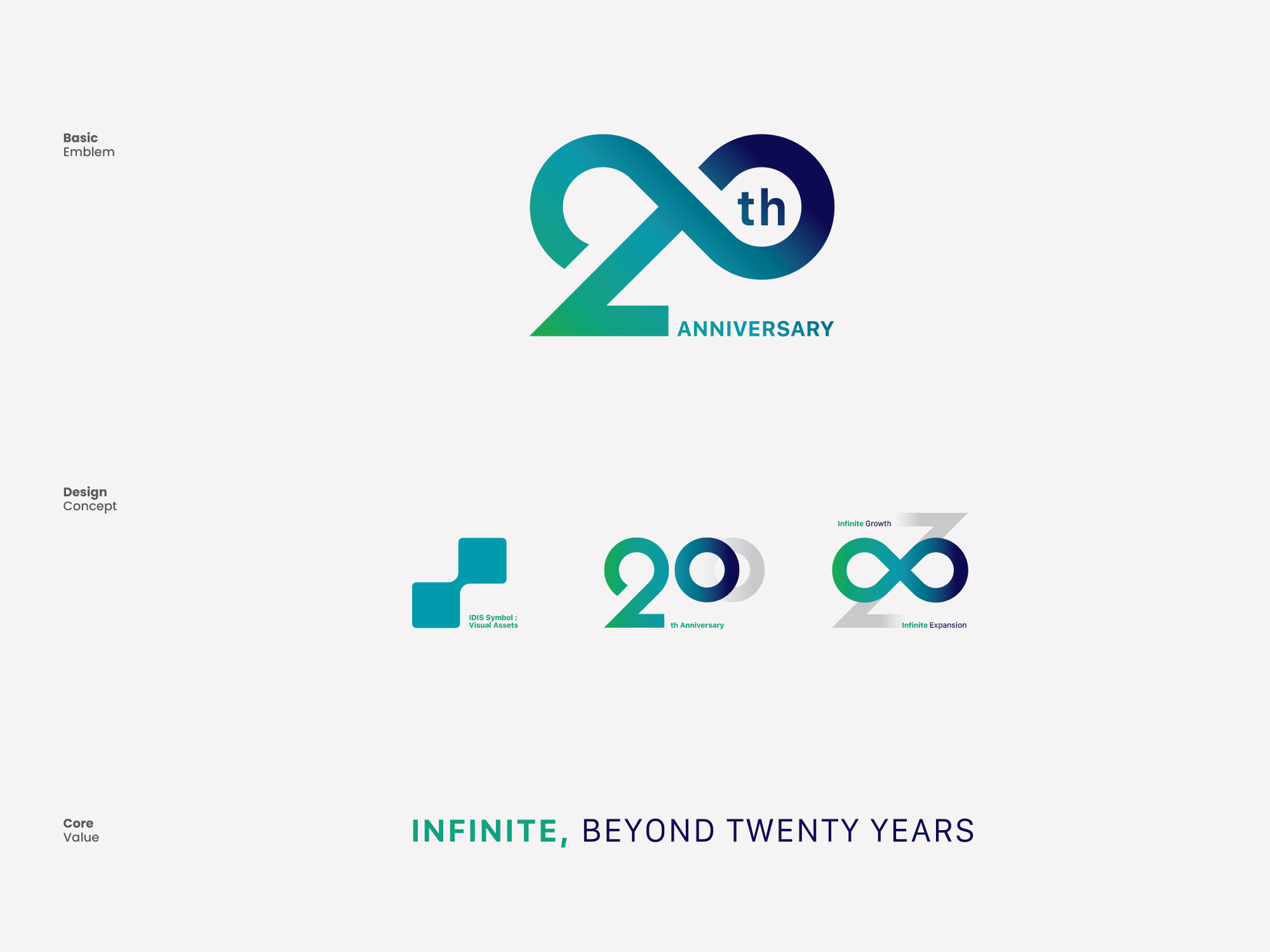
아이디스(IDIS) 20주년 기념 엠블럼
What we did
Client
IDIS/Angle Comm.
Description
아이디스(IDIS) 20주년 프로젝트는 글로벌 보안 기기 전문 기업의 역사와 미래 비전을 정제된 시각 언어로 정립한 대표적인 기업 엠블럼 디자인 사례입니다. 본 프로젝트는 창립 20주년을 맞이하여 그동안 축적된 기술적 혁신과 글로벌 시장에서의 리더십을 기념하고, 새로운 도약을 향한 기업의 핵심 가치를 시각적 자산으로 구현하기 위해 진행되었습니다. 객관적인 기업 분석을 바탕으로, 단순한 연도의 표기를 넘어 아이디스가 지향하는 안전과 신뢰, 그리고 끊임없는 진화의 방향성을 제시하는 비주얼 시스템을 구축하는 데 중점을 두었습니다.
아이디스 20주년 기념 기업 엠블럼 디자인은 보안 영상 기술의 본질인 렌즈의 광학적 포커스와 끊임없이 연결되는 선형 구조를 결합하여 설계되었습니다. 숫자 ’20’의 형태를 끊어짐 없이 이어지는 무한대(∞)의 기하학적 궤적으로 시각화하여 기업의 무한한 성장 가능성과 지속 가능한 혁신을 표현했습니다. 동시에, 카메라 렌즈의 조리개를 연상시키는 원형의 비례 구조를 접목하여 아이디스의 하드웨어적 전문성과 영상 보안 산업 내 독보적인 정체성을 논리적인 시각 언어로 치환했습니다.
-
기업 엠블럼 디자인 전략 및 시각 언어 매핑
성공적인 기념 엠블럼 제작 및 구축은 기업의 과거 유산을 존중하면서도 미래의 철학을 일관된 메시지로 전달하는 브랜드 아키텍처를 세우는 과정입니다. 스크램블 스튜디오는 형태적 안정성과 기하학적 그리드 시스템을 기반으로 심볼 디자인을 개발했습니다. 선의 굵기, 자간, 비례를 수학적으로 조율한 전용 타이포그래피 시스템은 디지털 스크린부터 대형 인쇄 매체, 금속 뱃지에 이르기까지 어떠한 환경에서도 명확한 가독성과 시인성을 보장합니다.
-
컬러 사이콜로지 및 시각적 정체성 시스템
브랜드의 감성적 가치와 신뢰도를 전달하기 위해 전략적인 색채 설계가 적용되었습니다. 기업의 전문성과 견고한 권위를 상징하는 메인 코퍼레이트 컬러와, 20주년의 영광과 비전을 시각적으로 환기하는 프리미엄 메탈릭 실버 및 골드 톤을 유기적으로 결합했습니다. 이러한 정밀한 컬러 팔레트는 기업 엠블럼 디자인 내에서 복잡한 메시지를 시각적으로 단순화하여 대중의 인지 품질을 향상시킵니다.
-
매체 확장성 및 통합 브랜드 경험의 완성
현대의 비주얼 아이덴티티는 온오프라인의 경계를 넘어 유연하게 확장되어야 합니다. 스크램블 스튜디오의 기업 엠블럼 디자인 시스템은 공식 문서, 사원증, 디지털 웹사이트 UI, 모바일 애플리케이션 인터페이스, 공간 사이니지, 패키징 및 기념 굿즈에 이르기까지 전방위적인 터치포인트에서 활용될 수 있는 체계적인 가이드라인을 제공합니다. 이를 통해 기업은 다양한 채널에서 일관된 브랜드 경험을 유지하며, 장기적인 자산 가치를 보존할 수 있습니다.
IDIS 20th Anniversary Corporate Emblem Design and Visual Identity Construction
The IDIS 20th Anniversary project by Scramble Studio serves as a prominent corporate emblem design reference, establishing the history and future vision of a global security technology leader into a refined visual language. This project was initiated to commemorate two decades of technological innovation and global market leadership, materializing the company’s core values for its next leap forward into a strategic visual asset. Based on objective corporate analysis, the primary focus was to construct a robust visual system that goes beyond merely marking the year, instead presenting the direction of safety, trust, and continuous evolution that IDIS pursues.
The IDIS 20th Anniversary Emblem is designed by combining the optical focus of a lens—the essence of video security technology—with a continuously connected linear structure. The form of the numeral ’20’ is visualized as a continuous geometric trajectory resembling the infinity symbol (∞), expressing the company’s infinite growth potential and sustainable innovation. Simultaneously, by incorporating a circular proportional structure reminiscent of a camera lens aperture, the hardware expertise and the distinct identity within the video surveillance industry are logically translated into a clear visual language.
-
Corporate Emblem Design Strategy and Visual Language Mapping
Successful commemorative emblem design and construction involve building a brand architecture that respects past heritage while delivering future philosophy through a consistent message. Scramble Studio developed the symbol design based on structural stability and a rigorous geometric grid system. The exclusive typography system, mathematically adjusting stroke weights, tracking, and proportions, ensures clear legibility and visibility across any environment, ranging from digital screens to large-scale print media and metallic badges.
-
Color Psychology and Visual Identity System
Strategic color engineering was applied to communicate the emotional value and credibility of the brand effectively. We organically combined the primary corporate color, which symbolizes professional expertise and solid authority, with premium metallic silver and gold tones that visually evoke the glory and vision of the 20th anniversary. This precise color palette visually simplifies complex corporate messages within the corporate emblem design, significantly enhancing cognitive quality among the target audience.
-
Media Scalability and Completion of Integrated Brand Experience
A modern visual identity must expand flexibly beyond the boundaries of online and offline environments. Scramble Studio’s corporate emblem design system provides a systematic guideline that can be utilized across omni-channel touchpoints. This encompasses official corporate documents, employee ID cards, digital website UI, mobile application interfaces, spatial signage, packaging, and commemorative merchandise. Through this comprehensive approach, the enterprise can maintain a consistent brand experience across diverse marketing channels, safely preserving the long-term equity and value of its corporate brand assets.