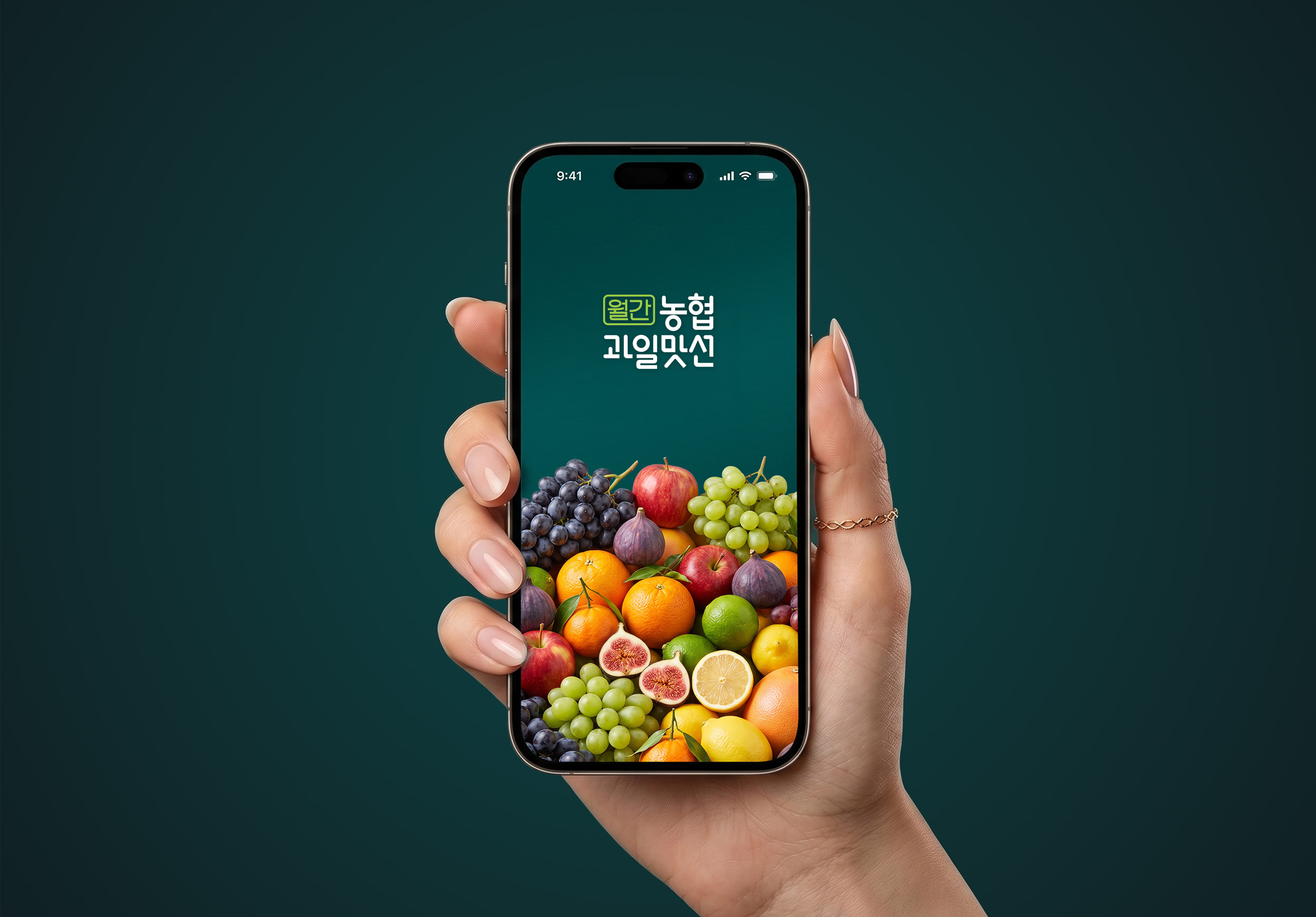
구독 서비스 브랜딩 |
‘월간 농협과일맛선’
What we did
Client
농협경제지주/인터콤
Description
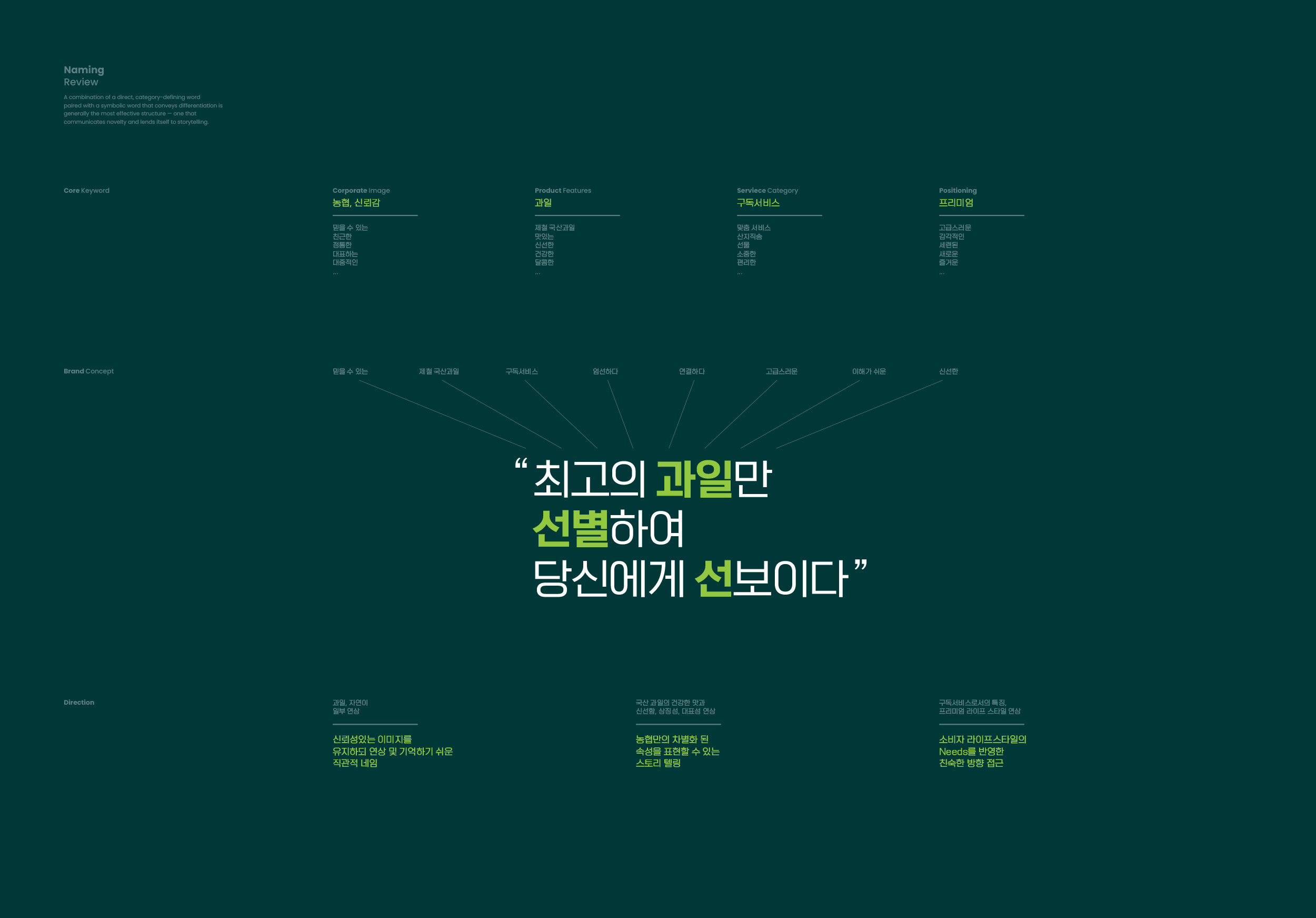
2023년, 농협은 수입 농산물 확대와 국산 과일 소비 감소라는 시장의 변화에 대응하여 전국 우수 산지에서 엄선한 국산 프리미엄과일을 매월 고객의 집 앞으로 배송하는 정기 구독 서비스를 기획했습니다. 스크램블 스튜디오는 과일 구독 시장 내 기존 브랜드들과 확고한 차별점을 만들고 본 프로젝트의 시장 안착을 위해 ‘월간 농협과일맛선’의 구독 서비스 브랜딩 / 신사업 BI 디자인을 수행했으며, 농협 특유의 견고한 ‘신뢰감’을 ‘프리미엄’ 가치로 시각화하여, 브랜드 네이밍부터 워드마크, 엠블럼, 패키지, 그리고 비주얼 시스템 가이드라인에 이르기까지 통합 브랜딩을 구축했습니다.
In 2023, responding to rising imports and declining domestic fruit consumption, Nonghyup launched a subscription service delivering premium Korean fruit, hand-picked from top farms nationwide, to customers’ doors each month. Scramble Studio led the new business branding and integrated BI design for “Nonghyup Fruit Subscription,” aiming to differentiate it from existing brands in the fruit subscription market and support its successful launch. The team translated Nonghyup’s characteristic trustworthiness into a premium brand value, building an integrated design solution spanning brand naming, wordmark, emblem, packaging, and a visual system guideline.
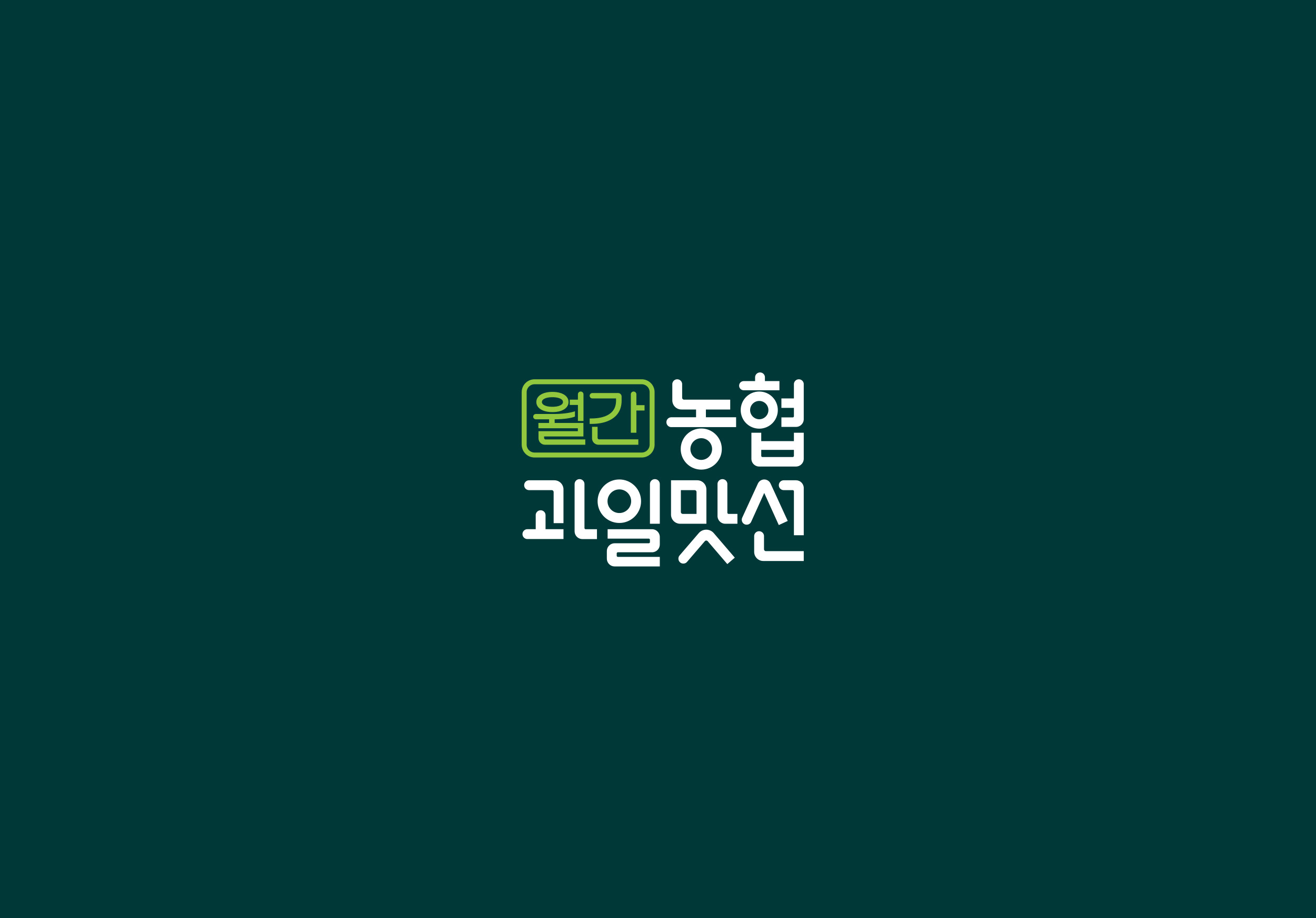
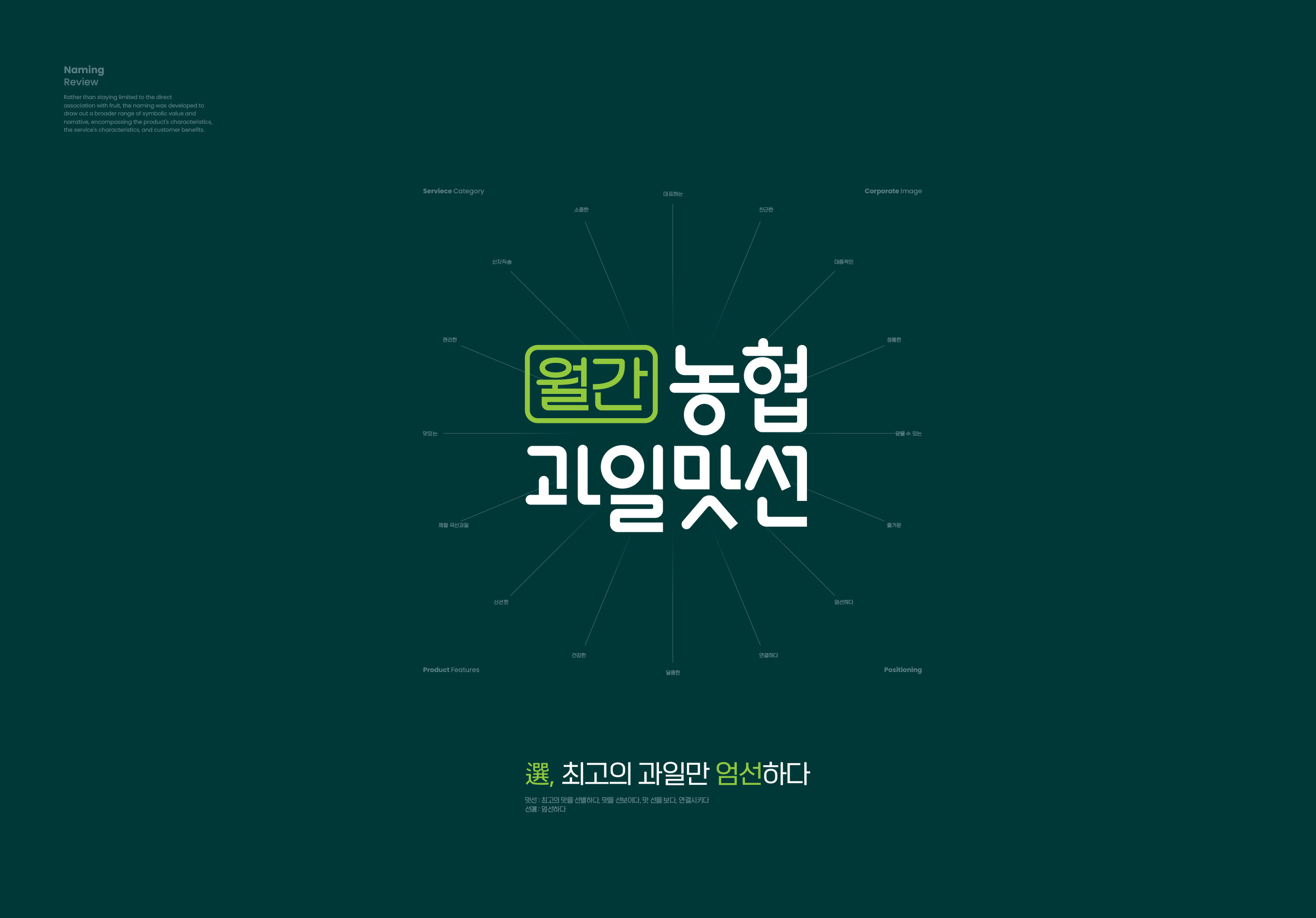
브랜드 커뮤니케이션의 얼굴인 워드마크는 구독 서비스 브랜딩 프로젝트의 성격을 직접적으로 나타내고 농협이 직접 품질을 ‘검수’, ‘인증’한 제품이라는 신뢰감과 자신감을 시각적으로 담아내고자 ‘월간’ 텍스트를 인장(Stamp) 형태로 표현했습니다.
The wordmark, as the face of the brand’s communication, renders the word “월간” (“Monthly”) in the form of a stamp — a design chosen to directly convey the “monthly subscription” nature of the service, while visually capturing the confidence and trust behind a product that Nonghyup has personally inspected and certified for quality.


농협의 구독 서비스 브랜딩 프로젝트 ‘월간 농협과일맛선’의 엠블럼 디자인은 정기 구독 서비스의 핵심 가치인 ‘배송’, ‘연결’,’방향성’을 화살표로 시각화되었고, 과일 바구니 형태와 유기적으로 결합해 고객이 서비스의 특징을 한눈에 인지할 수 있도록 디자인되었습니다.
The emblem visualizes the subscription service’s core values — delivery, connection, and direction — through an arrow motif combined with a fruit basket shape, letting customers recognize the service’s defining traits at a glance.


브랜드의 첫인상을 결정하는 주색은 농협 고유의 그린 컬러를 ‘NH Fruits Dark Green’과 ‘NH Fruits Light Green’으로 재해석하여 농협의 기업 아이덴티티는 유지하되 브랜드가 가진 특징, 과일의 신선함과 선별된 제품이라는 의미의 고급스러움을 표현했으며, 다양한 매체에서 일관된 톤을 유지하도록 설계되었습니다.
The primary color reinterprets Nonghyup’s signature green into two tones — NH Fruits Dark Green and NH Fruits Light Green — preserving corporate identity while expressing the brand’s own character: freshness and premium selection. This color system, a core BI design element, stays consistent across mobile and print media.