제품 브랜드 아이덴티티 | LG CordZero
What we did
Client
Description
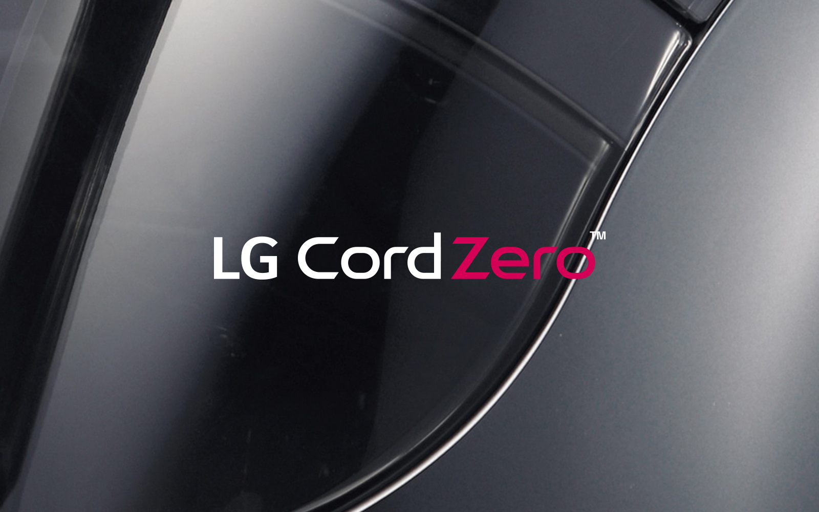
LG전자의 제품 브랜드 아이덴티티 프로젝트 CordZero는 제품 라인의 핵심 가치인 ‘Cord Less(선이 없는 자유로움)’ 컨셉을 시각적으로 명확하게 전달하되, 프리미엄 무선 청소기 브랜드 디자인에 걸맞은 정제되고 세련된 표현으로 구현하는 데 중점을 두었습니다. 워드마크 형태의 디자인은 획의 끝을 사선으로 처리한 디테일과 대각선(Diagonal Line) 요소를 통해 자유로운 움직임과 기술적 혁신을 표현했으며, 곡선(Rounded Line)과 직선(Straight Line), 획의 공간이 견고하게 조합되어 어떠한 매체와 사이즈에서도 왜곡 없이 안정적인 가독성을 유지할 수 있도록 디자인되었습니다.
LG Electronics’ product brand identity project for “CordZero” focused on visually conveying the core concept of “freedom from cords” while embodying a refined, sophisticated aesthetic befitting a premium cordless vacuum brand. The wordmark design expresses freedom of movement and technological innovation through diagonal line elements and stroke endings cut at an angle; furthermore, the robust combination of curved and straight lines, along with the spacing between strokes, ensures stable legibility without distortion across any medium or size.
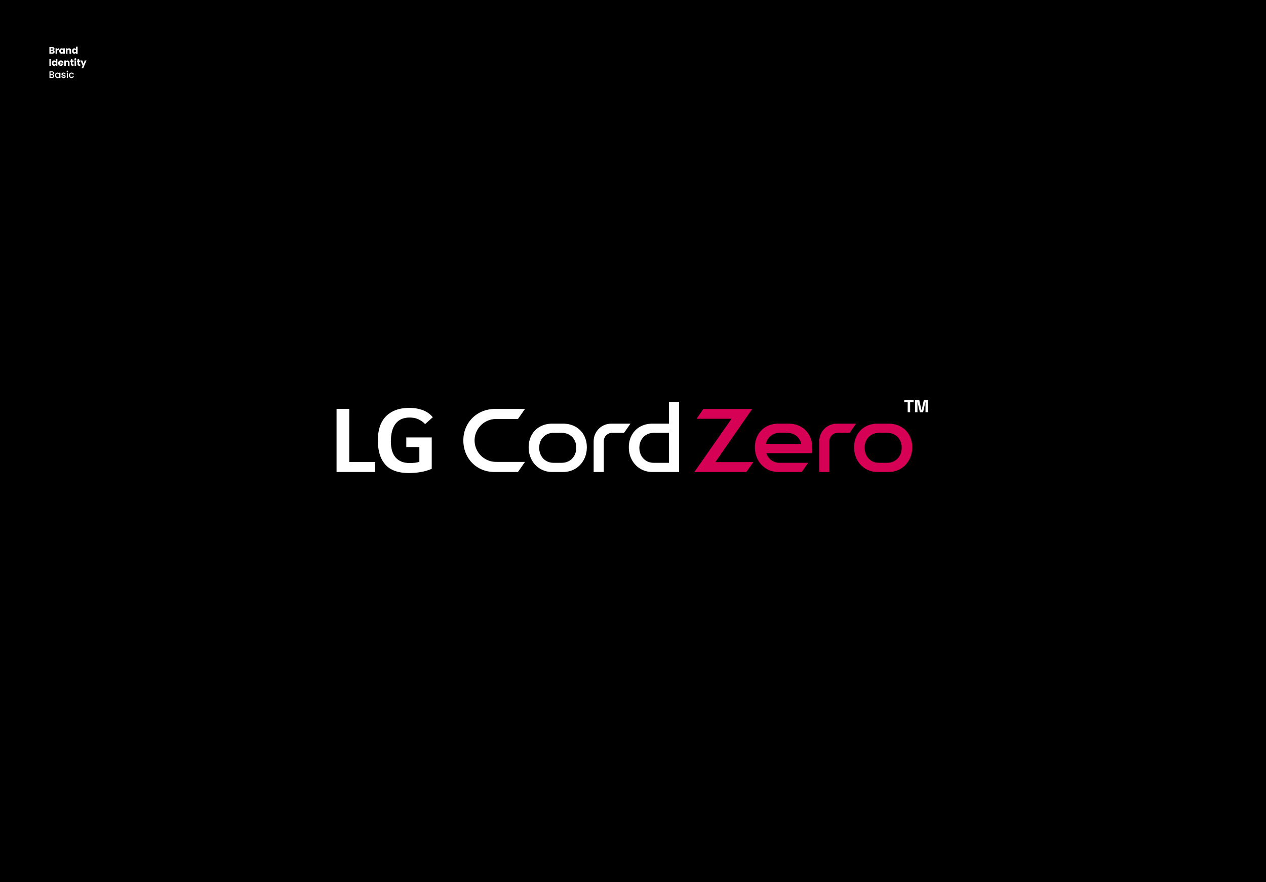

LG CordZero의 로고타입 디자인은 Cord Line을 상징하는 선의 형태와 기하학적인 라운드를 결합했습니다. 특히 ‘C’, ‘e’, ‘o’와 같은 라운드 형태의 자소에는 평선을 가미하고, ‘Z’의 사선에는 Edge와 같은 각도를 적용하여, 다소 밋밋할 수 있는 자소들에 제품의 특성과 유니크함을 부여하고 무선 청소기 브랜드 디자인으로서의 아이덴티티를 강조하였습니다.
A global company’s product brand identity conveys not only the product’s characteristics to consumers visually, but also the company’s image and credibility. This requires the visual language to carry both solidity and refinement, and further, to convincingly represent the product’s ‘integrity’ and ‘precision.’ The logotype design of LG CordZero combines line forms symbolizing the Cord Line with geometric rounding. In particular, flat lines were incorporated into rounded letterforms such as ‘C,’ ‘e,’ and ‘o,’ while the diagonal stroke of the ‘Z’ was accentuated with an angle matching that of the Edge—giving otherwise plain letterforms the product’s distinct character and reinforcing the identity of a cordless vacuum cleaner brand design.