Fruits Brand Identity | Melots Melon Brand & Package Design
What we did
Client
청양농협/농민신문사
Description
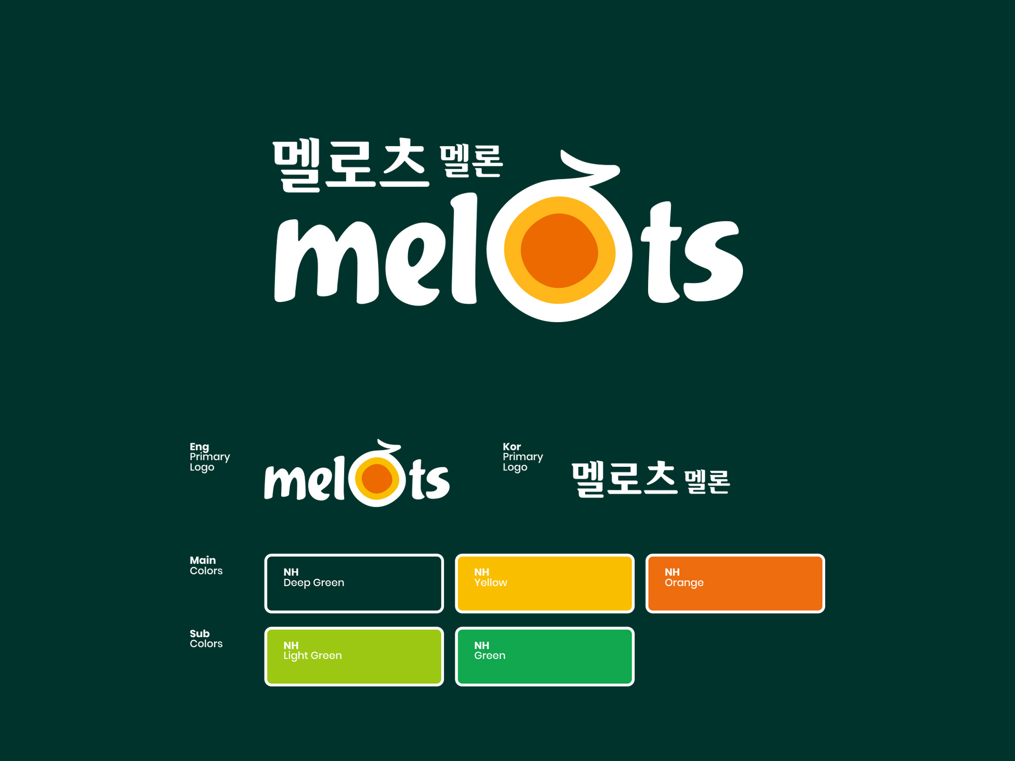
Melots Fruits Brand Identity & Package Design은
청양농협 멜론의 풍부한 과즙과 달콤함을 시각적으로 전달하기 위해 기획된 농산물 브랜딩 프로젝트입니다. ‘Melots’는 Melon과 Lots의 합성어로, 과즙이 가득한 멜론의 특징을 브랜드 네이밍에 담고 있으며 Fruits Brand Identity는 멜론의 형태를 직관적으로 표현하여 자연스럽고 친근한 인상을 주는 동시에 농산물 브랜드로서의 신뢰감과 견고함을 강조했습니다.
Melots Brand Identity & Package Design was developed to visually communicate the rich sweetness and abundant juice of Cheongyang Nonghyup melons. The name Melots combines Melon and Lots, meaning “lots of juice,” expressing the brand’s core value of juicy, sweet melons. The Brand Identity is based on the intuitive form of a melon, designed to feel natural, friendly, and structurally solid, reinforcing trust as an agricultural brand.
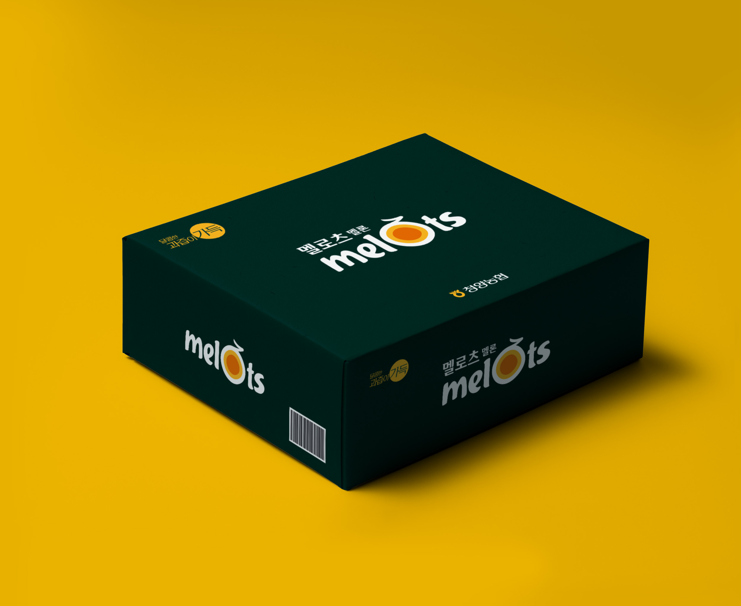
The package design highlights freshness and quality through a clean and straightforward layout, allowing consumers to easily recognize the product’s premium value. This project reinterprets a local agricultural brand with a modern and refined visual identity.