가전 브랜드 아이덴티티 |
LG Innovation Font Family
What we did
Client
Description
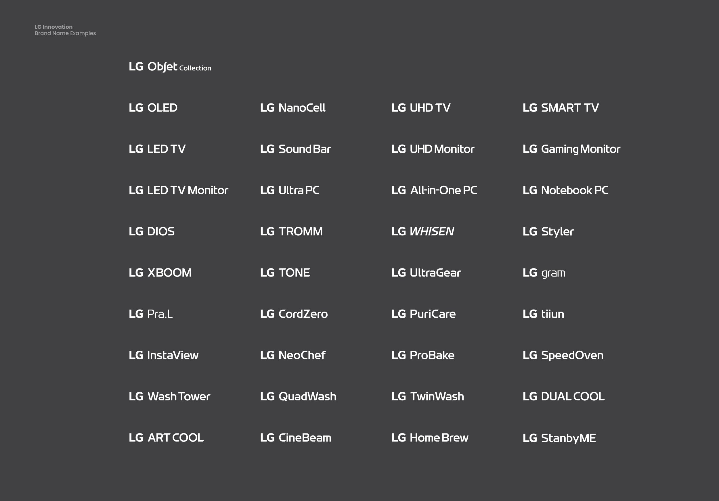
LG Innovation Font Family는 LG전자의 기업 브랜드 정체성 강조 및 일관된 가전 브랜드 아이덴티티를 구축을 위해 진행된 브랜드 전용 서체 시스템입니다. 2015년 생활가전(구 H&A, Home Appliance & Air Solution) 사업부의 브랜드 전용 서체 H&A Innovation Semibold Type 개발을 시작으로 2016년 두꺼운 형태의 Extrabold Type, 좁은 형태 적용을 위한 Narrow Type 개발까지 전체적인 Family Type의 서체 시스템으로 개발되었고, 2021년 LG Innovation Rounded라는 형태로 확장되었습니다. 현재는 한글에도 적용할 수 있는 버전으로도 개발되어 LG전자 가전 브랜드의 핵심 브랜드 자산으로 활용되고 있습니다.
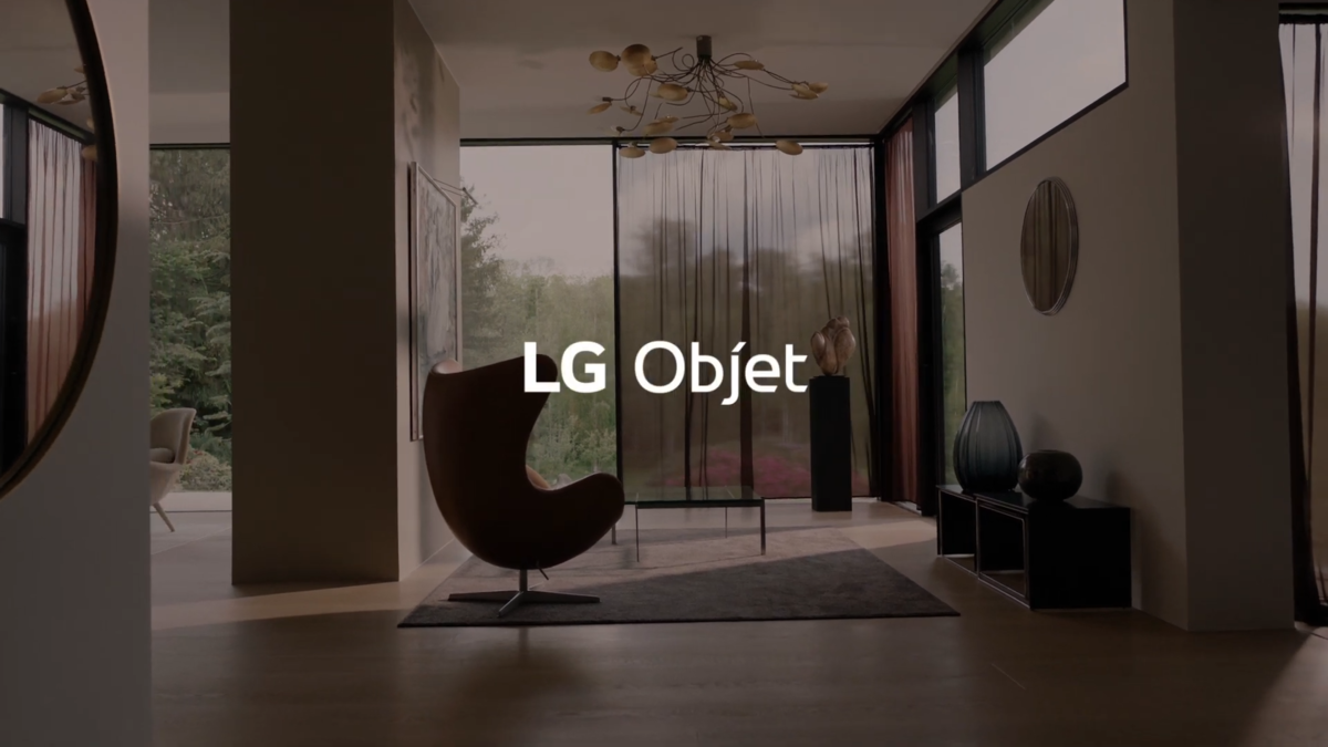
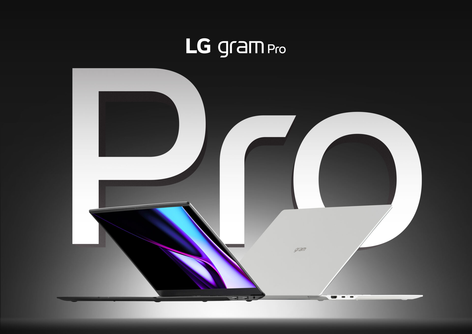
*광고 이미지 출처 : LG전자 홈페이지
The LG Innovation Font Family is a proprietary brand typeface system developed to reinforce LG Electronics’ corporate brand identity and establish a consistent home appliance brand identity. It began in 2015 with the development of H&A Innovation Semibold Type, the proprietary typeface for the Home Appliance & Air Solution (H&A) division, and grew into a full family type system with the 2016 development of a bolder Extrabold Type and a Narrow Type for condensed applications, before expanding in 2021 into LG Innovation Rounded. It has since been developed into a version applicable to Hangul as well, and continues to serve as a core brand asset of LG Electronics’ home appliance brand.
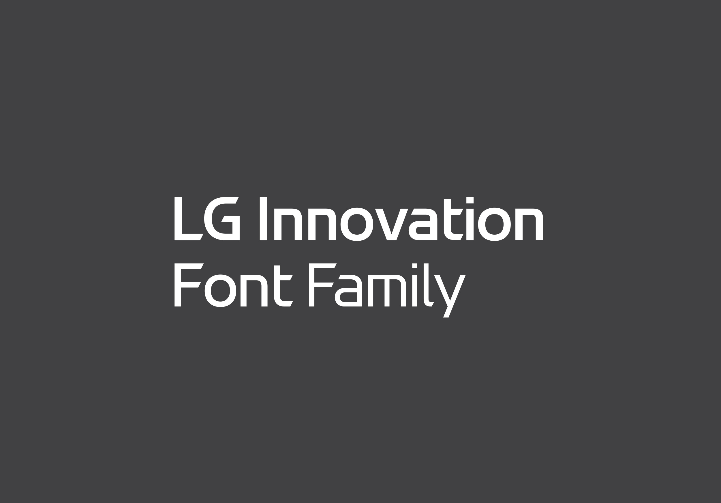
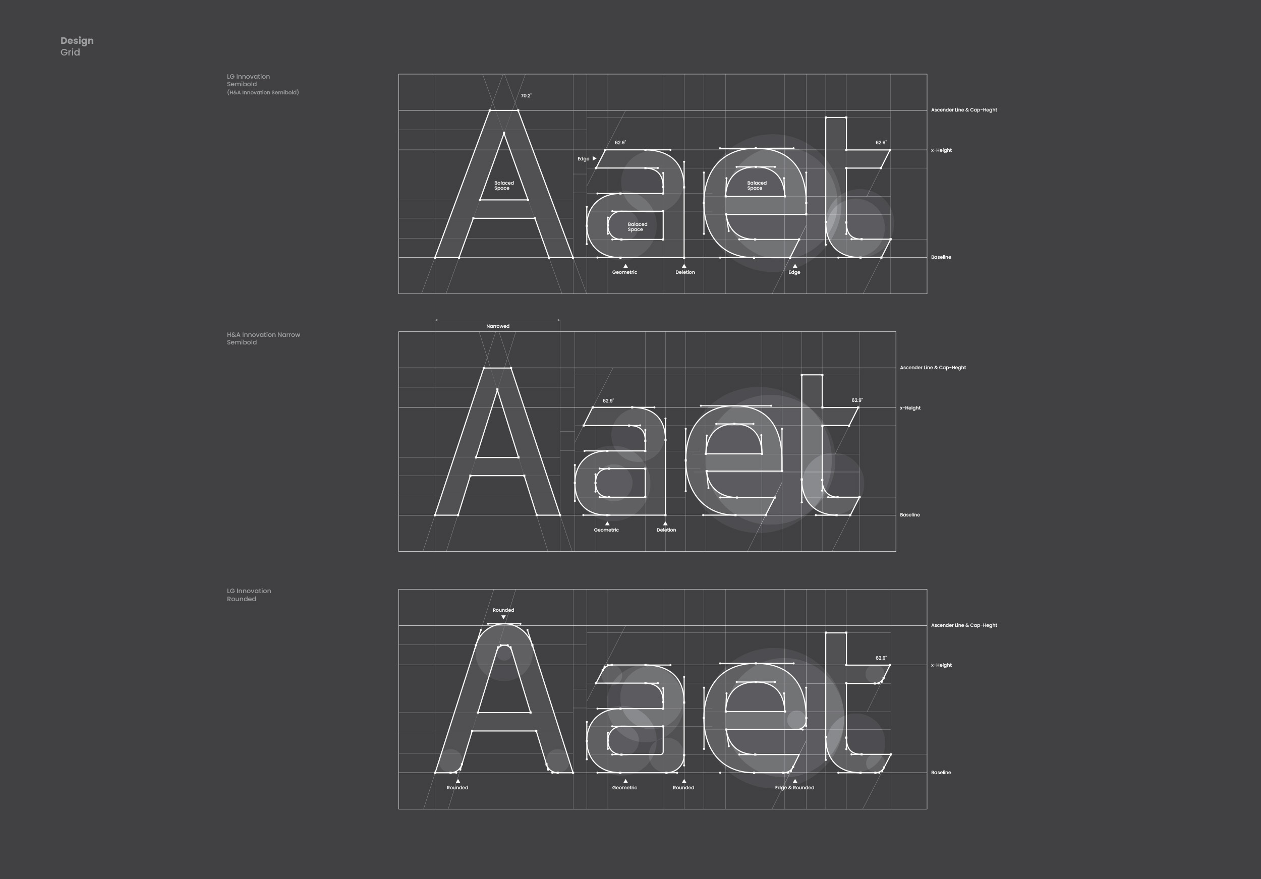
브랜드 전용 서체 LG Innovation Font Family는 LG전자의 브랜드 비전과 아이덴티티를 ‘Smart’, ‘Innovation’, ‘Edge’라는 세 가지 핵심 컨셉으로 표현했습니다. 가전 브랜드 아이덴티티라는 특징에 맞춰 직선의 느낌을 강조하였고, 기하학적인 곡선과 견고한 밸런스를 통해 미래지향적인 이미지와 LG전자 특유의 친근하고 부드러운 인상을 동시에 담아냈습니다. 또한 획의 끝부분에 사선 엣지(Edge)를 적용해 첨단 기술력의 정체성을 시각적으로 담아냈습니다.

LG Innovation Font Family는 가전 브랜드 아이덴티티 디자인 시스템으로서 브랜드의 식별자이자 이미지 전달자 역할을 할 뿐 아니라, 내부 실무 디자이너의 사용성까지 고려하여 제작되었습니다. 디자이너의 작업 부담을 최소화할 수 있도록 대문자 높이(Cap Height)와 어센더 라인(Ascender Line)을 동일하게 조정하고, 원형 자소(‘O’, ‘Q’ 등)를 제외한 모든 자소를 베이스라인(Baseline)에 정렬시켜, 서체의 형태와 높이를 별도로 조정하지 않고도 즉각적인 디자인 전개가 가능하도록 설계되었습니다.
The LG Innovation Font Family was created not only to serve as a home appliance brand identity design system that functions as both a brand identifier and image carrier, but also with the usability of in-house working designers in mind. To minimize designers’ workload, the cap height and ascender line were adjusted to match, and all characters except round letterforms (‘O’, ‘Q’, etc.) were aligned to the baseline—allowing for immediate design execution without the need to separately adjust the typeface’s shape or height.

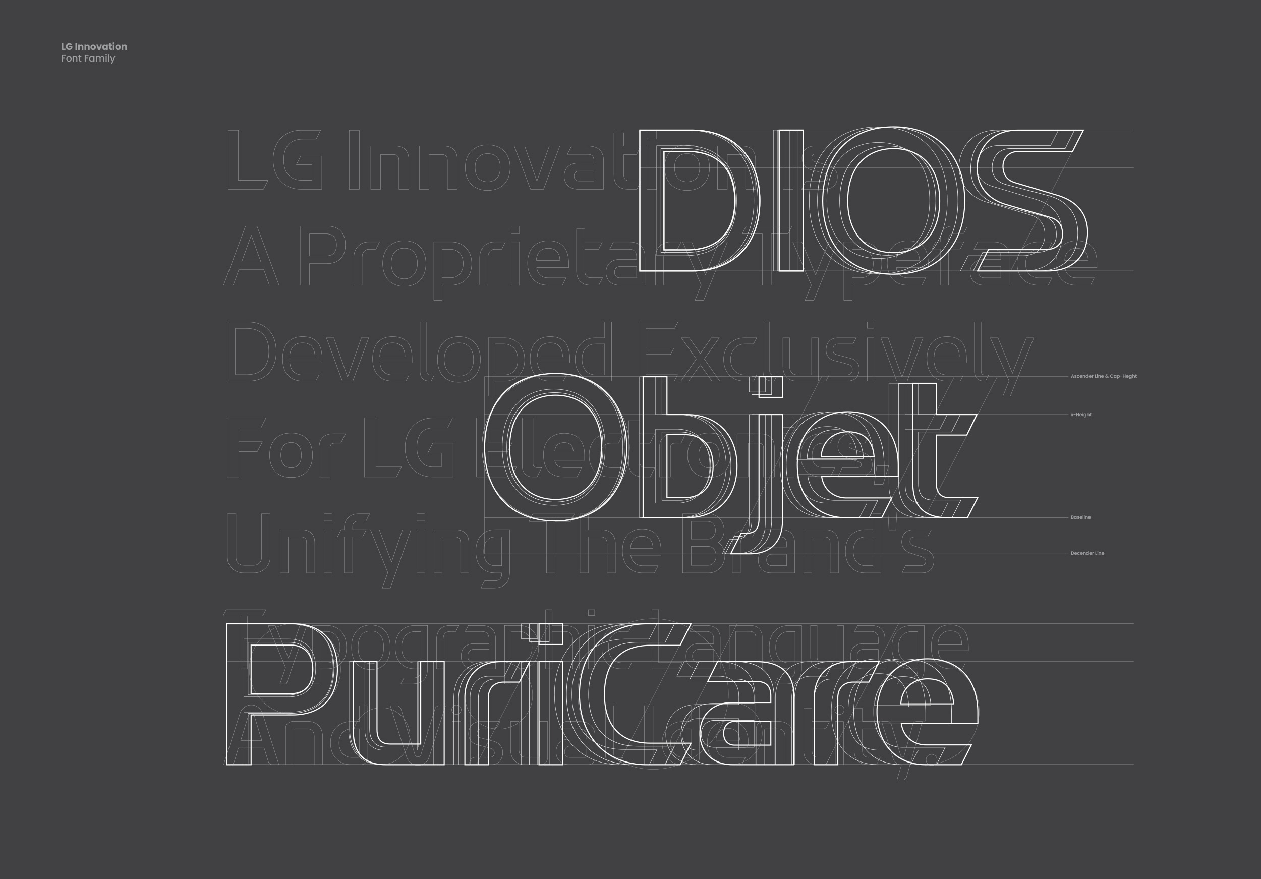

기업의 브랜드 아이덴티티는 브랜드가 고객과 만나는 모든 접점의 일관성에서 출발합니다. 그런면에서 기존 LG전자의 디자인 시스템은 제품별 식별력은 갖추었으나, 사업부서와 제품마다 캐릭터가 강해 통일된 정체성을 전달하기에는 시각적 연결성이 부족했으며, 이를 보완하기 위해 다각도의 디자인 스터디와 리파인먼트를 거쳐, 개별화된 디자인을 아우르고 일관성을 부여하는 브랜드 전용 서체 시스템이 구축되었습니다.
A company’s brand identity begins with consistency across every touchpoint where the brand meets its customers. In this respect, LG Electronics’ existing design system achieved strong product-level identifiability, but the distinct character of each business division and product made it difficult to convey a unified identity, leaving a gap in visual cohesion. To address this, a proprietary brand typeface system was built through multi-angle design studies and refinement—one that embraces individualized designs while bringing consistency across them.