공공기관 행사 브랜딩 |
서해 수호의 날
Description
국가보훈처(현 국가보훈부. 이하 국가보훈부)의 서해 수호의 날은 국가 주관 기념식의 상징성과 보훈의 의미를 정제된 시각 언어로 표현한 공공기관 행사 브랜딩 프로젝트로, 대한민국 서해를 수호한 장병들의 헌신을 기리기 위해 제정된 국가기념일입니다. 본 프로젝트는 서해 수호 55용사와 참전 장병들을 추모하는 국가적 행사의 이벤트 아이덴티티이자 비주얼 아이덴티티로서, 국민의 안보 의식과 국토 수호의 가치를 명확한 국가 기념행사 로고 및 시각 매뉴얼로 전달하는 데 중점을 두었습니다.
The West Sea Defense Day by the Ministry of Patriots and Veterans Affairs is a public institution event branding project that structures the symbolism and meaning of a state-organized commemorative ceremony into a refined visual language, serving as a national anniversary established to honor the devotion of the soldiers who defended the West Sea of the Republic of Korea. As the event identity of a national ceremony commemorating the 55 heroes of the West Sea and participating veterans, this project focused on delivering the value of national security and homeland defense through a clear visual manual.

서해 수호의 날 이벤트 아이덴티티는 공공기관 행사 브랜딩 프로젝트로, 대한민국 정부의 시각 요소 중 태극 마크의 시각 요소를 재해석하여, 기하학적 형태의 파도와 서해 앞바다를 지키는 우리 장병들의 힘을 표현하였고, 기하학적인 구조를 바탕으로 견고하게 디자인된 로고타입을 통해 국가 기념행사 로고서 요구되는 신뢰성과 정보 명확성을 전달하고자 했습니다.
As a public institution event branding project, the West Sea Defense Day event identity reinterprets the visual elements of the Taegeuk mark from the Republic of Korea government’s visual system to express geometric waves and the strength of our soldiers defending the West Sea. Furthermore, through a robust logotype designed on a geometric structure, it aims to deliver the reliability and informational clarity required of a national commemorative event logo.


본 프로젝트의 컬러 시스템은 희생된 장병들에 대한 추모의 의미를 담은 스카이 블루와 서해를 상징하는 네이비 블루를 주색으로 지정하고, 우리 군인들의 역동성과 에너지를 나타내는 레드를 보조 컬러로 유기적으로 사용했으며, 명도, 채도의 대비를 엄격히 통제하여 국가 기념행사 로고로써의 경건함과 시각적 안정감을 동시에 표현했습니다.
The color system for this project designates sky blue, reflecting the memorial for the fallen soldiers, and navy blue, symbolizing the West Sea, as its primary colors, while organically utilizing red as a secondary color to represent the dynamism and energy of our military. By strictly controlling the contrast in lightness and saturation, it simultaneously expresses the solemnity and visual stability befitting a national commemorative event logo.
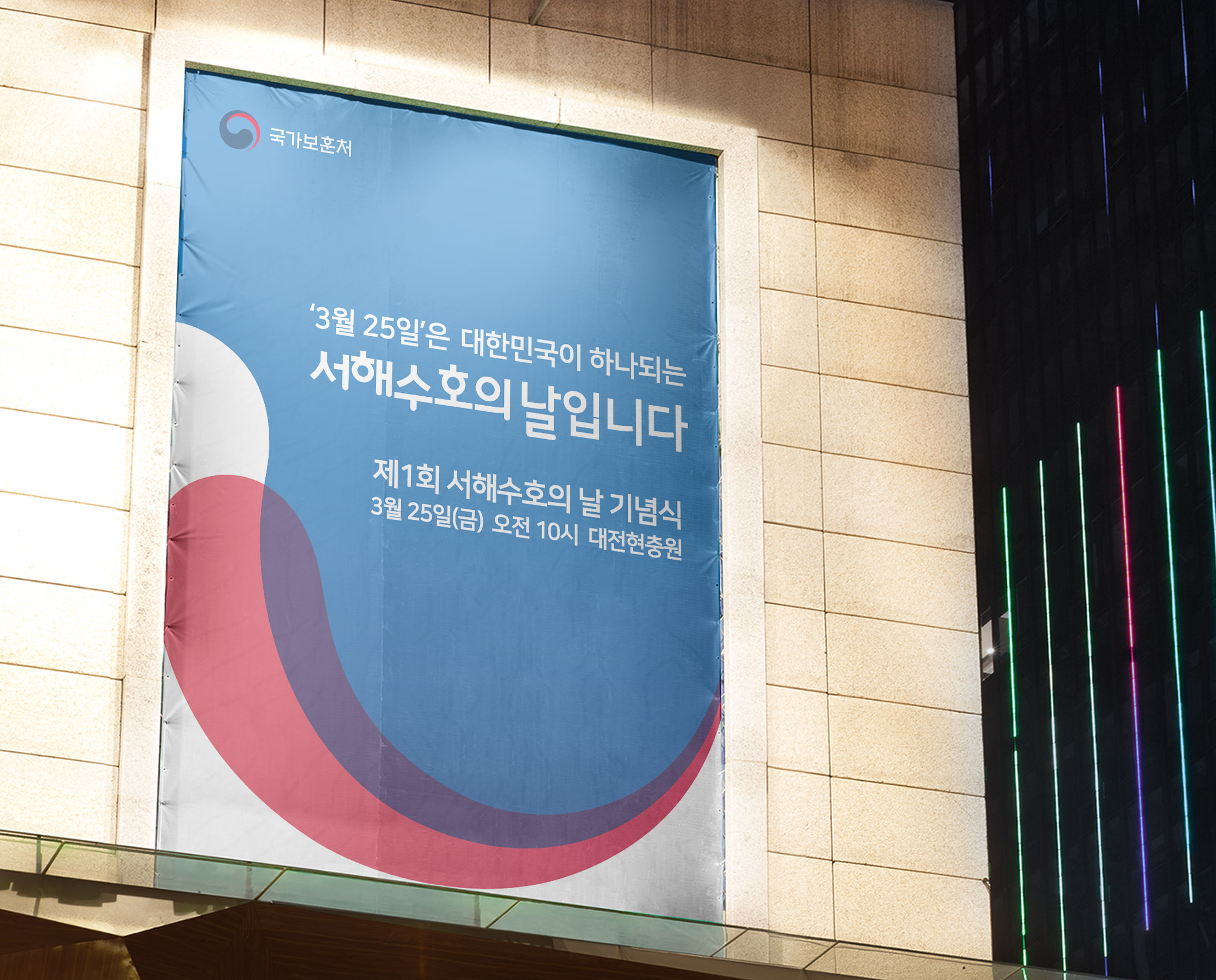
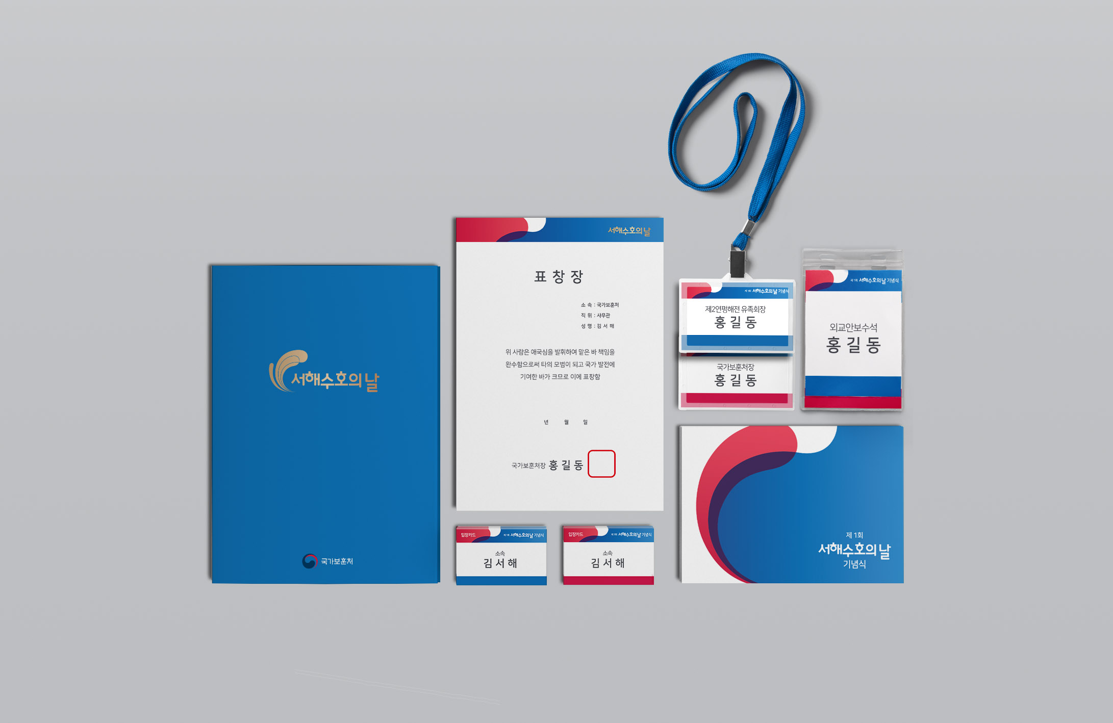
공공기관 행사 브랜딩 프로젝트 ‘서해수호의 날’의 그래픽 모티프는 심볼마크를 기반으로 제작되었으며, 국가 기념행사 로고의 그래픽으로써 일관된 정체성을 유지하면서도 유연하게 활용될 수 있도록 형태와 비율의 제한을 최소화했습니다. 이를 기반으로 한 비주얼 아이덴티티(Visual Identity)는 유가족과 내빈을 비롯해 미디어를 통해 행사를 접하는 모두에게 현수막, 초청장, 리플렛, 그래픽 템플릿까지 유기적으로 확장될 수 있도록 디자인되었으며, 체계적인 디자인 가이드라인을 통해 다양한 환경에서도 왜곡 없이 안정적으로 관리·운영될 수 있도록 하였습니다.
The graphic motif for the public institution event branding project ‘West Sea Defense Day’ was created based on the symbol mark, and as the graphic system for the national commemorative event logo, restrictions on form and proportion were kept to a minimum to allow flexible use while maintaining a consistent identity. Built on this foundation, the Visual Identity was designed to extend organically—from banners, invitations, and leaflets to graphic templates—for everyone who encounters the event, including bereaved families, distinguished guests, and the public reached through media coverage, and was structured through systematic design guidelines to ensure stable, distortion-free management and operation across diverse environments.