2014 대한민국 정부 경제혁신 정책 브랜딩
Description
대한민국 정부 경제혁신 비전 슬로건 디자인 프로젝트는 국가의 경제 구조 개혁과 미래 성장 동력 확보라는 거시적 정책 비전을 대중이 직관적으로 체감할 수 있도록 시각화한 공공 브랜딩 프로젝트입니다. 본 슬로건 디자인은 국가적 차원의 무거운 정책적 메시지를 경직된 관공서 스타일에서 벗어나 국민 누구나 쉽게 이해하고 공감할 수 있는 현대적인 디자인 언어로 전환하는 것을 핵심 과제로 설정하고 개발을 시작했습니다.
정형화된 사각형의 형태는 형식적인 정책과 비전으로 정의하고, 이 사각형의 ‘틀’의 파괴로 표현하여 과감하게 기존의 틀을 벗어나 ‘혁신’을 표현했으며, 바람개비의 형상으로 경제의 활발한 순환을 상징합니다.
The Republic of Korea Government’s Economic Innovation Slogan Design Project is a public branding initiative that visualizes the macro-level policy vision of reforming the nation’s economic structure and securing future growth engines in a way that the public can intuitively grasp. This project began with the core objective of transforming heavy, national-level policy messages from a rigid, bureaucratic style into a modern design language that anyone can easily understand and relate to.
The standardized rectangular shape represents formal policies and visions, and by breaking this “frame,” we boldly expressed “innovation” by breaking free from existing constraints. The pinwheel shape symbolizes the vibrant circulation of the economy.

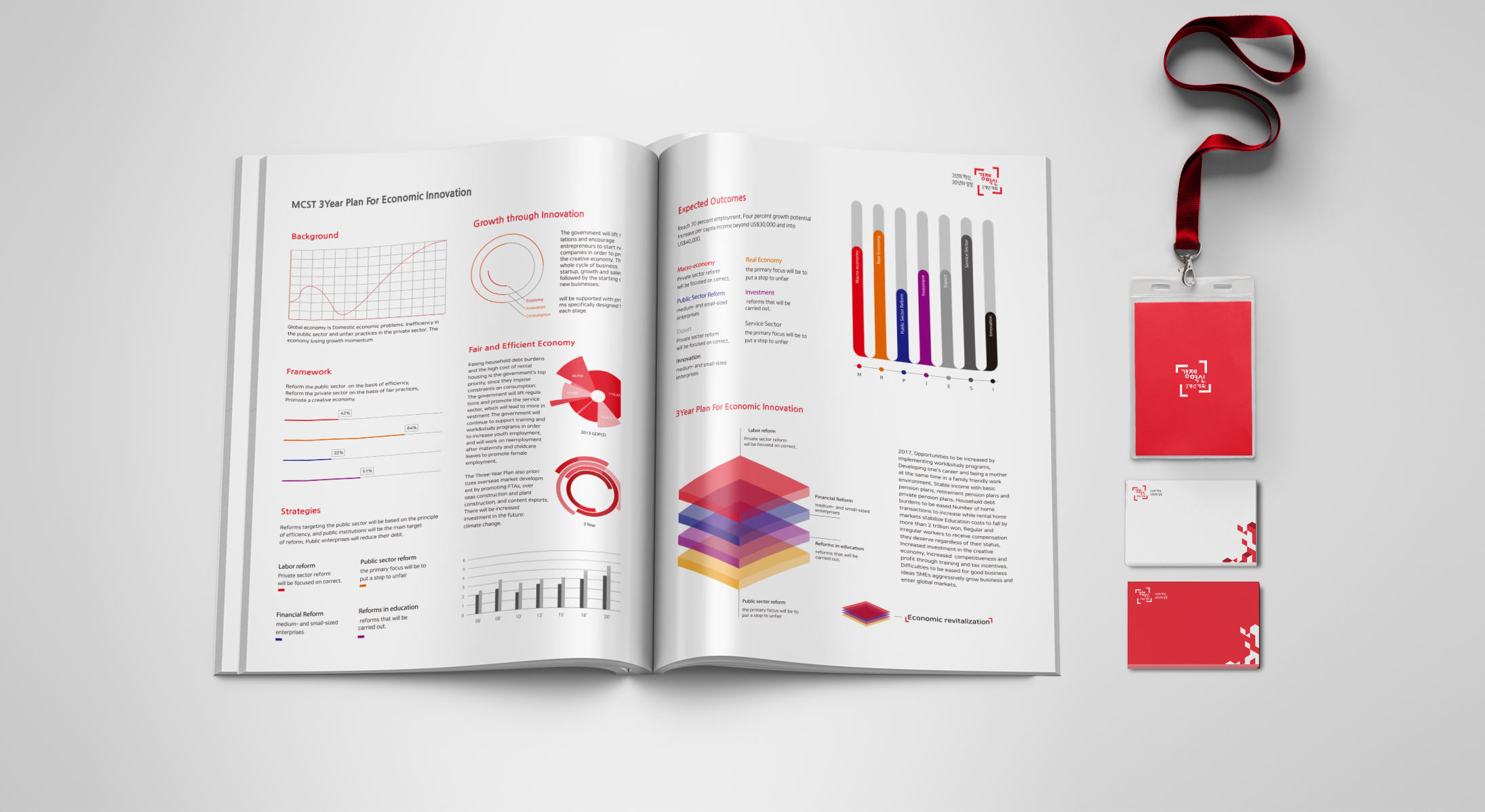
본 비전 슬로건 디자인의 그래픽 시스템은 혁신의 의미를 담고 다이내믹함을 동시에 보여줄 수 있는 컬러 팔레트를 채택했습니다. 전통적인 대한민국의 컬러 스킴인 블루/레드를 탈피하고, 한층 생동감 있는 레드를 전면 배치하여 국가 경제의 정책 혁신의 생동감을 극대화했으며, 바람개비처럼 돌아가는 국가/기관/기업/국민 등 경제 주체들의 상생을 상징하는 유기적이고 유연한 그래픽 모티프는 본 정책 슬로건 디자인의 의미를 한층 더 입체적으로 보완해 줍니다.
The graphic system of this vision slogan design adopts a color palette that embodies the meaning of innovation while simultaneously showcasing dynamism. Breaking away from the traditional Korean color scheme of blue and red, a more vibrant red is prominently featured to maximize the dynamism of policy innovation in the national economy. Furthermore, the organic and flexible graphic motif, symbolizing the mutual prosperity of economic actors—including the state, institutions, companies, and citizens—spinning like a pinwheel, complements the meaning of this policy slogan design in a more three-dimensional way.


