
자산관리 브랜드 디자인 |
NH WM MASTERS
What we did
Client
Description
2023년 출범한 NH WM MASTERS는 NH농협금융그룹의 주요 금융 계열사 NH뱅크, NH농협생명, NH농협손해보험, NH투자증권, NH아문디자산운용 등 금융 계열사에서 선발된 업계 최정상 자산관리 자문단으로, 그룹의 최상위 고객에게 리서치에 기반한 프리미엄 투자 전략과 종합 자산관리를 제공합니다. 본 프로젝트는 금융 브랜드 아이덴티티 / 자산관리 브랜드 디자인 프로젝트로써 NH WM MASTERS를 상징함과 동시에 자문을 받는 고객에게는 최고의 전문가가 제공하는 스마트한 자산관리라는 신뢰감을, 선발된 자문 위원에게는 업계 최정상이라는 확고한 자부심을 부여할 수 있도록 전략적이고 체계적으로 디자인되었습니다.
Launched in 2023, NH WM MASTERS is an elite team of wealth management advisors selected from across NH NongHyup Financial Group’s key financial affiliates — including NH Bank, NH NongHyup Life Insurance, NH NongHyup Property & Casualty Insurance, NH Investment & Securities, and NH-Amundi Asset Management — delivering research-driven premium investment strategies and comprehensive wealth management to the group’s top-tier clients. This project was designed strategically and systematically to symbolize NH WM MASTERS while instilling two things at once: for clients receiving advisory services, a sense of trust in smart asset management delivered by the best experts in the field; and for the selected advisors themselves, a firm sense of pride in being recognized as among the industry’s very best.
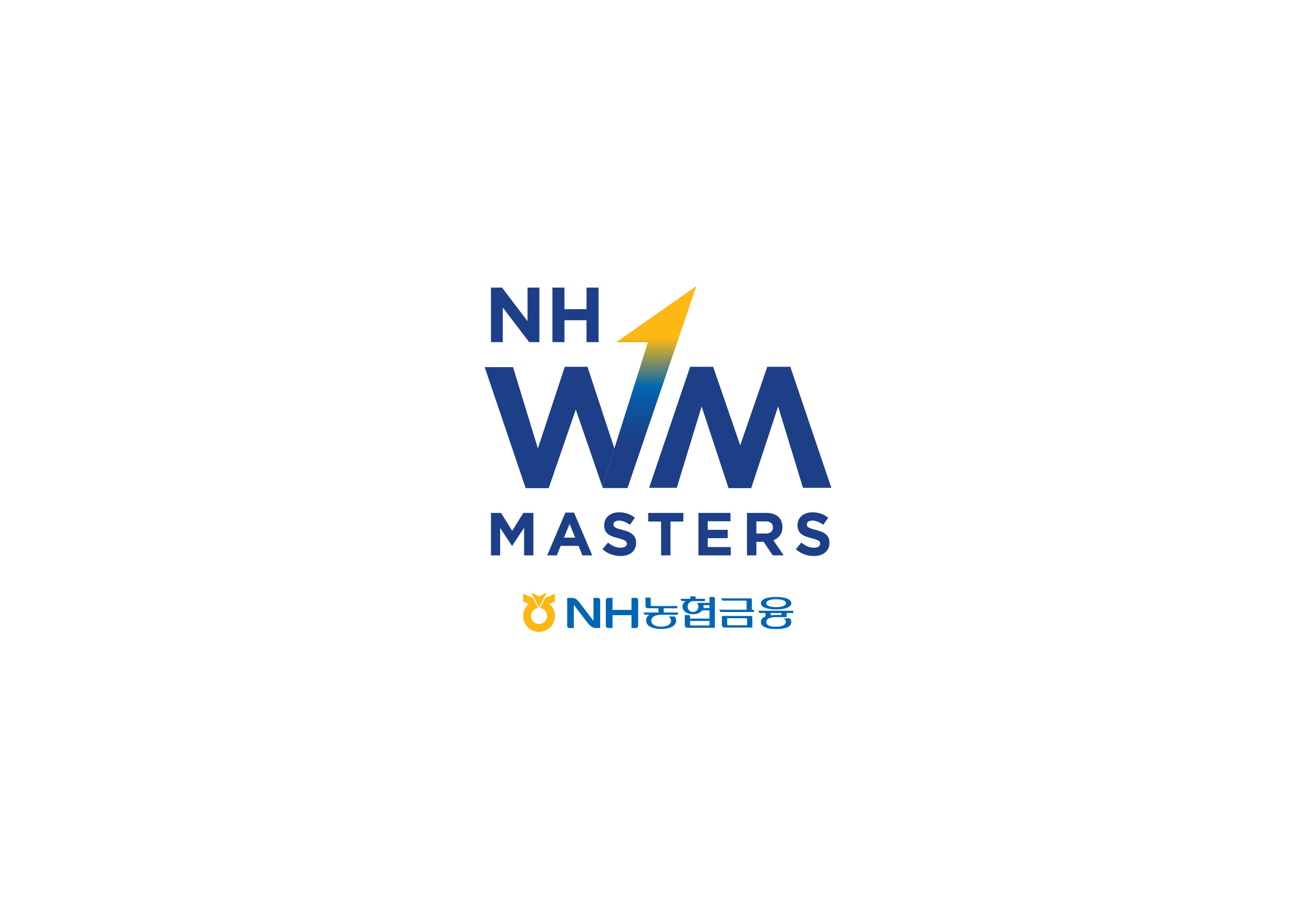


NH WM MASTERS의 비주얼 아이덴티티는 알파벳 ‘W’, ‘M’의 구조적 특징을 복잡한 금융 시장의 변동성과 주식 그래프의 형태로 직관적으로 표현했으며, 강하게 우상향하는 화살표와 숫자 ‘1’을 통해 WM MASTERS가 지향하는 최고의 투자 자문단이라는 정체성을 확립하고 타겟 고객에게 강력한 브랜드 아이덴티티를 각인시키고자 했습니다.
The visual identity of NH WM MASTERS intuitively translates the structural characteristics of the letters “W” and “M” into the shape of stock market graphs, capturing the volatility of complex financial markets. A sharply upward-pointing arrow combined with the numeral “1” establishes the identity of WM MASTERS as the top-tier investment advisory team it aspires to be, aiming to leave a strong, lasting brand impression on its target customers.

금융 브랜드 아이덴티티에 있어 독립적인 정체성을 구축함과 동시에 모기업의 신뢰도를 유지하기 위해, NH농협금융그룹의 코퍼레이트 컬러인 NH Yellow, NH Blue, NH Dark Blue를 메인 색상으로 사용하여 웹 콘텐츠, 명함이나 웹사이트 등 다양한 온·오프라인 매체에서 NH농협금융그룹의 고객이 가지고 있던 긍정적인 브랜드 이미지 자산을 WM MASTERS로 자연스럽게 연결시키는 역할을 수행합니다.
In financial branding, establishing an independent identity while maintaining the trust associated with the parent company is essential. To that end, the design uses NH NongHyup Financial Group’s corporate colors — NH Yellow, NH Blue, and NH Dark Blue — as the primary palette across a range of online and offline media, including web content, business cards, and websites. This naturally carries over the positive brand image that NH NongHyup Financial Group’s customers already hold, extending that equity seamlessly to WM MASTERS.


