한식당 브랜딩 |
Gururi – Fusion Korean Quisine in Kobe
What we did
client
Gururi, Kobe
Description
‘빙그르르’, ‘빙 둘러서’를 의미하는 Gururi(ぐるり)는 한국과 일본 부부가 세계 여행을 통해 얻은 경험과 영감을 바탕으로 선보이는 일본 고베의 퓨전 한식당으로, 다양한 문화를 통한 아이디어와 레시피를 한식/일식 베이스의 다양한 메뉴와 공간 전반에 녹여내어, 일상 속에서 새로운 미식을 경험할 수 있는 편안한 장소를 지향합니다. 퓨전 한식당 브랜딩 프로젝트 Gururi의 스토어 아이덴티티 디자인은 세계 여행 속의 다양한 스토리텔링과 고베를 여행하는 여행자와 지역의 이웃이 자연스럽게 머무를 수 있는 따뜻하고 친근한 공간의 분위기, 음식과 사람이 교류하는 편안한 공간으로서의 브랜드 경험을 시각화하고자 했습니다.
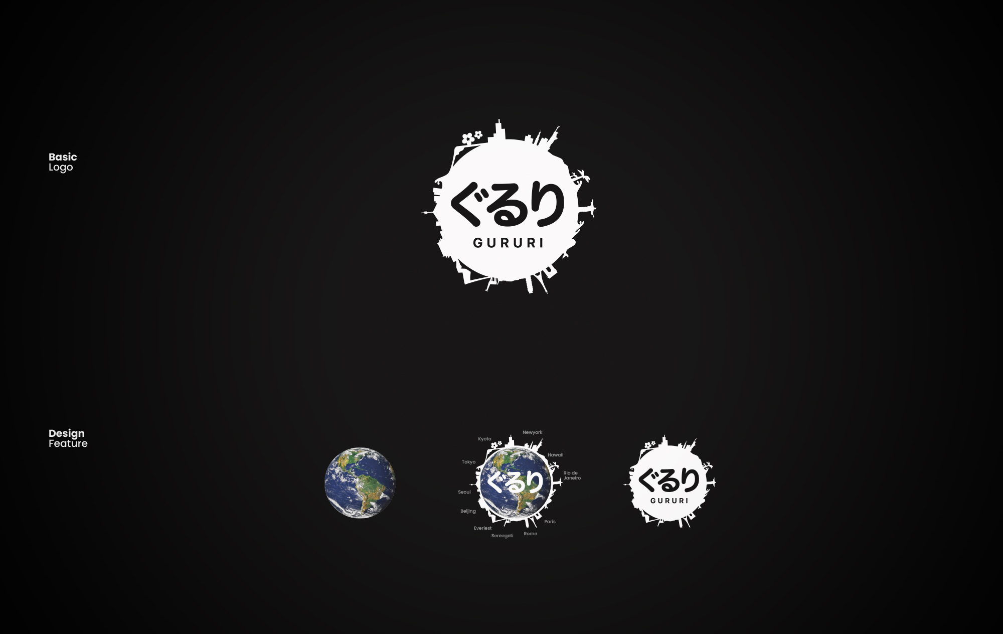
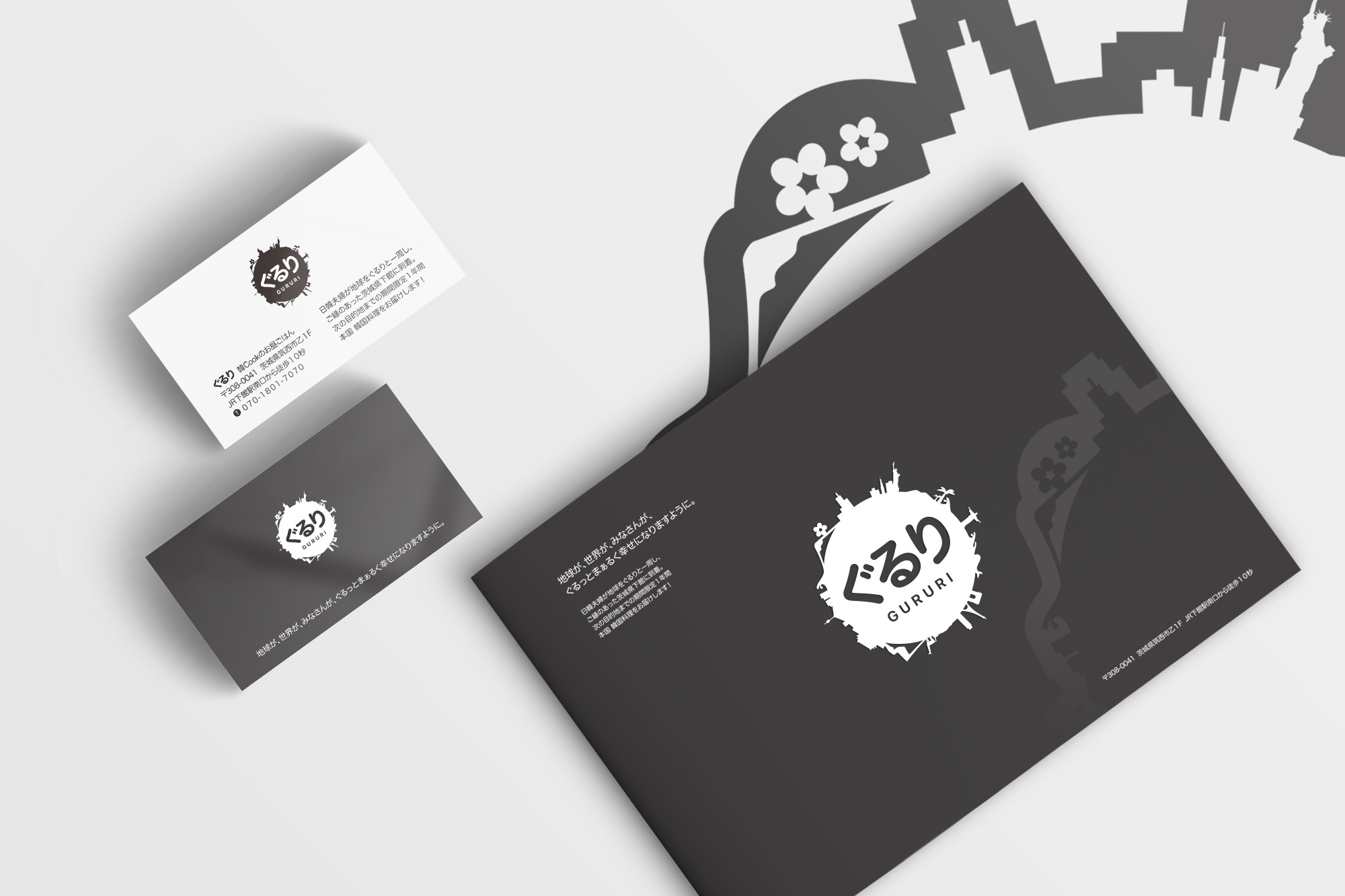
퓨전 한식당 브랜딩 프로젝트 Gururi의 스토어 아이덴티티 디자인은 지구를 상징하는 원형 구조를 중심으로, 한국의 서울타워, 일본의 후지산, 뉴욕의 자유의 여신상 등 오너 셰프가 경험한 전 세계의 다양한 상징 요소를 직관적으로 표현했으며, 다크 그레이 색상을 통해 세계의 상징 색상을 모두 담기 보다 모든 색상과 어울릴 수 있도록 하였습니다.
“Gururi”—a term signifying a circular motion or “all around”—is a fusion Korean restaurant in Kobe, Japan, created by a Korean-Japanese couple based on the experiences and inspiration gained from their travels around the world. The restaurant aims to be a comfortable space where diners can enjoy a novel culinary experience in their daily lives, blending ideas and recipes from diverse cultures into a menu rooted in Korean and Japanese cuisine. The store identity visualizes the brand experience—a welcoming atmosphere where travelers visiting Kobe and local residents can naturally linger, and a space that fosters connection between food and people—while incorporating storytelling elements from the owners’ global journeys.
The store identity design for Gururi centers on a circular motif symbolizing the globe and intuitively incorporates iconic landmarks experienced by the owner-chef, such as Seoul Tower in Korea, Mount Fuji in Japan, and the Statue of Liberty in New York. A dark gray color palette was chosen to ensure harmony with a wide range of other colors, rather than attempting to encompass the specific hues of every global landmark.